▶ Click a screen number / timecode to jump. Each screen is graded on Text · Meaning · Visual.
Full per-screen audit — every one of the 54 unique on-screen graphics, each graded on three axes: Text (spelling/typography), Meaning (screen vs voiceover & medical canon), Visual (composition/legibility/colour/polish vs RYA-DNA). Critical pass (deliberately hunting for problems) with an adversarial re-check on every claimed hard error. Cut-list →
54UNIQUE SCREENS
1🔴 ERROR
3🟠 VISUAL FIX
41🟡 POLISH
9🟢 CLEAN
⚑ Systemic findings — apply once, across the set
🎨
Colour semantics — green is overloaded
The teal/recovery-green (#4ADE80) is used as the accent for almost every symptom & section heading (SYMPTOM #1 VISION, MANIFESTATION = SYMPTOM, FATIGUE, ‘new lesion = SYMPTOMS’, ‘APPEARS’…) AND for the TRUE-RELAPSE column/heading. In the skin’s rule green = good/recovery, so a warning concept in green is a mild tension on titles — and an active problem in the True-vs-Pseudo table (the urgent TRUE RELAPSE in reassuring green, benign pseudo in alarm red). Decision needed: either treat teal as a pure brand accent (then only fix the comparison table) or reserve green for positives and move symptom/section accents to azure #4EA8DE.
🖼
Composition — single-line cards float in empty black
Many title / term / equation cards (MS SYMPTOMS map, SYMPTOM #1–#5 titles, ‘= SYMPTOMS’, ‘Symptom APPEARS’, the MRI panels) are one short line or a small cluster adrift in a large black field — they read sparse and under-designed next to the RYA-DNA standard. Centre/anchor them and give the charts room to fill the frame. This is exactly what the Claude Design brief targets (wave/DMTs charts, BBB, flow, comparison).
MS Sym
1🟡 Polish
Mid-animation partial reveal of an azure heading ("MS Sym…" typing toward "MS Symptoms"); nothing legible-complete yet, so no hard error.
TextcleanVisible glyphs 'MS Sym' are correct English with correct casing; text is mid-reveal so the truncation is animation, not a typo. No Cyrillic leftover visible. Cannot fully verify final spelling of 'Symptoms' from this partial frame, but nothing wrong is shown.
MeaningcleanVO is introducing the concept of an MS symptom; an 'MS Sym[ptoms]' heading matches the moment and the sweep-read question card ('typical MS symptoms / relapse look like'). No medical claim, number, or colour-vs-meaning conflict present in this frame. Azure heading color is neutral/brand, not a green=good vs red=danger semantic, so no contradiction.
VisualpolishTransitional frame: heading is typing in (only 'MS Sym' shown), so judge the system not this instant. Heading sits center-left over the dark vignette while the doctor enters from the right — composition is intentionally leaving room for him. Concern for the final state: the azure-on-near-black heading is fairly low-contrast/desaturated teal and reads small in the wide black field; on the settled frame it should land with enough weight and clear safe-zone so it doesn't collide with the doctor's shoulder/coat now intruding on the right. Lime label / accent hierarchy from the DNA not yet visible. Recommend verifying the fully-revealed frame for contrast and that text clears the figure.
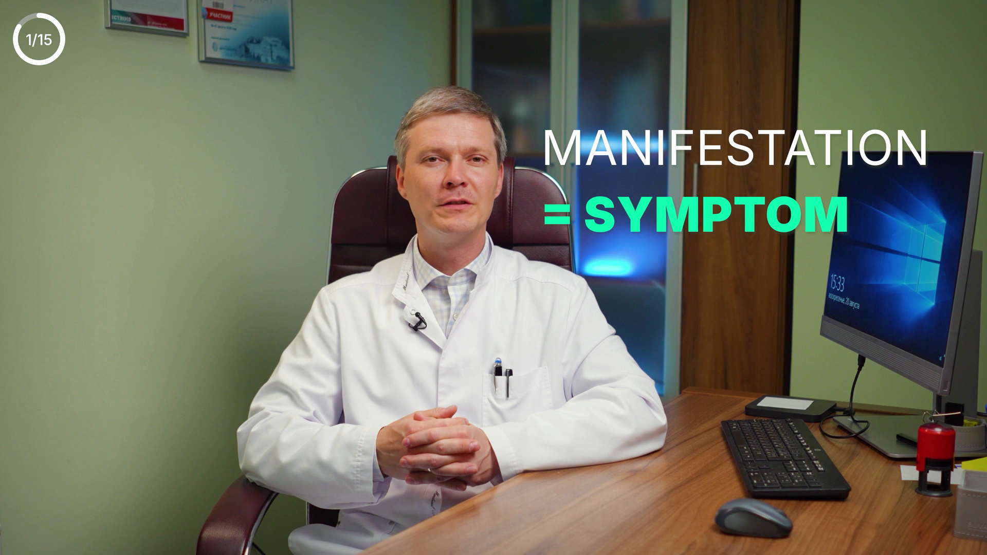
MANIFESTATION
= SYMPTOM
2🟡 Polish
Greek-definition card "MANIFESTATION = SYMPTOM" matches VO; only quibble is SYMPTOM rendered in the skin's positive-green.
TextcleanBoth words spelled correctly, all-caps, no typos, no Cyrillic leftover. "MANIFESTATION" and "SYMPTOM" correct. No punctuation/spacing issues.
MeaningconsiderEquation matches VO ("manifestation means symptom") and is conceptually fine. Minor colour-vs-meaning quibble: SYMPTOM is in good-green (#4ADE80) which in this skin = good/recovery, yet a symptom is neutral/negative. At a purely definitional moment it's an accent choice, not a hard contradiction, but green carries semantic weight here — worth a look. No wrong numbers, no third-party caption.
VisualcleanRight-third placement anchored over subject, not lost in black. Clear hierarchy: white definiendum over azure "=" + colored "SYMPTOM". Legible size, good contrast against darker monitor/wall. "MANIFESTATION" runs near the right edge but stays within safe zone. Slight overlap with the Windows desktop behind it but text stays readable. On-DNA. N/15 counter top-left fine.
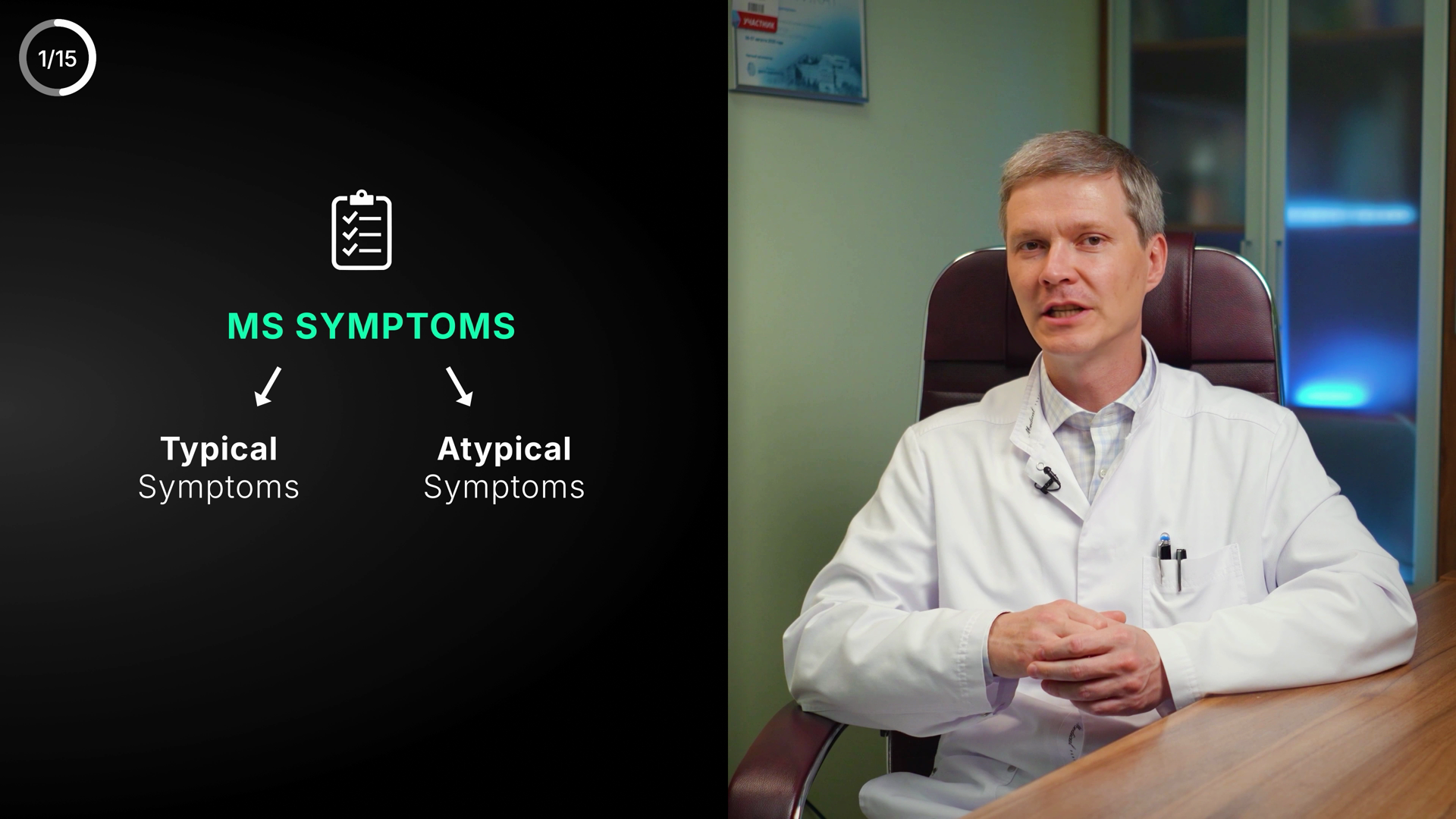
MS SYMPTOMS
Typical Symptoms
Atypical Symptoms
3🟡 Polish
Typical-vs-Atypical MS symptoms split — clean text, but green neutral header + cluster floats high with dead space below
TextcleanAll English, no Cyrillic leftover. 'MS SYMPTOMS', 'Typical', 'Atypical', 'Symptoms' all correctly spelled; no typo/grammar/punctuation/spacing issues. Corner counter 1/15 (ignored per rule).
MeaningconsiderOn-screen Typical/Atypical split matches VO exactly ('symptoms characteristic of MS... and symptoms that aren't typical') and canon (atypical = rarer signs). One colour-vs-meaning nit: the neutral taxonomy header 'MS SYMPTOMS' is rendered in the 'good' green (#4ADE80) rather than the neutral azure accent (#4EA8DE). It doesn't fight meaning (not a danger item shown calm), so not a hard error, but a neutral header in reserved-green is off-DNA. Child branches are correctly neutral white/grey.
VisualpolishHierarchy clear (clipboard icon -> heading -> two arrowed branches), legibility and contrast on black are excellent, text well clear of the doctor / safe zone, arrows clean and symmetric. Weakness: the whole cluster sits in the upper-center of the left panel and the lower ~40% of the black panel is empty dead space — diagram floats high and feels unanchored. Vertically center the cluster (or add a baseline element) for balance. Not mid-animation; this is the settled composition.
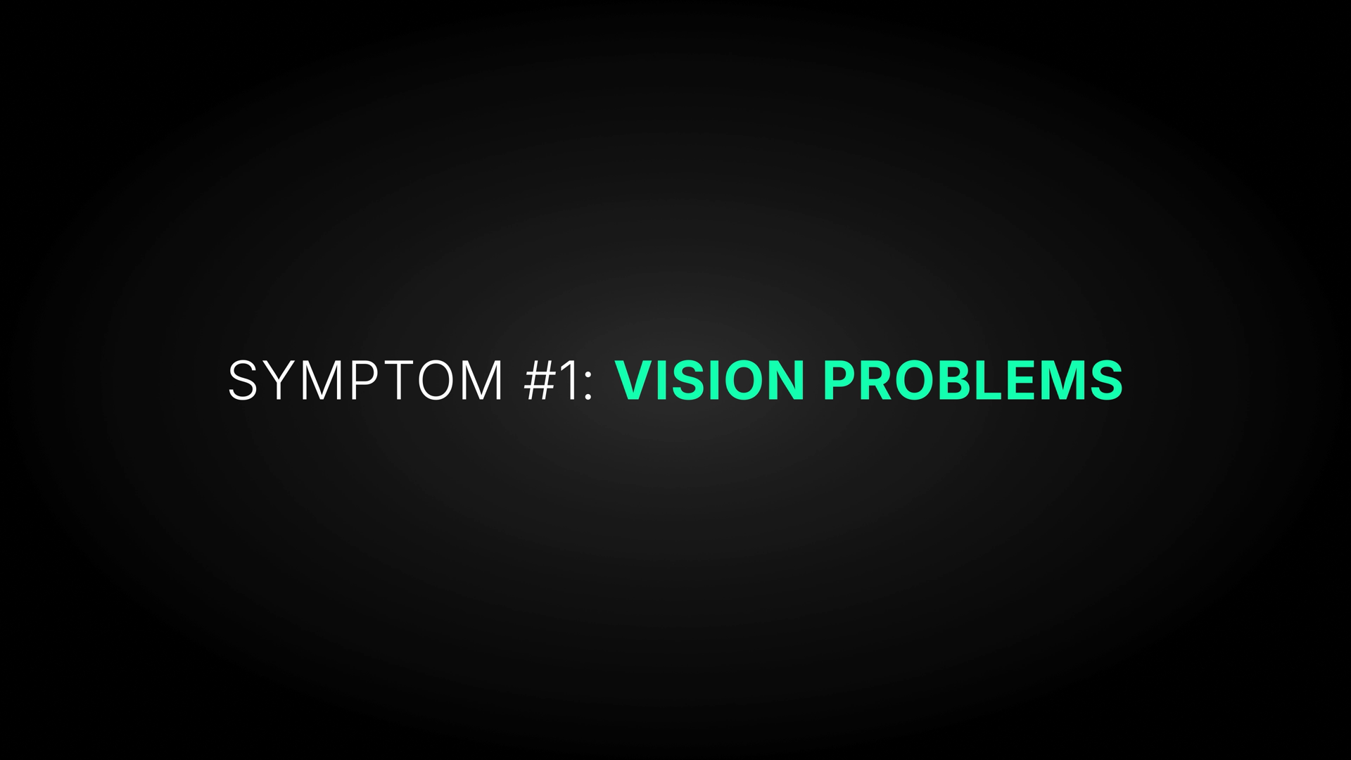
SYMPTOM #1: VISION PROBLEMS
4🟡 Polish
Clean S1 title card "SYMPTOM #1: VISION PROBLEMS" — only nit: symptom label rendered in the good/recovery green.
TextcleanAll English, no Cyrillic. Correct spelling (SYMPTOM / VISION / PROBLEMS), correct colon+space punctuation, consistent all-caps heading. No typography issues.
MeaningconsiderLabel matches VO (vision loss / dark spot in visual field) and canon S1 (decreased vision in one eye, optic neuritis). Accurate general header. Only consideration: 'VISION PROBLEMS' is rendered in the green that the colour rule reserves for good/positive/recovery — a symptom (danger/warning) shown in the recovery-green is a mild colour-vs-meaning tension. Reads as standard azure-skin accent rather than a semantic green badge, so not a hard error.
VisualpolishSingle centered line on a large near-black field with soft radial vignette — title-card style, intentional and legible (strong white+teal contrast on #0A1420). Dead-center alignment, clean safe-zone, on-brand accent. Composition is sparse with a lot of empty black; reads clean but minimal vs a richer DNA card. Polish only.
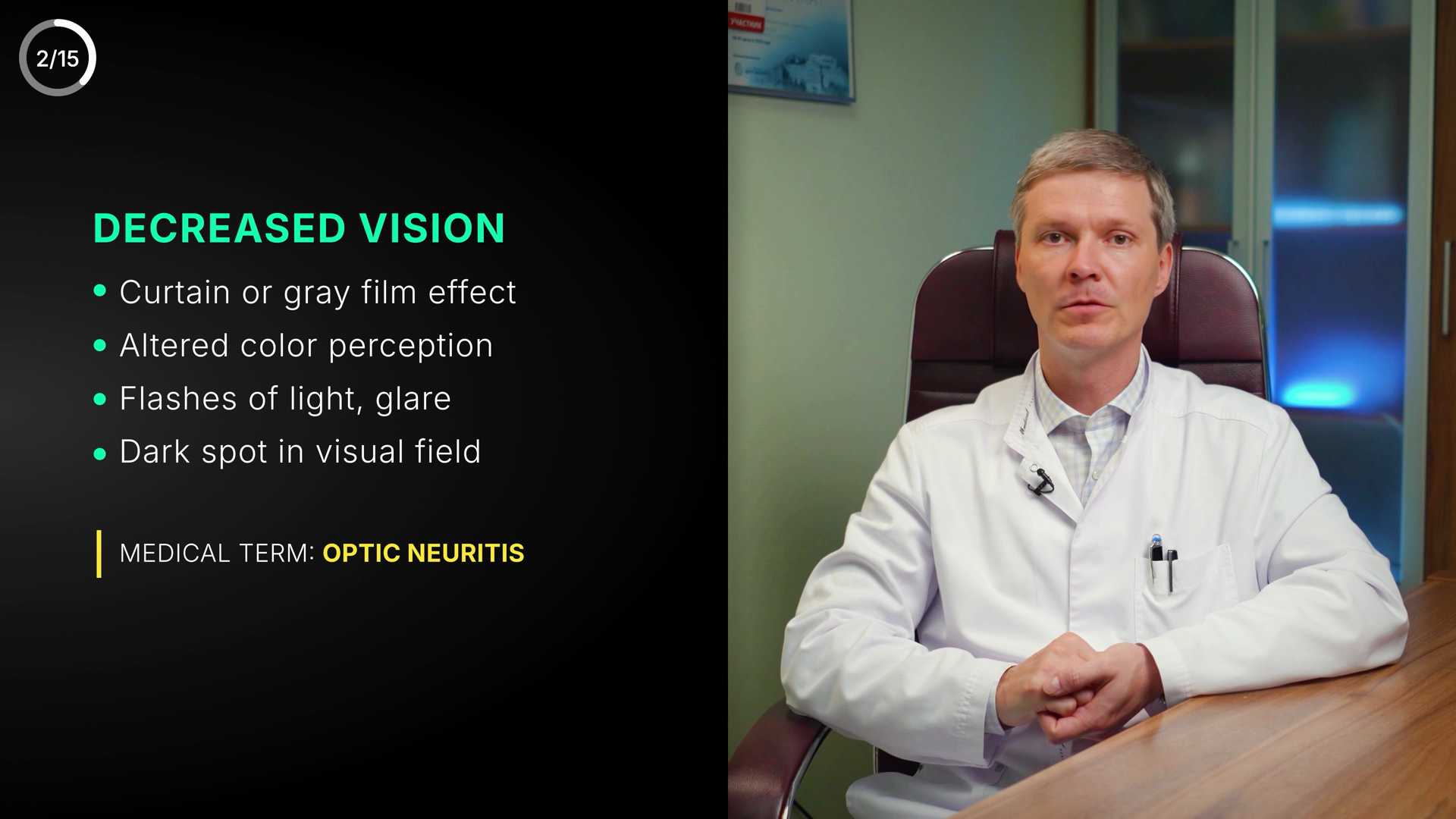
2/15
DECREASED VISION
Curtain or gray film effect
Altered color perception
Flashes of light, glare
Dark spot in visual field
MEDICAL TERM: OPTIC NEURITIS
5🟡 Polish
Clean S1 "Decreased vision / Optic neuritis" panel, but VO has already moved to S2 double vision — screen/VO desync.
TextcleanAll English, no Cyrillic leftover. Heading DECREASED VISION correct; bullets 'Curtain or gray film effect', 'Altered color perception', 'Flashes of light, glare', 'Dark spot in visual field' all spelled correctly; American 'color'/'gray' used consistently. Label 'MEDICAL TERM:' + 'OPTIC NEURITIS' exact correct spelling. No typos, punctuation or capitalization issues.
MeaningconsiderRep-frame is the tail of the S1 ‘Decreased vision / Optic neuritis’ card overlapping the first words of the S2 double-vision VO. The double-vision card does follow — just check the cut isn’t held a beat too long. Not a real error.
VisualcleanStrong RYA-DNA layout: left text panel on near-black, doctor clear on right, all text well inside safe zone. Good hierarchy — green heading, white bullets with green dots, lime accent bar + amber medical-term highlight. Green heading is a heading-accent not a meaning signal, so the green=good colour rule is not violated; amber on OPTIC NEURITIS fits the warn/label convention. Legible, well aligned, balanced. Note: the panel reads as a full settled state (not mid-animation).
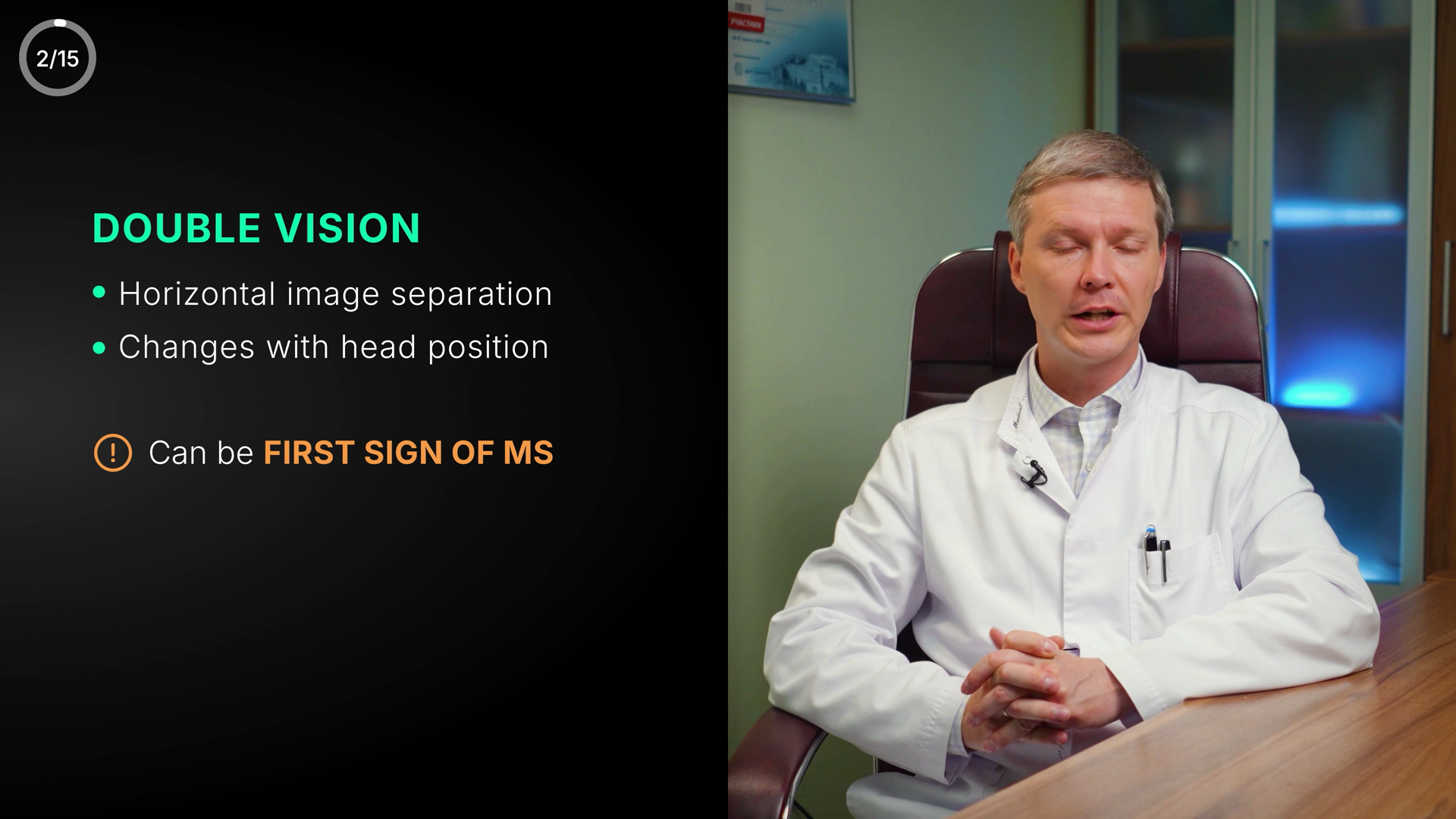
2/15
DOUBLE VISION
Horizontal image separation
Changes with head position
Can be FIRST SIGN OF MS
6🟢 Clean
S2 Double Vision symptom card — matches VO and canon exactly; clean.
TextcleanAll English, no Cyrillic. No typos/grammar issues. 'DOUBLE VISION' heading and 'FIRST SIGN OF MS' all-caps are intentional emphasis. Punctuation/spacing correct.
MeaningcleanMatches VO (double vision can be first sign; horizontal separation) and S2 canon (horizontal separation, changes with head position, can be first sign). 'Can be FIRST SIGN OF MS' in amber with alert icon = correct cautionary/clinical-significance flag, does not fight meaning. Green heading is channel symptom-card style, not a positive-meaning signal — no contradiction. No un-blurred third-party caption.
VisualcleanClear hierarchy heading->bullets->warning. Strong contrast on dark left panel; doctor framed right, no text on face, text in safe zone. Lime heading + azure bullets + amber warning per DNA. Minor: gap between 2nd bullet and warning line is a touch large, and the panel gradient fade into the doctor is slightly soft — polish-level only.
SYMPTOM #2: NUMBNESS & WEAKNESS
7🟡 Polish
Clean S2 label card — but the symptom name is shown in GREEN (the good/recovery colour), which fights the warning meaning.
TextcleanAll English, no Cyrillic. Spelling correct: NUMBNESS & WEAKNESS, SYMPTOM. Numbering #2 with colon and ampersand all consistent. No typos, grammar, spacing or punctuation issues. Caps used uniformly across both runs.
MeaningconsiderLabel matches canon S3 (numbness/clumsiness/weakness — fingers/whole limb, fine-motor loss, arm/leg weakness) and the VO about numbness + clumsiness/awkwardness. Honest summary of the symptom. ONE concern: the highlighted symptom name is rendered in #4ADE80 green, the palette's GOOD/recovery colour. A symptom is a warning, so per the colour rule green here is a colour-vs-meaning mismatch — accent should be azure #4EA8DE / lime #D4E44B (neutral label) or warn amber, not the positive green. Likely a series-wide styling choice shared across symptom cards rather than a one-off contradiction, so flagged as consider, not hard error.
VisualpolishSingle centered line on near-black radial-vignette bg, vertically/horizontally centered, well inside safe zone, no overlap with doctor (graphic-only card). Strong hierarchy: white prefix de-emphasises, green bold symptom carries the eye. Space Grotesk caps, good kerning, high contrast, fully legible. Polish notes: lots of empty black above/below — the single line floats a touch small/lonely in a 1920-wide frame; a thin azure underline/kicker or slightly larger type would give more presence and tie it to the azure DNA. Green accent also reads slightly off-brand vs the azure/indigo/lime identity (see meaning).
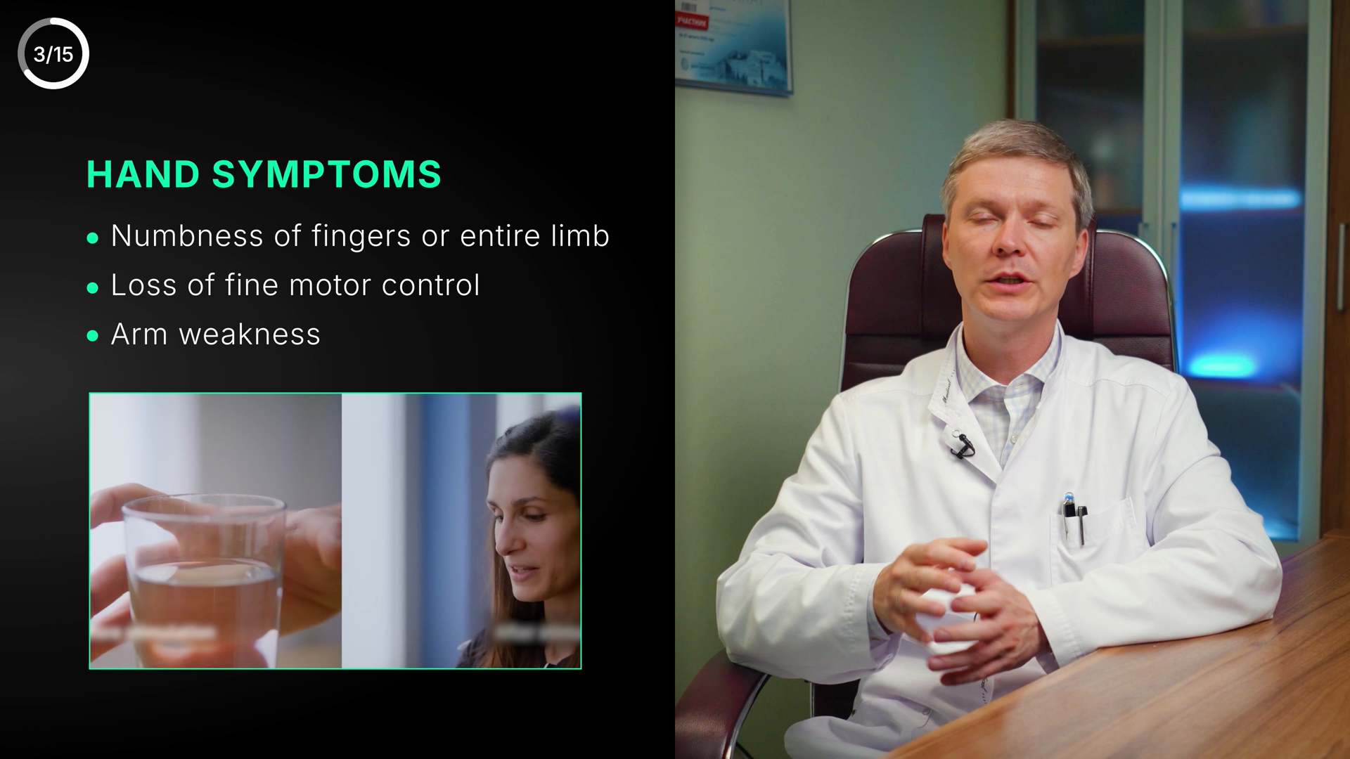
3/15
HAND SYMPTOMS
Numbness of fingers or entire limb
Loss of fine motor control
Arm weakness
8🟡 Polish
English symptom slide is clean text-wise, but heading "HAND SYMPTOMS" contradicts a VO that is entirely about legs/limbs.
TextcleanAll English, correctly spelled, no Cyrillic leftover. 'Numbness of fingers or entire limb', 'Loss of fine motor control', 'Arm weakness' — grammar/caps/punctuation all fine. Heading 'HAND SYMPTOMS' correctly cased. No typos.
Meaningconsider‘HAND SYMPTOMS’ card; a separate ‘LEG SYMPTOMS’ card follows right after. The rep frame just overlaps the leg part of the VO. Scope is fine across the two cards.
VisualpolishClean left-third panel: green heading + 3 lime-dot bullets over near-black, doctor on right. Legible, well safe-zoned, no text on face/edge. B-roll thumbnail bottom-left is tidy. Two nits: (1) the saturated spring-green for an entire warning list slightly fights the green=good DNA rule — amber/azure would signal 'symptom' better; (2) the top bullet 'Numbness of fingers or entire limb' runs close to mid-frame and competes for width — confirm it doesn't crowd the subject at full res. Hierarchy and polish otherwise on-DNA.
3/15
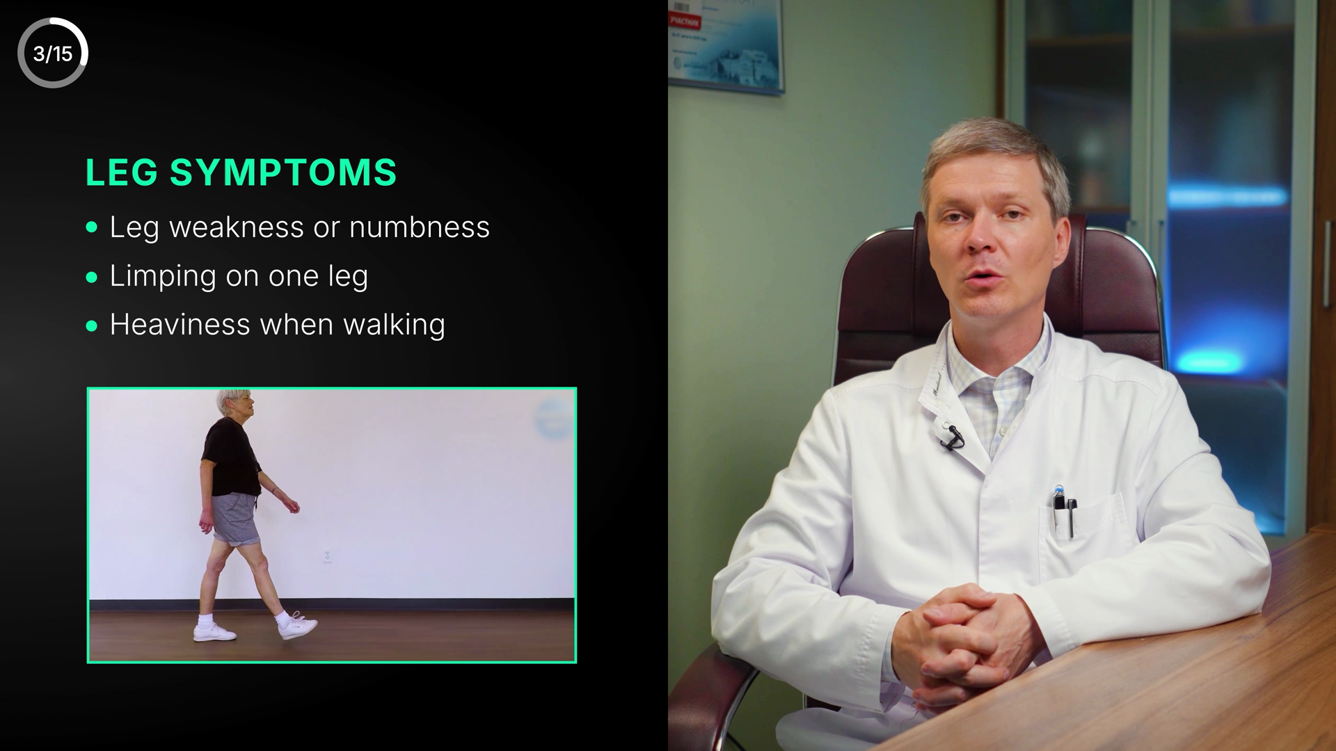
LEG SYMPTOMS
Leg weakness or numbness
Limping on one leg
Heaviness when walking
9🟡 Polish
Leg-symptoms card — clean English text matching VO + canon; only a mild green-on-symptom colour consideration.
TextcleanAll English, correctly spelled, no Cyrillic leftover. Heading 'LEG SYMPTOMS' and three bullets ('Leg weakness or numbness', 'Limping on one leg', 'Heaviness when walking') are typo-free with consistent sentence-case and clean punctuation. No medical-term spelling at risk here.
MeaningconsiderMatches VO (limping on one leg, heaviness when walking) and canon S3 (numbness/weakness/limping in arm or leg). Inset walking clip reinforces the gait point and shows no un-blurred third-party logo/caption/watermark. Minor consideration: heading + inset border use the bright 'good' green (#4ADE80 family) on what is a symptom/warning list — not a semantic 'this is positive' signal but the section-accent colour; acceptable if consistent across all symptom screens, otherwise green slightly fights the warning context.
VisualcleanClean left-text / right-doctor split. Strong hierarchy (Space Grotesk heading > Montserrat bullets), good legibility and contrast on #0A1420, bullets aligned, inset clip framed with crisp green border and well within safe zone. Doctor's face unobstructed. 3/15 permanent corner counter — not an issue. Composition balanced, not lost in black; matches RYA-DNA standard.
SYMPTOM #3: BALANCE & C
10🟡 Polish
Mid-animation reveal of "SYMPTOM #3: BALANCE & C[OORDINATION]" title card — text truncated and lost in empty black.
TextcleanVisible text 'SYMPTOM #3: BALANCE & C' is correctly spelled English, no typos, no Cyrillic. The trailing 'C' is a mid-animation cut-off (likely BALANCE & COORDINATION), so truncation is an animation artifact, not a spelling/grammar error. Cannot fully verify the hidden word, but nothing visible is misspelled.
MeaningconsiderMatches VO and canon: S3/S4 is the rarer dizziness/balance & coordination symptom, consistent with VO 'rarer symptoms, not as typical for MS.' Note a label-vs-canon mismatch: the master canon lists Numbness/weakness as S3 and Balance/coordination as S4 (rarer), yet this card numbers Balance & Coordination as 'SYMPTOM #3.' If the video re-orders so that this rarer symptom is shown 3rd, fine — but confirm numbering is internally consistent across the screen sequence so #3 isn't double-used or skipped. Color: 'BALANCE & C' rendered in green — per the colour rule green = good/positive, but this is a symptom/warning. As a section-title accent (not a status indicator) risk is low, yet a balance/coordination DEFICIT shown in 'good-green' is a mild meaning-vs-colour tension worth a glance.
VisualpolishBrief ‘SYMPTOM #3: BALANCE & COORDINATION’ title flash caught mid-wipe; as a transient title it’s fine, but like the other symptom titles it’s a single line lost in a big black field — anchor/enrich it.
SYMPTOM #4: URINARY DYSFUNCTION
11🟡 Polish
Urinary dysfunction is mislabeled "SYMPTOM #4" — per canon it is the 5th symptom (S4 = dizziness/coordination)
TextcleanAll English, no Cyrillic leftover. 'SYMPTOM #4: URINARY DYSFUNCTION' spelled correctly, correct caps, correct colon and hash. No typo/grammar/typography issues.
MeaningconsiderNumbered ‘#4’. The video’s own symptom numbering runs 1–5 (double vision folded into #1 Vision) and is internally consistent — NOT an off-by-one error against my canon. Just confirm the 1–5 sequence is intended.
VisualpolishSingle centered line in lower-mid third, white setup text + lime accent on the key term, on-DNA azure-bg treatment, good contrast and legibility, centered alignment clean, well inside safe zone. But the line floats in a large empty black field with no supporting element (icon/rule/counter context) — feels under-built vs a polished RYA card. Polish-level only, not broken.
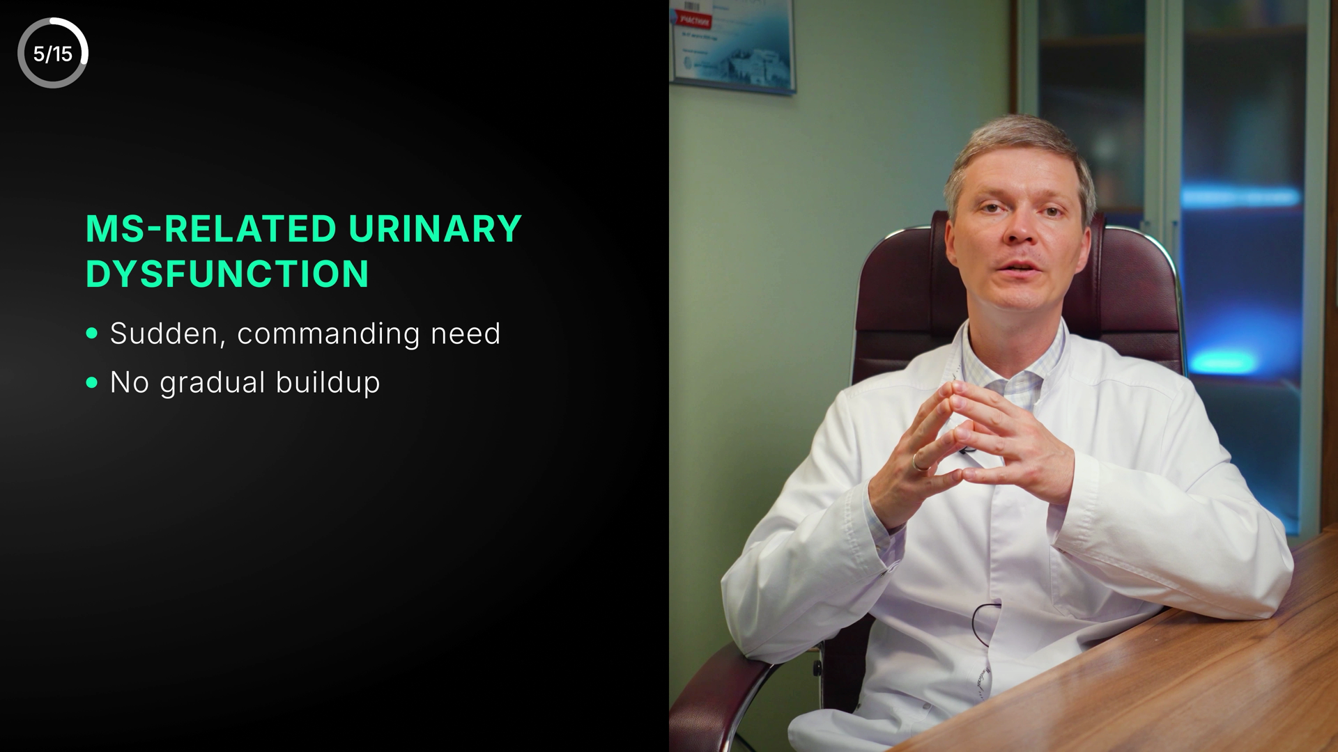
MS-RELATED URINARY DYSFUNCTION
• Sudden, commanding need
• No gradual buildup
12🟡 Polish
S5 urinary urgency panel — text matches VO/canon, but a dysfunction/symptom heading is rendered in recovery-green, fighting the colour rule.
TextcleanAll English, no Cyrillic leftover. No spelling/typo/grammar issues. 'MS-RELATED' hyphen correct, comma in 'Sudden, commanding need' correct, 'DYSFUNCTION' / 'URINARY' / 'gradual buildup' all spelled correctly. Capitalization consistent (all-caps heading, sentence-case bullets).
MeaningconsiderContent is accurate and on-VO: this is S5 urinary urgency / imperative voiding — 'sudden, commanding need' + 'no gradual buildup' faithfully paraphrase the VO ('how strong this urge is... urinary urgency, or imperative voiding'). Matches medical canon. BUT colour-vs-meaning: the heading is in the recovery/positive green (≈#4ADE80 'good'), used here to label a DYSFUNCTION/symptom (a negative/warning concept). Per the DNA rule green=good/recovery, amber/red=warning — a symptom panel shown in positive-green sends the wrong affect. Lime label colour (#D4E44B) or azure/amber would fit the meaning better. Not a factual error, hence 'consider'.
VisualpolishClean left-side panel: left-aligned heading over two lines + two dotted bullets, good internal hierarchy and spacing, fully legible at size, comfortably inside safe zone, not on the doctor's face. Composition is a touch sparse — text occupies upper-left of a large empty black third, leaving a big void in the lower-left; could be vertically centered or the block enlarged to better fill the negative space. Main polish note overlaps the meaning flag: the bright emerald heading reads as the channel's 'good/recovery' green rather than a neutral lime label or warning hue, which is off-tone for a dysfunction. Bullet dots and body grey are crisp; no alignment or contrast problems.
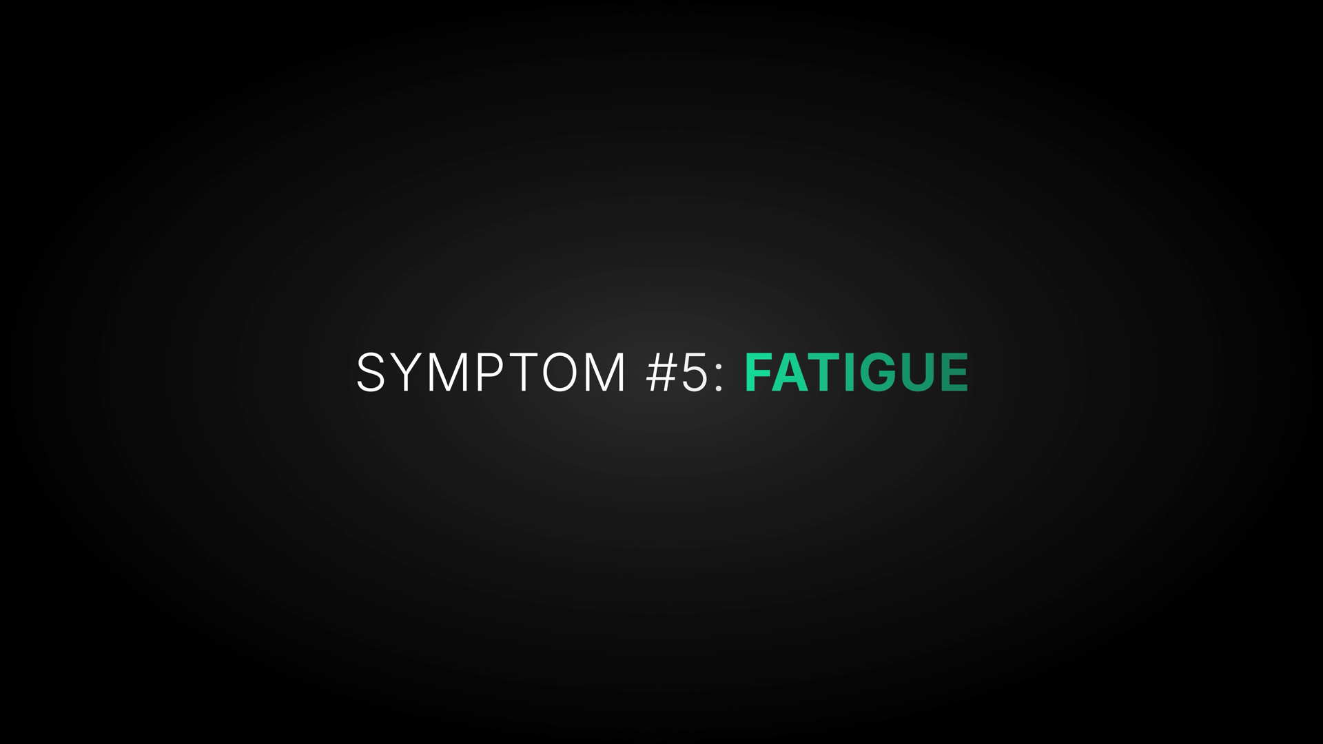
SYMPTOM #5: FATIGUE
13🟡 Polish
Symptom intro card "SYMPTOM #5: FATIGUE" — number conflicts with canon (fatigue = S6) and FATIGUE rendered in recovery-green.
TextcleanSpelling/grammar/caps all correct: 'SYMPTOM #5: FATIGUE'. English only, no Cyrillic leftover. Colon spacing and #-numbering formatting clean.
MeaningconsiderNumbered ‘#5: FATIGUE’ — same internal 1–5 numbering as the other cards (consistent, not an error). Separate point: ‘FATIGUE’ is in the good/recovery green — see the systemic colour note.
VisualpolishSingle centered line, horizontally balanced, high contrast, fully legible — on-brand minimal symptom-intro card. Sits slightly above true vertical center and floats in a large empty black field; radial vignette adds some depth but composition is sparse. Type reads as clean grotesque consistent with heading font. Minor: green accent doubles as the meaning concern above.
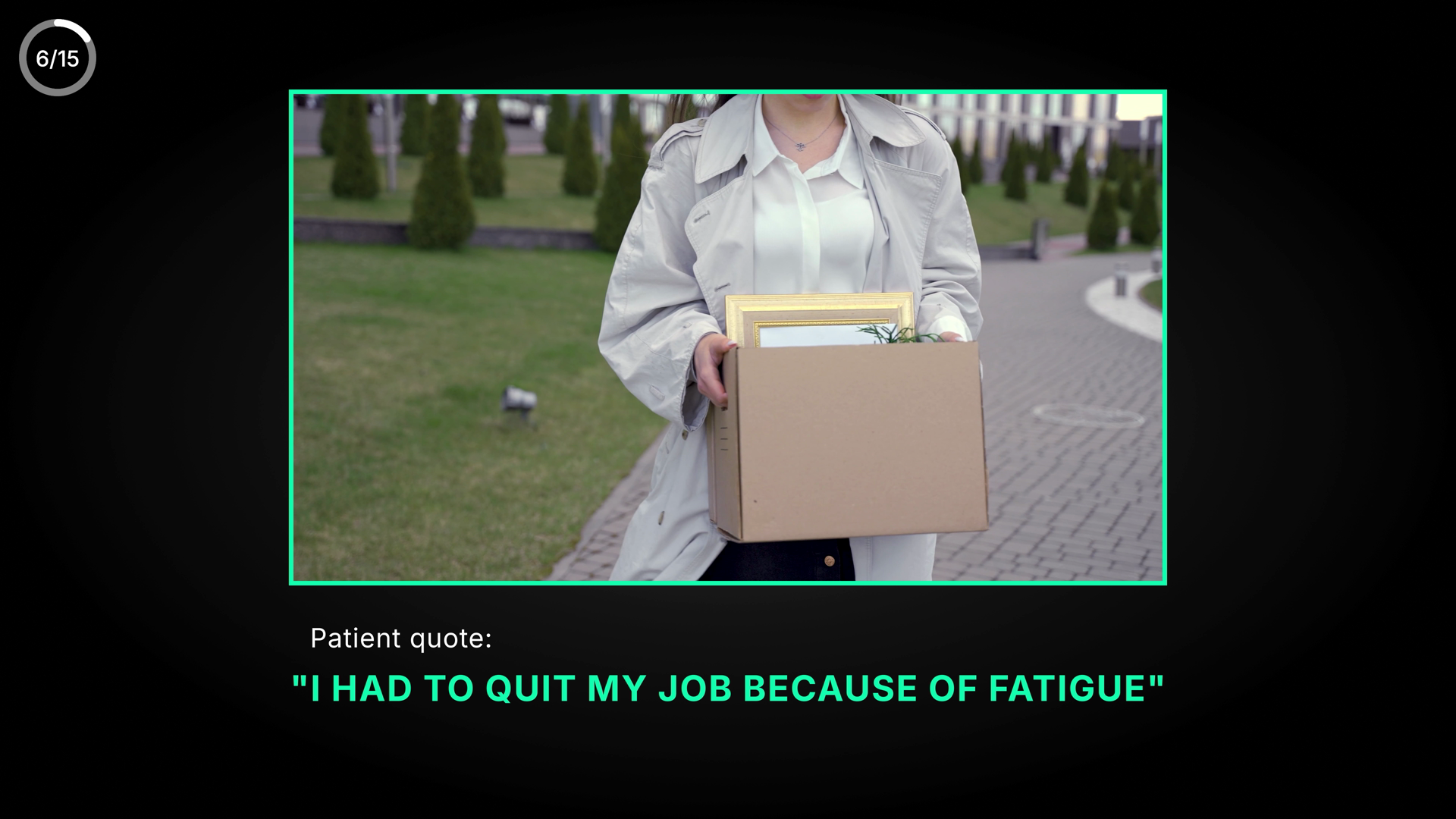
Patient quote:
"I HAD TO QUIT MY JOB BECAUSE OF FATIGUE"
14🟢 Clean
Patient-quote card illustrating fatigue's life impact (box-of-belongings B-roll); matches VO and S6 canon — clean.
TextcleanAll English, no Cyrillic leftover. 'Patient quote:' and the all-caps quote correctly spelled and punctuated with matching opening/closing double quotes. No typos, grammar, or spacing issues.
MeaningcleanVO at 4:04 is about persistent fatigue being a characteristic sign needing investigation in a young person (S6 Fatigue). The quote 'I had to quit my job because of fatigue' plus the box-of-belongings B-roll directly illustrate fatigue's life impact — matches VO and canon. No wrong number/range, no contradiction, no color-vs-meaning conflict (neutral azure quote, not a misused danger/recovery hue). No un-blurred third-party caption. Corner counter 6/15 vs audit label 'Screen #14' is an internal numbering note only, not flaggable per rules.
VisualcleanCaption lives in the lower-third black band, well inside the safe zone (not on the subject), strong azure-on-black contrast and legible at size. Framed video carries the skin's azure/green border. Composition balanced, not lost in empty black. Minor: 'Patient quote:' label is small/left-indented while the quote is centered — an intentional label/quote hierarchy, acceptable; could nudge the label to align with the quote's left edge for extra polish, but not a defect.
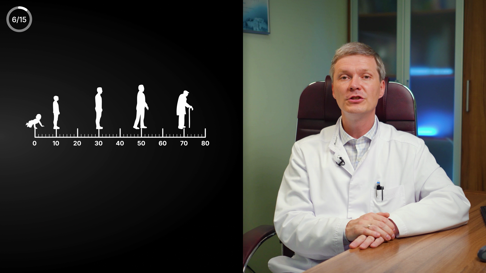
6/15
0 10 20 30 40 50 60 70 80
15🟡 Polish
Human-aging lifespan timeline (silhouettes baby→child→adult→elderly over 0–80 age axis) under the S6 fatigue / "investigate in a young person" VO — conceptually OK, no text errors.
TextcleanOnly numerals on screen (age axis 0–80) plus the permanent 6/15 corner counter. No words to misspell, no punctuation, no Cyrillic leftover. Digits are evenly spaced and correctly sequenced in tens. No text issues.
MeaningconsiderVO point is AGE: MS in a YOUNG person needs investigation (canon risk age 20–30 / onset ~20–40). Graphic is a generic full-lifespan 'ages of man' timeline to 80 with crawling baby, child, young adult, walking adult, elderly-with-cane. It supports the age theme loosely but is unanchored to the MS window — no marker/highlight on ~20–40, reads as aging-in-general rather than 'young person'. Not a factual error (0–80 is a bare axis, claims no MS-onset range; nothing contradicts canon), but it under-serves the VO. No colour-vs-meaning conflict (monochrome). No third-party caption/logo.
VisualpolishStatic frame (no mid-animation partial reveal). Split layout: full graphic on left black panel, doctor on right — composition is balanced and the figures sit comfortably above the axis, legible white-on-black, axis numerals crisp at this size. Off-DNA though: pure white/grey monochrome with NO azure/indigo/lime accent, no Space Grotesk heading or label — looks like a stock infographic dropped in, not the YTMSEN skin. Lower-left quadrant under the axis is large empty black (the graphic floats high). To match RYA-DNA, recolour/accent the relevant young-adult band (azure) and add a short Montserrat caption tying it to 'investigate in young patients'.
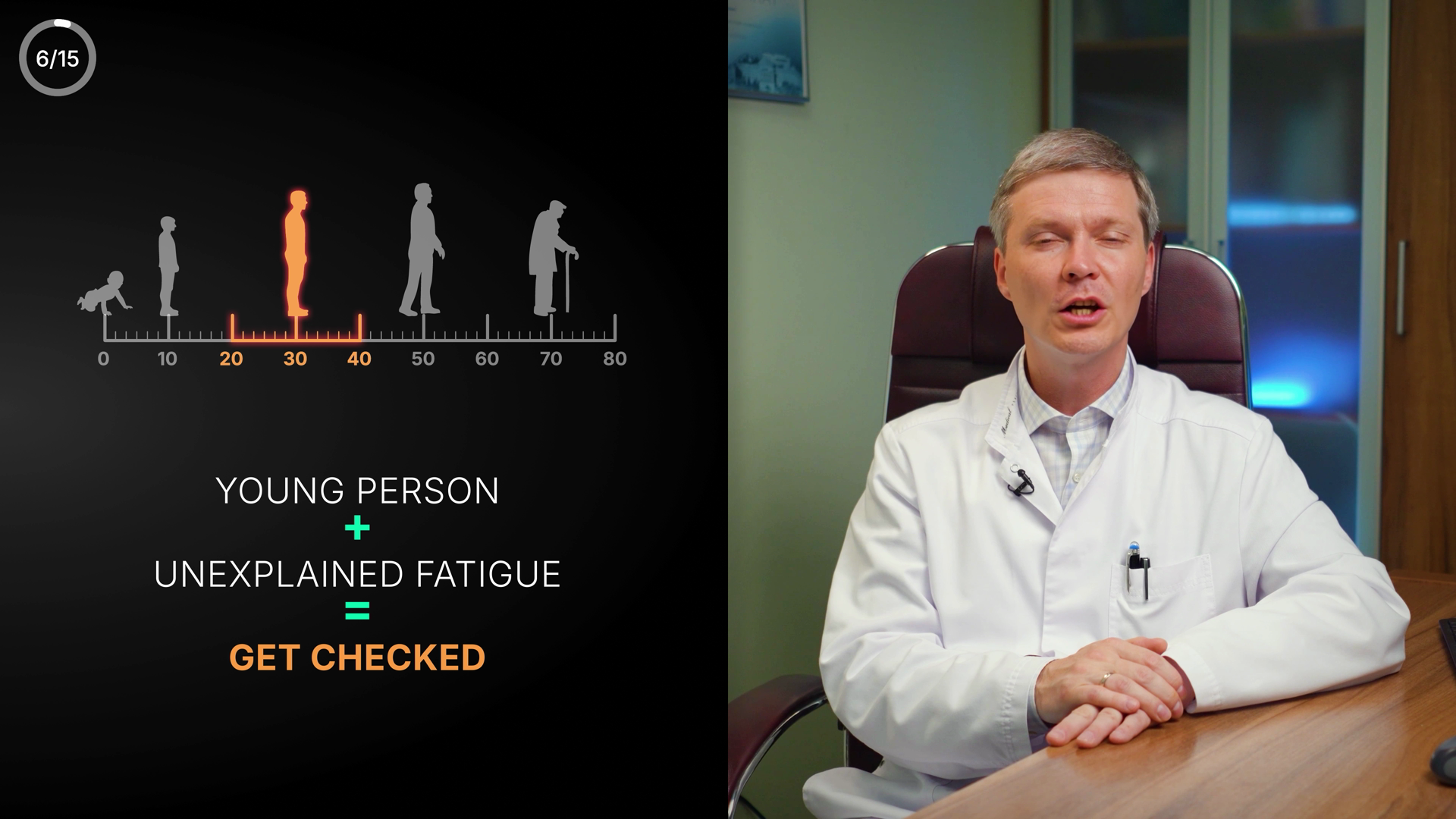
0 10 20 30 40 50 60 70 80 (orange band 20–40, orange labels 20/30/40, orange standing figure at 30)
YOUNG PERSON
+
UNEXPLAINED FATIGUE
=
GET CHECKED
6/15
16🟢 Clean
S6 fatigue+age "get checked" infographic — clean, English, age band 20–40 matches real-onset canon
TextcleanAll English, correct spelling and caps: YOUNG PERSON + UNEXPLAINED FATIGUE = GET CHECKED. Axis is numerals only (0–80). No Cyrillic, no typos, no punctuation issues.
MeaningcleanMatches VO beat (young person → needs to be investigated) and canon S6 (fatigue → young person → investigate). Highlighted age band 20–40 with figure at ~30 aligns with the real-MS-onset ~20–40 note; this VO moment states no number so no contradiction. Colour logic correct: green '+' connector, amber 'GET CHECKED' as warn/call-to-act (not danger). VO is bridging toward atypical/epileptic, but screen correctly holds the preceding fatigue conclusion — not an error.
VisualcleanBalanced split: lifespan-axis infographic left, doctor right. Clear hierarchy — orange highlighted figure + band immediately reads the at-risk age; PERSON/FATIGUE/GET CHECKED stack legible with good contrast on the dark azure bg. Axis numerals crisp, safe-zones clean, on-DNA Space Grotesk/Montserrat feel. 6/15 corner counter fine (ignored).

Atypical Presentations
17🟡 Polish
Section title card "Atypical Presentations" — clean, matches VO and canon; only a mild sparse-layout polish note.
Textclean"Atypical Presentations" — correct spelling, proper title-case, no typos, no Cyrillic leftover. No text issues.
MeaningcleanMatches VO at this moment ("there are also atypical presentations") and the canon's Atypical section. Azure/teal accent on "Atypical" is a brand-highlight color, not a good/danger semantic — no colour-vs-meaning conflict.
VisualpolishCentered two-tone title (teal-green lead word + white) on radial-vignette black; good contrast, legibility, alignment and safe-zone. Minor: minimalist card reads slightly sparse/small in the large empty black field with no supporting subtitle or icon to anchor it vs a richer DNA section card. Ships fine.
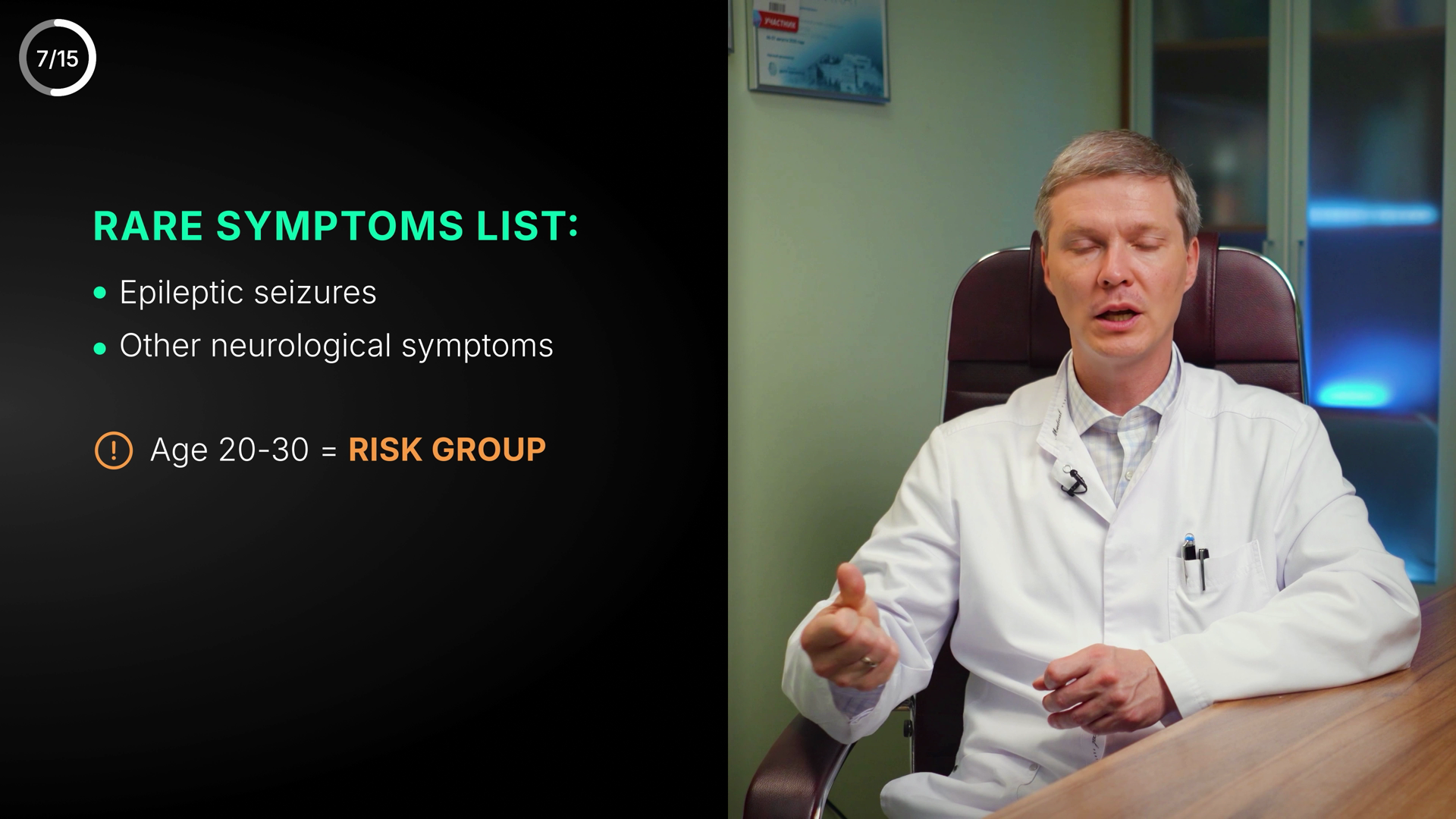
RARE SYMPTOMS LIST:
• Epileptic seizures
• Other neurological symptoms
(!) Age 20-30 = RISK GROUP
18🟡 Polish
Rare/atypical MS symptoms + 20-30 risk age — clean and on-canon; only nits are hyphen-vs-en-dash and green header on a warning topic
TextminorAll English, no Cyrillic leftover. Spelling correct: 'Epileptic seizures', 'Other neurological symptoms', 'RISK GROUP'. Capitalization/grammar consistent. Only nit: numeric range 'Age 20-30' uses a hyphen (-) where typographic best practice for a range is an en-dash (20–30). Minor, not a true error.
MeaningconsiderMatches VO beat (rare/atypical signs + risk age) and medical canon: atypical = epileptic seizure / rarer neurological signs; VO risk age = 20–30, screen shows 20-30 — correct. Amber warning icon + amber 'RISK GROUP' correctly signals caution (color matches meaning). One tension: the section header 'RARE SYMPTOMS LIST' is rendered in good-green (#4ADE80 zone), which the color rule reserves for good/positive/recovery; here it reads as a neutral label-accent rather than a 'this is good' signal, but on a warning/atypical topic a green heading is slightly off-message vs the strict color schema. Consider lime/azure label color instead of recovery-green.
VisualcleanLeft-anchored text block in the dark left third; doctor clear on the right with no overlap — good safe-zone and separation. Legible sizes/contrast, clear hierarchy (header > bullets > amber callout with icon). Block sits a touch high, leaving a large empty lower-left quadrant; vertical centering would balance it better, but it is not lost in black. On-DNA azure skin, fonts and accent colors consistent. Permanent 7/15 corner counter present (not an issue).
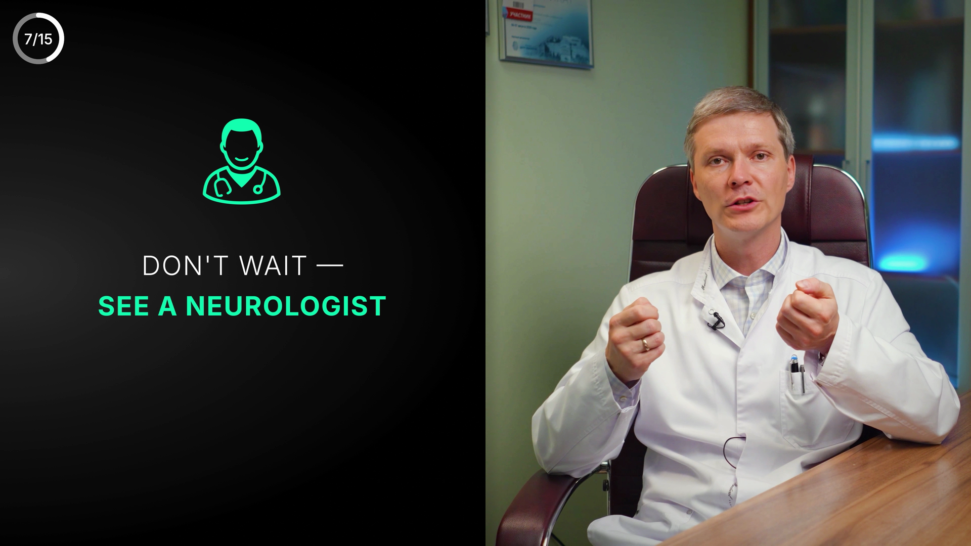
DON'T WAIT —
SEE A NEUROLOGIST
19🟡 Polish
CTA "Don't wait — see a neurologist" over doctor B-roll; matches VO; only nit is urgent CTA shown in positive-green.
TextcleanSpelling correct (NEUROLOGIST), apostrophe in DON'T fine, em-dash with proper spacing. No Cyrillic leftover. English throughout.
MeaningconsiderMatches VO near word-for-word ('not wait'/'see at least a neurologist') and the canon neurologist CTA. Colour-vs-meaning nit: the action line 'SEE A NEUROLOGIST' (and icon) is rendered in good/positive green #4ADE80 while the framing 'DON'T WAIT' is urgency/warning — per the stated colour rule urgent content leans red/amber, so calm-green slightly softens the urgency. Defensible as channel accent for the positive recommended action; borderline, not a hard error.
VisualpolishClean split layout: doctor B-roll right (well-composed, not occluded), text + green doctor icon stacked in left safe zone. Strong contrast/legibility, good hierarchy (white setup → larger green payoff). Group sits high/center-left leaving a large empty black lower-left third — slightly top-heavy; could lower/center the block or balance the dead space. 7/15 corner counter is the permanent counter (not an issue).
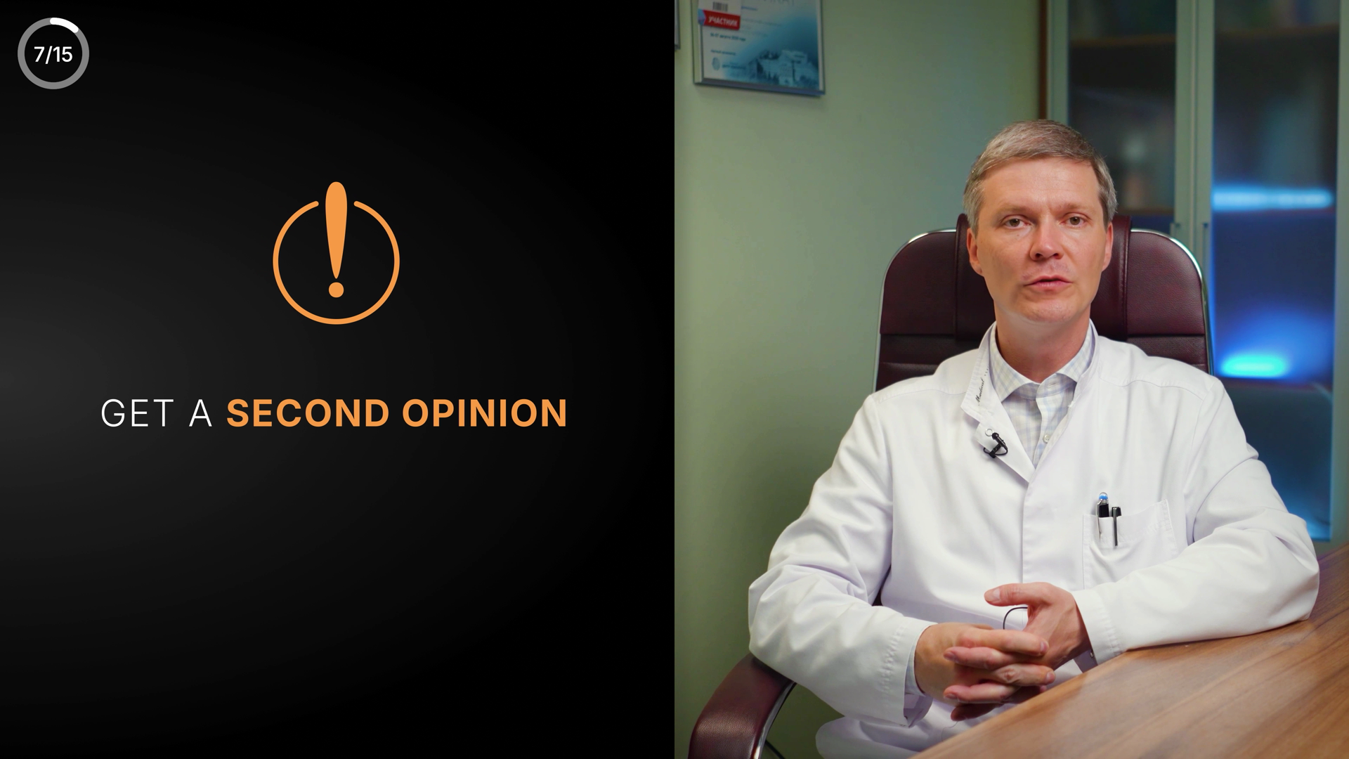
GET A SECOND OPINION
20🟡 Polish
Left-panel CTA card "GET A SECOND OPINION" with orange alert-circle icon — clean text/meaning, but orange is off the azure DNA palette.
TextcleanGET A SECOND OPINION — correct spelling, grammar, all-caps consistent. No typos, no Cyrillic leftover. No text issues.
MeaningcleanMatches VO & canon: VO is about a symptom possibly being misattributed to a spinal/disc problem rather than something serious; canon explicitly notes 'Second opinion vs degenerative disc disease'. The advisory message is medically appropriate. Amber/orange reads as caution/advisory which fits a 'don't accept the first diagnosis' nudge — colour does not fight meaning.
VisualpolishComposition solid: alert-circle icon stacked over two-line text, well-centered in the left black panel, doctor unobstructed on the right; strong contrast and legibility. Polish only: the orange (~#E8862E) is OFF the YTMSEN azure/indigo DNA accent palette (azure #4EA8DE / indigo #8B7FF0) and even warmer/more saturated than the defined warn token #F59E0B. Recommend pulling the icon + highlighted 'SECOND OPINION' to the canonical warn #F59E0B (or an azure accent) for brand consistency. Text block sits comfortably inside safe zone.
SHARE YOUR SYMPTOMS
IN COMMENTS
21🟡 Polish
CTA "Share your symptoms in comments" with green accent + down arrow — clean, matches VO; only a minor visual-spacing/brand-accent nit.
TextcleanAll English, no Cyrillic leftover. 'SHARE YOUR SYMPTOMS IN COMMENTS' — correct spelling, grammar, all-caps consistent, no typos or punctuation issues.
MeaningcleanMatches VO exactly ('Feel free to share in the comments the symptoms characteristic for you') and the canon CTA: comment. No medical claim to fact-check here. Green is used as a neutral engagement/brand accent for the CTA, not as a recovery signal, so it does not fight the green=good rule. Down arrow conventionally points to the comment box — appropriate.
VisualpolishSplit layout: speech-bubble icon + two-line headline + down arrow stacked over left black half, doctor right — readable, strong white/green-on-near-black contrast, in safe zone, not on the doctor's face. Nits: a large empty black gap separates the headline from the arrow (block feels slightly top-heavy / arrow orphaned low), and the accent uses 'good' green (#4ADE80) rather than the azure/lime DNA accents — defensible for a friendly CTA but a slight brand drift. Not a partial/transitional reveal.
MS Course: Relapses & Remissions
22🟡 Polish
Clean title card naming the relapsing-remitting course; minor issue is both phases share one green colour, flattening the good-vs-warning distinction.
TextcleanAll English, no Cyrillic. "Relapses" and "Remissions" spelled correctly; colon and ampersand spacing correct; no typos or capitalization issues.
MeaningconsiderMatches VO ("relapsing, remitting course") and canon (course = relapsing-remitting). Soft flag: COLOUR RULE reserves green for good/recovery and amber/red for warning, but here both "Relapses" (the warning/danger phase) and "Remissions" (the good phase) are the same green — green is used as a generic accent rather than semantic encoding. Slide is descriptive, not urgency-advising, so it doesn't hard-contradict, but it misses differentiating the danger phase.
VisualpolishSingle centered line floating in a large empty black field — composition is light/underweight for full 16:9, lots of dead space above and below. Two-tone white-label + green-emphasis is legible, well-aligned, safe-zone fine, on Montserrat-ish body. Green reads emerald/teal (close to good #4ADE80) but slide leans entirely on green with no azure/indigo brand accent per skin. Polish only.
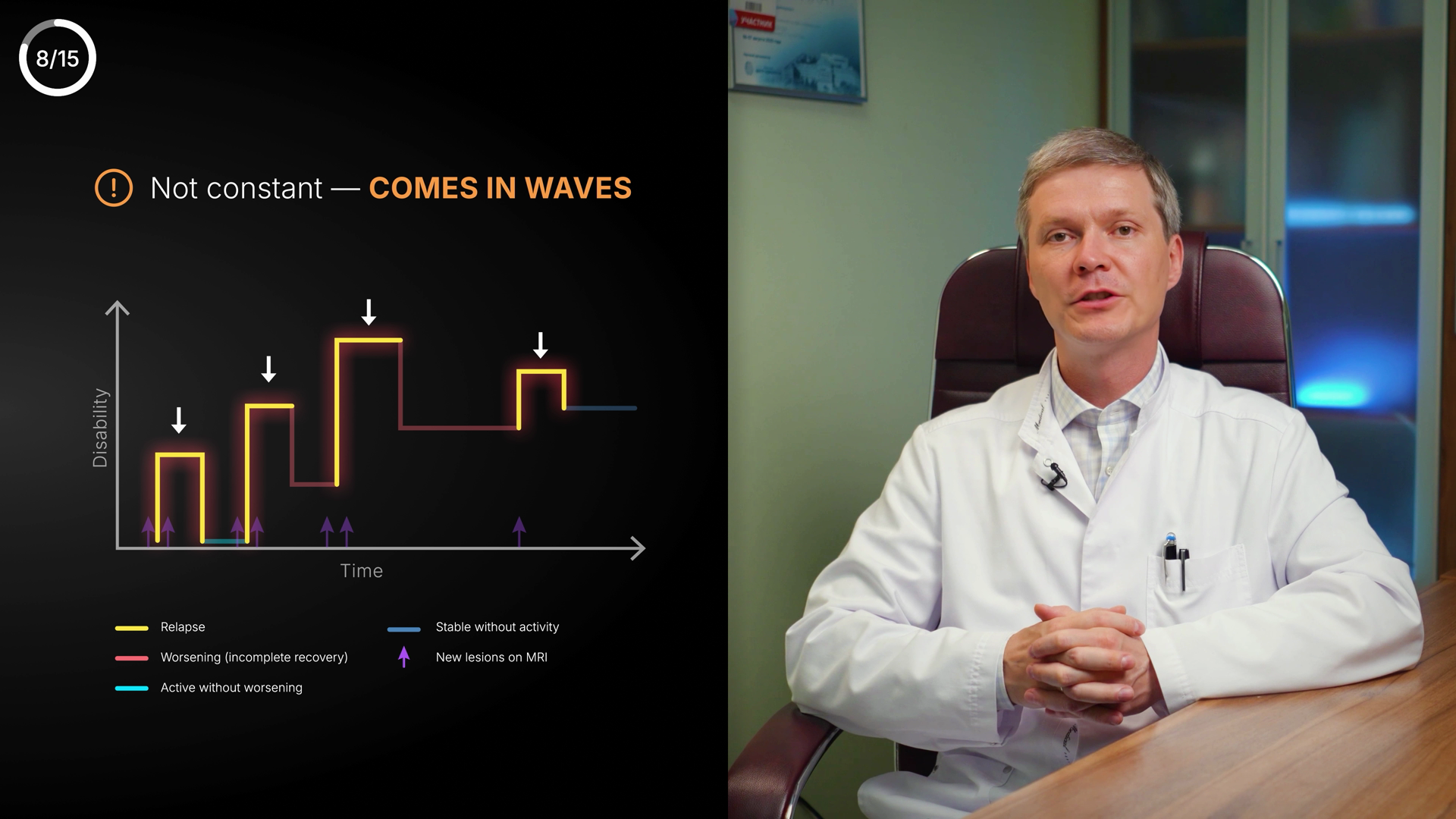
(!) Not constant — COMES IN WAVES
Disability
Time
Relapse
Worsening (incomplete recovery)
Active without worsening
Stable without activity
New lesions on MRI
23🟡 Polish
MS disability-staircase chart ("comes in waves") — clean English text, but graphic is denser/more advanced than the simple relapse VO.
TextcleanAll text English, no Cyrillic leftover. Spelling/grammar clean: 'Relapse', 'Worsening (incomplete recovery)', 'Active without worsening', 'Stable without activity', 'New lesions on MRI', 'Disability', 'Time'. Em-dash in 'Not constant — COMES IN WAVES' correct. Parentheses balanced. No typos.
MeaningconsiderHeader 'Not constant — COMES IN WAVES' matches VO (relapses/episodes) and relapsing-remitting canon. Chart correctly shows disability accumulating in a staircase: yellow=relapse spike, red=worsening with incomplete recovery, MRI-lesion arrows = relapse — all canon-consistent. Colour use OK (no calm-green on danger). Caveat: the graphic layers MS phenotype terms (Active without worsening / Stable without activity / New lesions on MRI) that go well beyond the simple VO line about relapses; slightly ahead of narration but not contradictory. No factual error.
VisualpolishLeft-half chart well-composed against azure-dark bg, doctor clear on right, text in safe zone, no overlap on face. Legibility: header and legend fine, but the 6-item legend and axis labels ('Disability','Time') are on the small side and the legend sits low near frame bottom edge. Glowing yellow relapse peaks read well; white down-arrows guide the eye. Lime/yellow vs accent palette is consistent. Minor: dense legend competes with chart; could enlarge axis labels and lift legend slightly. Not weak — solid RYA-DNA polish.
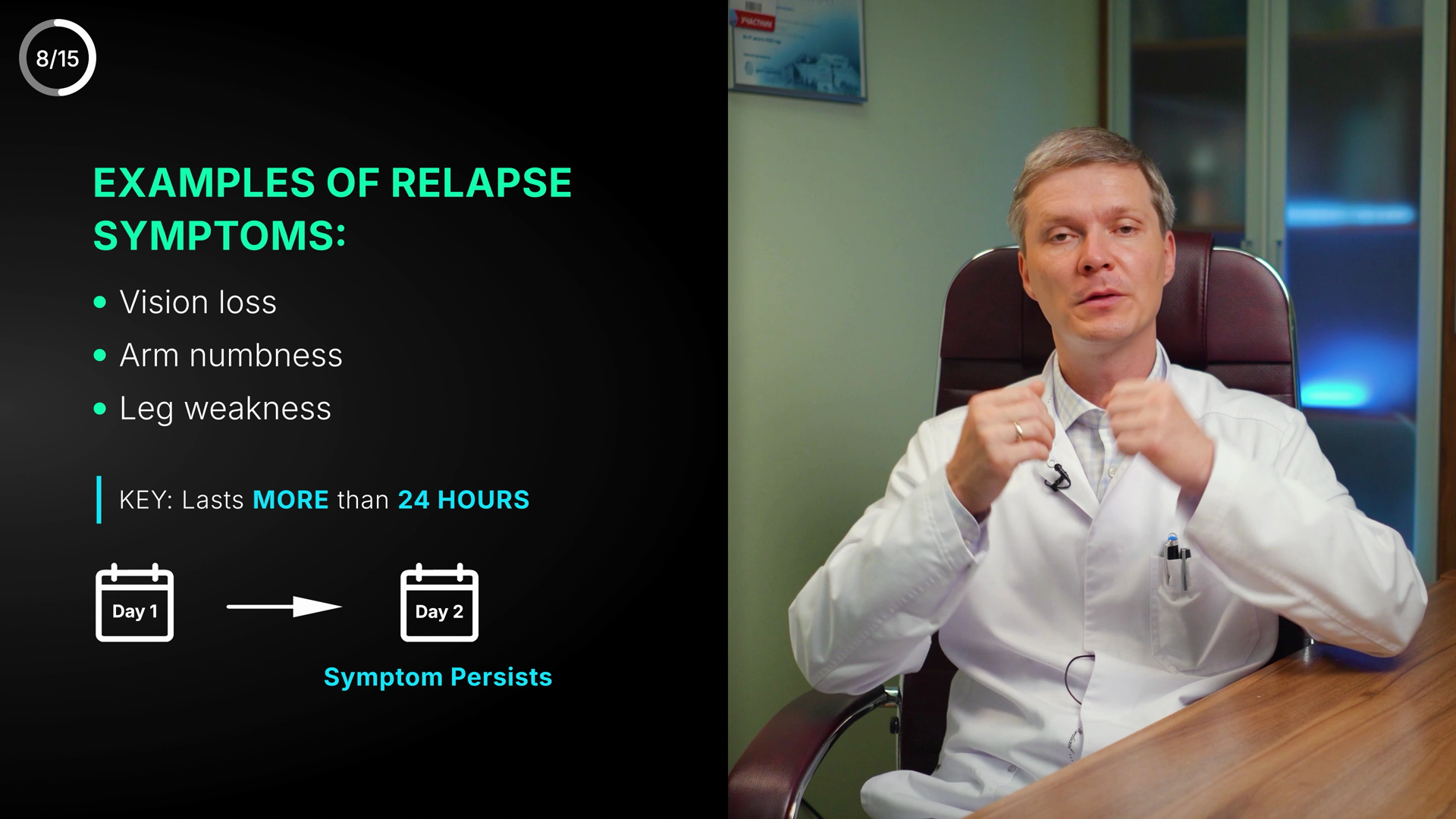
EXAMPLES OF RELAPSE SYMPTOMS:
Vision loss
Arm numbness
Leg weakness
KEY: Lasts MORE than 24 HOURS
Day 1 → Day 2
Symptom Persists
8/15
24🟢 Clean
Relapse-symptom examples + ">24h persistence" rule — all English, correct, matches VO; only a minor color-semantics nit.
TextcleanAll English, no Cyrillic. Spelling/grammar correct: 'EXAMPLES OF RELAPSE SYMPTOMS', 'Vision loss', 'Arm numbness', 'Leg weakness', 'KEY: Lasts MORE than 24 HOURS', 'Day 1'→'Day 2', 'Symptom Persists'. Capitalization and colon consistent. No typos or spacing issues.
MeaningcleanMatches VO ('appeared today... tomorrow still there... could be an MS relapse') and canon (relapse = symptom >24h). Day1→Day2 'Symptom Persists' correctly illustrates the >24h rule. Symptom examples are canon-valid: Vision loss (S1/optic neuritis), Arm numbness + Leg weakness (S3). 24 HOURS threshold is exactly correct. Minor: 'MORE than 24 HOURS' and 'Symptom Persists' use azure brand-accent — a persistence/warning concept; azure is the neutral accent (not green/good), so it doesn't fight meaning, but amber-warn could read more on-message. No un-blurred third-party captions; doctor footage clean.
VisualcleanStrong left-panel layout on the standard YTMSEN azure-dark scrim against the talking-head right. Clear hierarchy: lime-bulleted heading list → divider 'KEY' line with azure tick bar → calendar diagram. Lime bullets, white body, azure emphasis all on-DNA. Calendar Day1→arrow→Day2 is a clean, legible visual metaphor. Text well within safe zone, not on the doctor's face. Heading in Space-Grotesk-style caps reads well. Good contrast throughout. Polish-level only: the panel's right edge sits as a soft gradient over the footage rather than a hard mask, and 'Symptom Persists' floats slightly low/orphaned under Day 2 — could be centered to the whole diagram. Not a defect.
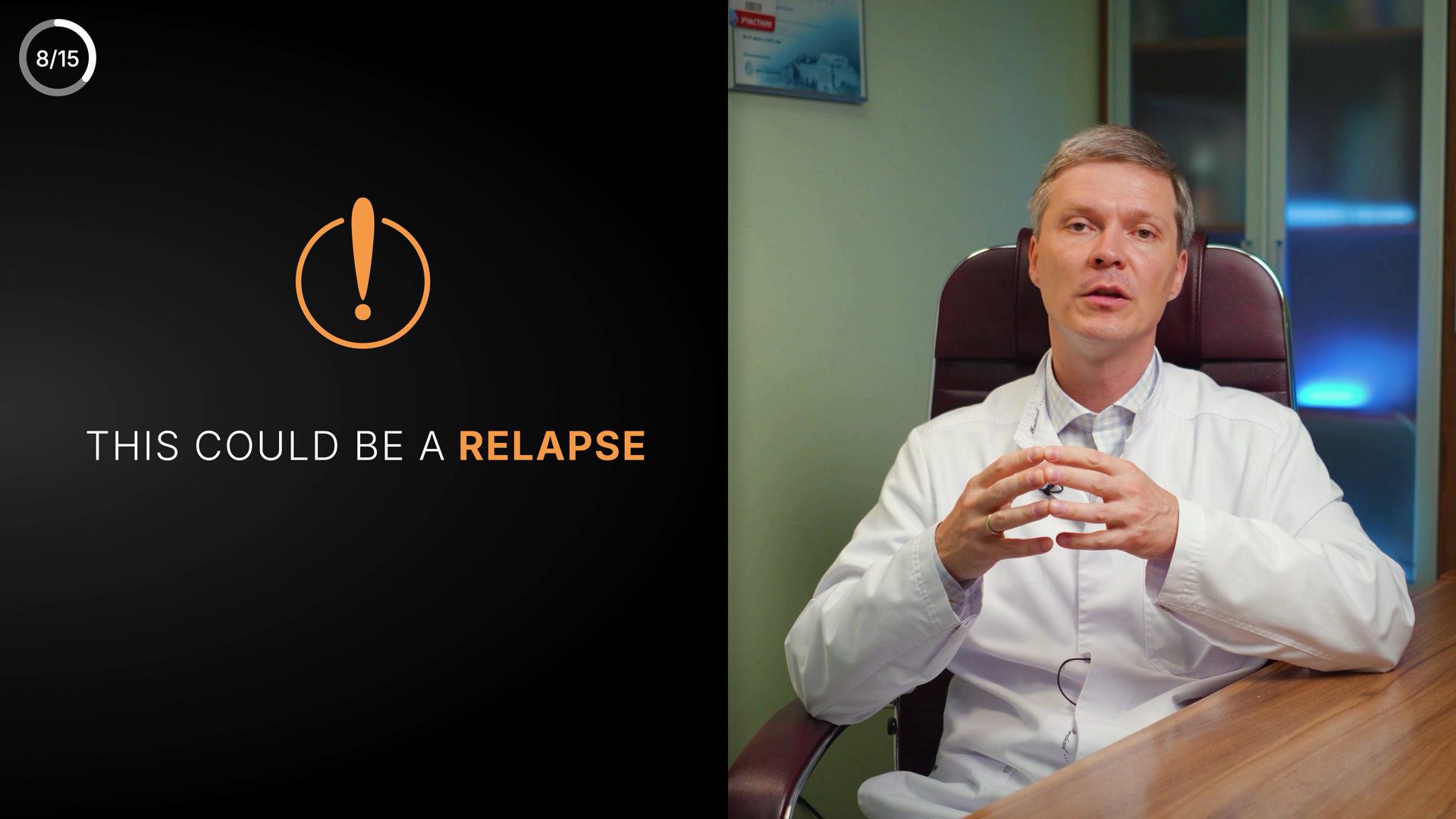
THIS COULD BE A RELAPSE
25🟢 Clean
Warning lower-third "THIS COULD BE A RELAPSE" with amber alert icon — clean, matches VO and canon.
TextcleanVerbatim 'THIS COULD BE A RELAPSE' confirmed on zoomed crop. All English, no Cyrillic leftover. 'RELAPSE' spelled correctly. No typo, spacing, or punctuation issues. Caps treatment consistent.
MeaningcleanMatches VO ('...the beginning of a relapse... see a doctor immediately, preferably an MS specialist') and canon (relapse = symptom >24h -> MS specialist immediately). Amber warning icon + amber 'RELAPSE' correctly signal urgency per colour rule (warn=amber, not calm-green). No contradiction, no third-party caption.
VisualcleanSplit layout: text left over dark radial gradient, doctor right. White body + bold amber keyword gives clear hierarchy with exclamation-in-circle icon stacked above. Strong contrast, fully legible, well clear of subject's face and edges. Amber matches azure-skin warn token. Minor nit only: left text band sits a touch low and the empty upper-left feels slightly hollow, but composition is balanced and on-DNA. 8/15 corner counter present (not flagged).

SEE AN MS SPECIALIST
IMMEDIATELY
26🟡 Polish
Urgent CTA "SEE AN MS SPECIALIST / IMMEDIATELY" — text & meaning clean; only flag is incidental Cyrillic wall certificate in background footage.
TextcleanGraphic layer text is flawless: 'SEE AN MS SPECIALIST' (white) + 'IMMEDIATELY' (pink). Correct spelling, all-caps, no typos, no punctuation issues, no Cyrillic in the overlay text. 'MS' correctly uppercase.
MeaningcleanMatches VO exactly ('see a doctor immediately, preferably an MS specialist') and canon (relapse >24h -> MS specialist immediately). Urgency word 'IMMEDIATELY' rendered in danger pink #E0607A and paired with a red alert/siren icon — colour correctly reinforces urgency per the rule (no calm-green on an urgent message). No mislabel, no wrong number.
VisualpolishEstablished split layout: left near-black panel with centered siren icon + two centered lines, right half live doctor. Good contrast, text well inside safe zone, hierarchy clear (white headline -> pink emphasis). Two nitpicks: (1) the left text block sits fairly low/centered with a large empty upper-left void — icon-to-text gap is generous; tightening vertical rhythm would feel more intentional. (2) In the original 2023 Russian footage (top-left of doctor frame) a framed wall certificate shows a red 'УЧАСТНИК' badge + soft Cyrillic — incidental, soft-focus set dressing (NOT an added overlay/watermark), but slightly legible; consider a light blur/reframe since this is an English re-version. Not a third-party-logo violation, hence not an error.
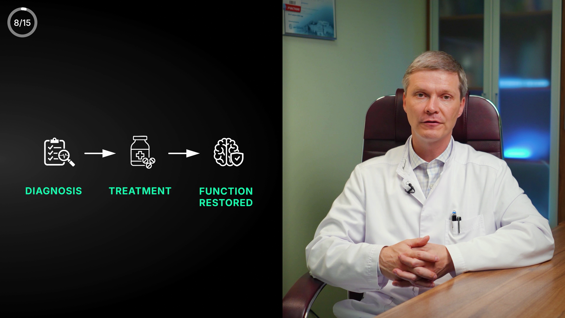
8/15
DIAGNOSIS
TREATMENT
FUNCTION RESTORED
27🟡 Polish
Three-step recovery flow (Diagnosis→Treatment→Function Restored) — clean, matches VO and canon; minor dead space above diagram
TextcleanAll English, correct spelling, no Cyrillic. DIAGNOSIS / TREATMENT / FUNCTION RESTORED all-caps, no typos, no grammar/punctuation issues.
MeaningcleanMatches VO & canon. VO is about treating relapse to restore impaired function fast; flow Diagnosis→Treatment→Function Restored mirrors canon (new lesion→treat fast→function restored). Icons (clipboard+magnifier / pill bottle+pills / brain+shield) fit each step. Green=positive/recovery is the correct colour for a restored-function outcome; no colour-vs-meaning conflict.
VisualpolishWell-balanced horizontal 3-step flow on the left panel; consistent line-weight icons, clean arrows, strong contrast (white icons + green labels on dark bg), legible, safe-zone OK (left of split, not on doctor's face). Nitpick: noticeable empty black band above the diagram — the whole flow could sit slightly higher/larger to fill the left panel better, and labels sit a bit low under icons. Permanent 8/15 corner counter fine. Polish-only, ships.

REMISSION
28🟡 Polish
Single-word chapter card "REMISSION" in good-green — correct English, matches VO and canon; only minor sparseness.
Textclean"REMISSION" — correct English spelling, all caps, no typo/grammar/punctuation issue, no Cyrillic leftover.
MeaningcleanMatches VO (introduces remission as second phase of relapsing-remitting course) and canon (Remission = well / no new symptoms). Green color = good/recovery is the correct color-meaning pairing for the positive phase; no contradiction.
VisualpolishCentered word, legible, high contrast, on-brand green. Deliberate minimal chapter-card reveal but sits small in a large empty black frame with no supporting sub-label/hierarchy — feels sparse vs RYA-DNA standard. Color is good-green rather than azure/lime heading palette, justified by meaning. Could be richer but ships.
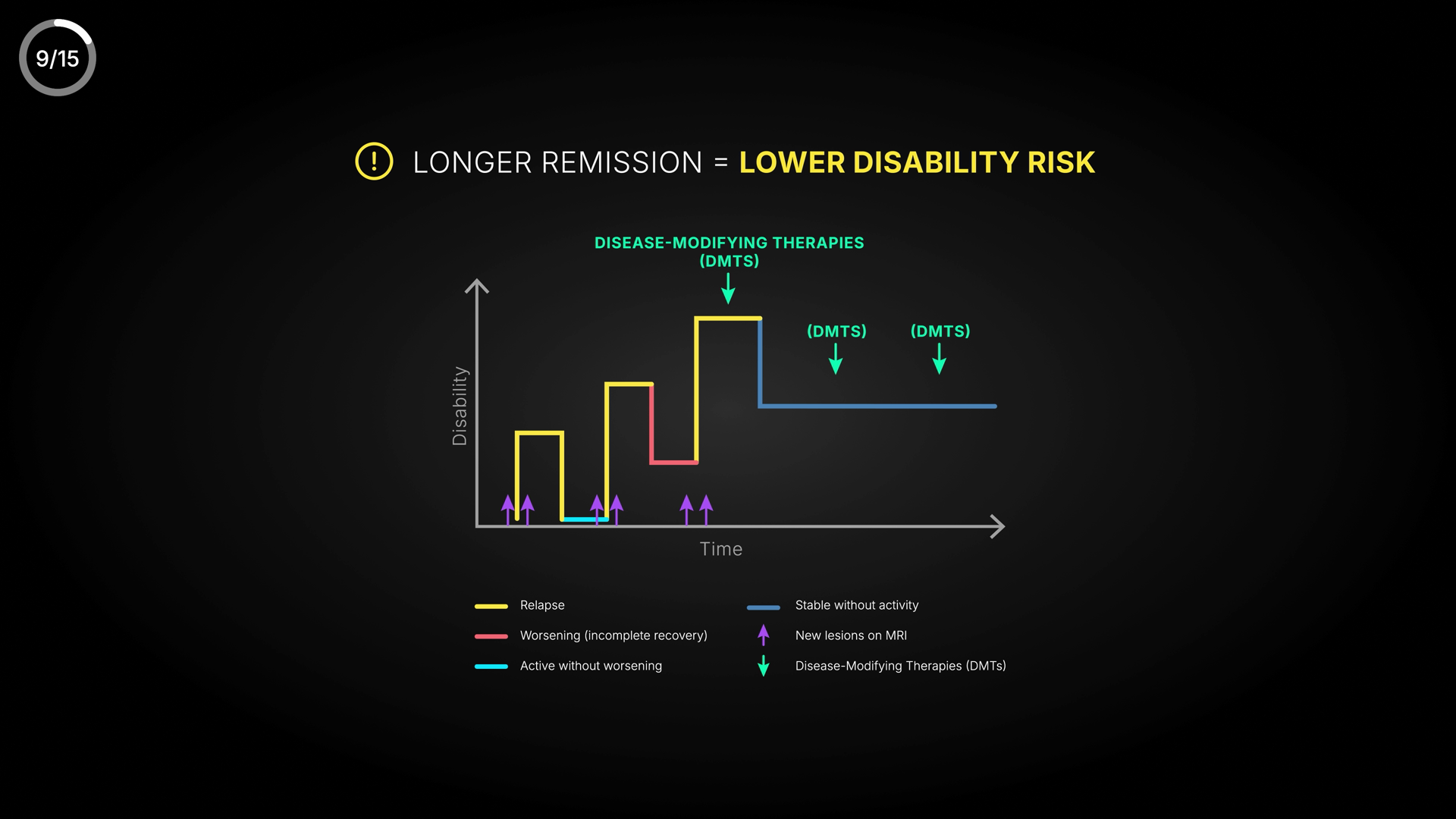
9/15
(!) LONGER REMISSION = LOWER DISABILITY RISK
DISEASE-MODIFYING THERAPIES (DMTS)
(DMTS)
(DMTS)
Disability
Time
Relapse
Worsening (incomplete recovery)
Active without worsening
Stable without activity
New lesions on MRI
Disease-Modifying Therapies (DMTs)
29🔴 Error
DMTs step-graph correctly maps remission→lower disability, but the acronym is mis-cased "(DMTS)" in 3 places vs the correct "(DMTs)" in the legend.
TexterrorAcronym casing error + internal inconsistency: the large green title 'DISEASE-MODIFYING THERAPIES (DMTS)' and both inline arrow labels read '(DMTS)' (all-caps S), while the legend correctly spells it 'Disease-Modifying Therapies (DMTs)' (lowercase plural s). Canonical form is DMTs — the 's' is a plural suffix, not part of the abbreviation. Three instances are wrong and contradict the legend on the same screen. Everything else spelled correctly; no Cyrillic; legend grammar/hyphenation clean ('Disease-Modifying', 'incomplete recovery').
MeaningcleanMatches VO and canon. Step-graph: yellow Relapse spikes + red 'Worsening (incomplete recovery)' raise the Disability/Time curve; purple up-arrows = 'New lesions on MRI' (relapse triggers). After green down-arrows ('DMTs') the curve drops/flattens to blue 'Stable without activity' / cyan 'Active without worsening' — i.e. therapy extends remission and lowers disability. Directly supports VO ('the longer we maintain it, the lower the chance of a disabling complication') and canon 'longer remission = lower disability risk; extend with DMTs'. Colour logic correct: green = positive intervention (good), red/amber = worsening, no calm-green-on-danger conflict. No un-blurred third-party captions.
VisualpolishComposition is reasonable and on-DNA (azure bg, lime headline accent, Space-Grotesk-style heading). Step-graph is the focal element, axis labels 'Disability'/'Time' legible. Issues: (1) the title 'DISEASE-MODIFYING THERAPIES (DMTS)' is redundant with the legend entry that fully respells it — duplicate text adds clutter; (2) the two right-side floating '(DMTS)' labels sit in fairly empty space and feel under-anchored relative to their tiny arrows; (3) overall content is somewhat small/centred with generous black margins. Legend two-column layout is tidy. No safe-zone or face-overlap problems. Not mid-animation — full static reveal.
WHY RELAPSES HAPPEN
30🟡 Polish
Centered section-title card "WHY RELAPSES HAPPEN" — clean, on-message intro to the autoimmune/relapse explanation; only nit is heavy emptiness around small lockup.
TextcleanAll English, no Cyrillic. Spelling/grammar/caps correct: WHY RELAPSES HAPPEN, all-caps consistent, no stray punctuation or spacing issues. No medical term to misspell here.
MeaningcleanMatches VO exactly — VO is opening the explanation of why relapses occur (immune system becomes activated, autoimmunity). Title is a neutral section header, no claim to contradict canon. Green accent on RELAPSES is a touch off the colour rule (relapse = warning/urgent, not good/recovery), but it reads as a neutral brand-accent highlight on a heading, not a meaning-bearing status indicator, so not an error.
VisualpolishStrong central composition, well within safe zone, clear three-tone hierarchy (white WHY / azure-green RELAPSES / grey HAPPEN) reads instantly. Soft radial vignette adds depth. Demanding-AD nits: the lockup is fairly small and floats in a large black field — could scale up ~15-20% for a more confident title-card presence; HAPPEN in mid-grey sits low in contrast against the dark bg vs the bright WHY, mildly uneven weight across the three words. Accent on RELAPSES is azure-green rather than the pure azure #4EA8DE / lime #D4E44B from the skin — acceptable but slightly off-palette. Overall polished and on-DNA.
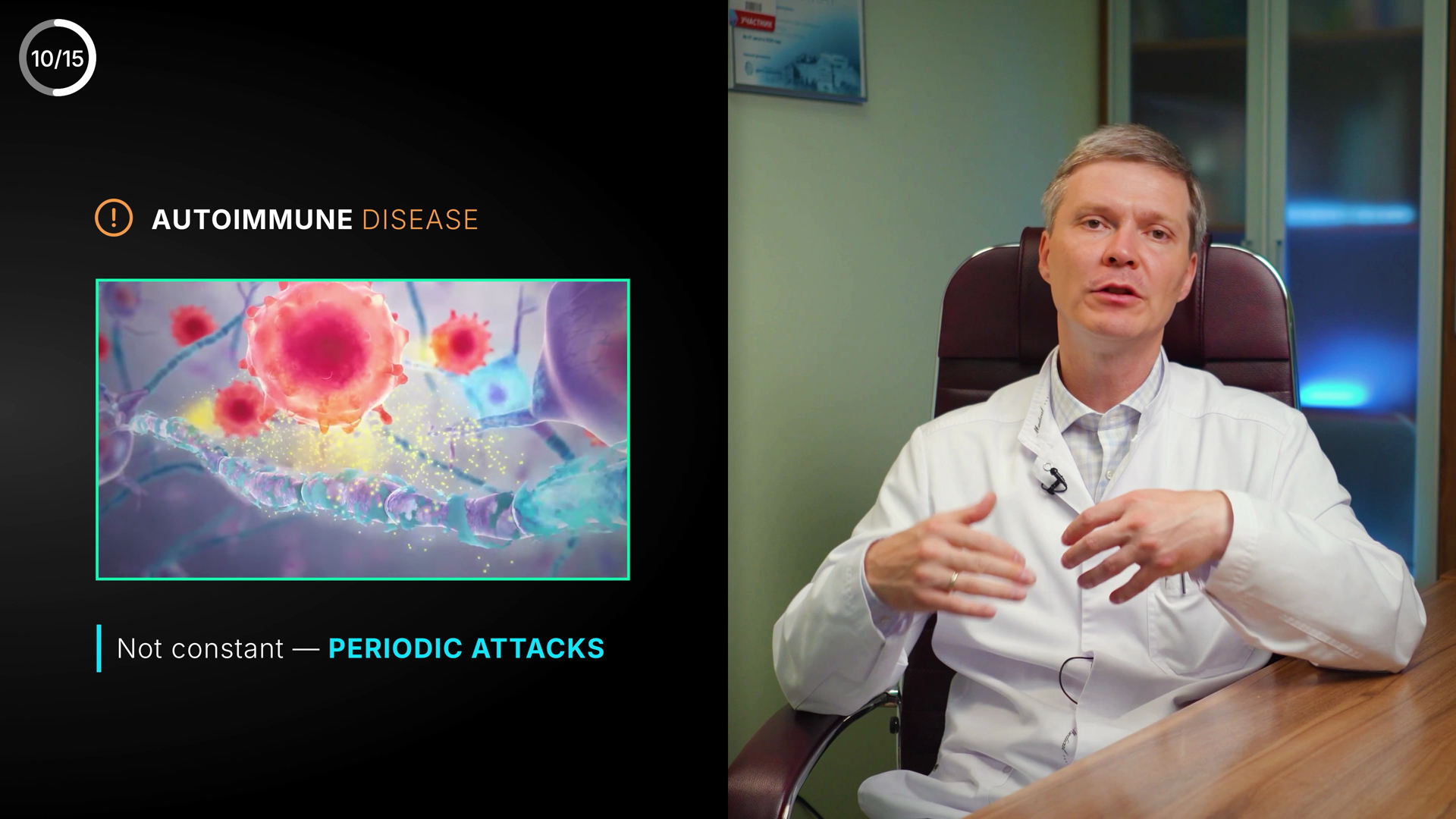
10/15
(!) AUTOIMMUNE DISEASE
Not constant — PERIODIC ATTACKS
31🟢 Clean
Autoimmune-cause card (warning icon + immune-cell B-roll + "PERIODIC ATTACKS") — clean, matches VO and MS canon.
TextcleanAUTOIMMUNE DISEASE and PERIODIC ATTACKS both spelled correctly; proper spaced em-dash in 'Not constant — PERIODIC ATTACKS'. No typos, no capitalization/punctuation issues, no Cyrillic leftover.
MeaningcleanVO: 'A sudden immune activation begins. Immune cells enter the brain...' On-screen 'AUTOIMMUNE DISEASE' + 'Not constant — PERIODIC ATTACKS' matches autoimmune-cause and relapsing-remitting (periodic) canon. Amber (!) warning icon is correct danger/warning colour, not a recovery-green context. B-roll = immune cells attacking neuron/myelin, on-message, no logos/watermarks/captions. Sweep-read 'Immune Cell' label is NOT actually present as on-screen text — no error.
VisualcleanSolid RYA-DNA layout: left dark panel with white+amber warning header, centered azure-bordered medical B-roll, lime accent bar + caption below. Clear hierarchy, legible contrast, doctor on right with no text on his face, all in safe zone. Slightly text-light upper-left with empty black above the header, but reads as intentional breathing room, not a flaw. 10/15 counter = permanent channel counter, not an issue.
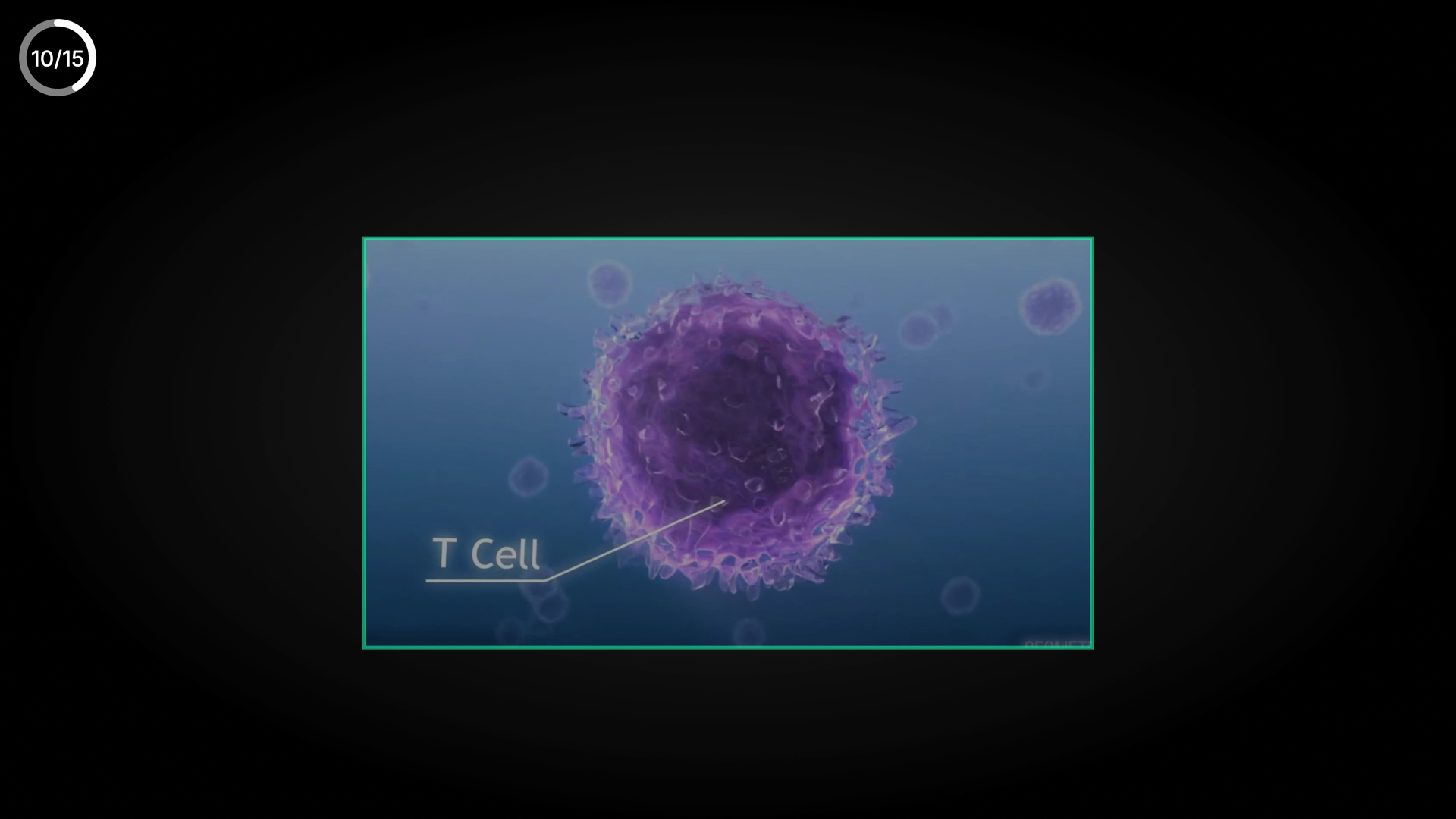
10/15
T Cell
32🟡 Polish
Embedded T-cell render labeled "T Cell" with leader line; clean and on-message, but the clip sits small inside a large black frame.
TextcleanOnly text is the permanent 10/15 corner counter (never flagged) and the label "T Cell". Spelling/grammar correct, English, no Cyrillic. "T Cell" is title-cased; biology house style usually writes "T cell" (lowercase c), but as a graphic call-out label the capital C is acceptable styling, not an error.
MeaningcleanVO at 6:44 describes immune cells entering the brain and forming new lesions; labeling the autoimmune effector cell as a T cell matches both the VO ("immune cells") and MS canon (autoimmune, immune cells enter brain → lesions). Color is neutral/informational (not green-good or red-danger), appropriate for an explanatory cell-anatomy label. No mislabel, no wrong number, no un-blurred third-party caption visible in the embedded clip's corners.
VisualpolishThe embedded T-cell clip is framed with a thin azure/teal border (on-brand) and the "T Cell" leader-line call-out is clean and legible (white on lighter blue, adequate contrast, sits inside safe zone, not on a face). Weakness: the clip is a modest rectangle floating in a very large expanse of black, so the composition reads under-filled and the subject is smaller than it could be. Tightening the frame / scaling the clip up would improve presence vs the RYA-DNA standard. The leader line correctly targets the cell. Not mid-animation.
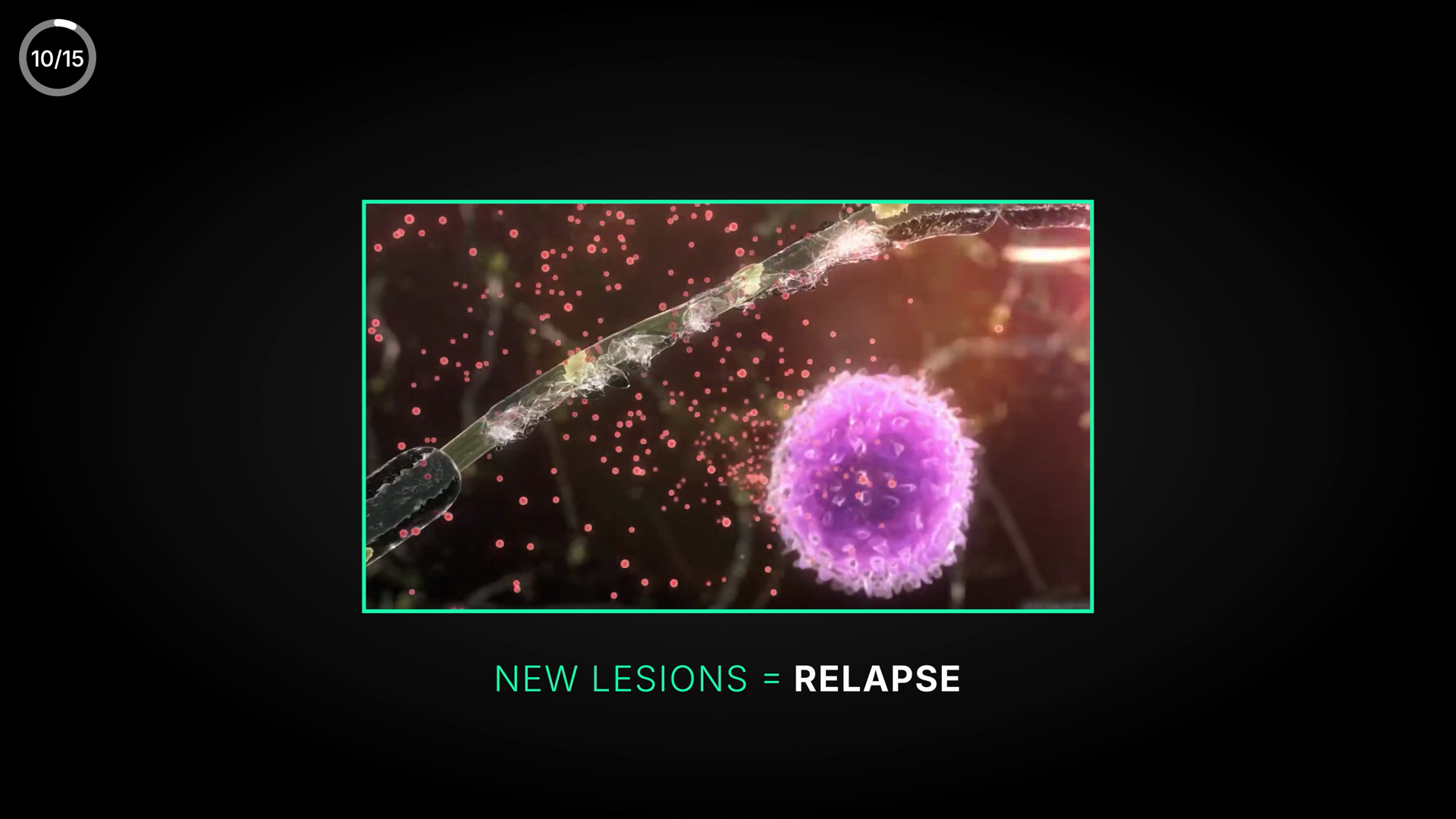
NEW LESIONS = RELAPSE
33🟡 Polish
Lesions=relapse equation matches VO/canon; only flag is recovery-green used on a warning concept.
TextcleanAll English, no Cyrillic leftover. "LESIONS" and "RELAPSE" spelled correctly; grammar/punctuation/spacing clean. The = sign is rendered with proper spacing. 10/15 corner counter is the permanent channel counter (not flagged).
MeaningconsiderText matches VO ("lesions, that's what a relapse is... relapse is inflammation within the CNS") and canon (Cause: new lesions = relapse). B-roll = 3D nerve fiber + immune cell with red lesion dots, consistent with autoimmune lesion formation; no third-party logos/watermarks/captions. COLOUR NOTE: "NEW LESIONS" is shown in good-green (#4ADE80) while a relapse is a danger/warning concept — green used here as a generic accent fights the green=good/recovery rule. Consider warn/amber or danger for the lesion/relapse term. Not a factual error.
VisualcleanBalanced composition: azure-framed B-roll panel centered, caption beneath. Strong hierarchy (green keyword + white emphasis on RELAPSE). Legible, good contrast, well within safe zone, not lost in black. Matches YTMSEN azure DNA. Fully revealed, not mid-animation.
RELAPSE = INFLAMMATION
34🟡 Polish
Correct, on-VO equation "RELAPSE = INFLAMMATION" — only concern is the danger concept rendered in good-green and a sparse, generic layout.
TextcleanBoth words correct, no typos; INFLAMMATION spelled correctly with the double-M. All English, no Cyrillic leftover. Caps + spacing around the equals sign are consistent.
MeaningconsiderEquation matches VO ('a relapse is essentially inflammation within the CNS') and canon (relapse = inflammation in CNS) exactly. Caveat: INFLAMMATION is set in the lime/green-teal family, but per the color rule green=good/positive/recovery while a relapse/inflammation is the negative danger event — color slightly fights meaning. Reads as a generic accent rather than the skin's azure; consider azure/indigo or warn-amber instead of green for the danger concept.
VisualpolishSingle centered line, legible, high contrast, well inside safe zone, balanced — but lost in a large empty black vignette: small relative to frame, no hierarchy, no azure accent, no label chip or other RYA-DNA skin elements. Reads like a plain keyword/lower-third card rather than a designed screen. Accent color is green rather than the YTMSEN azure (#4EA8DE) accent. Not mid-animation — it's a complete reveal. Polish: scale up / add skin framing and switch accent off generic green.
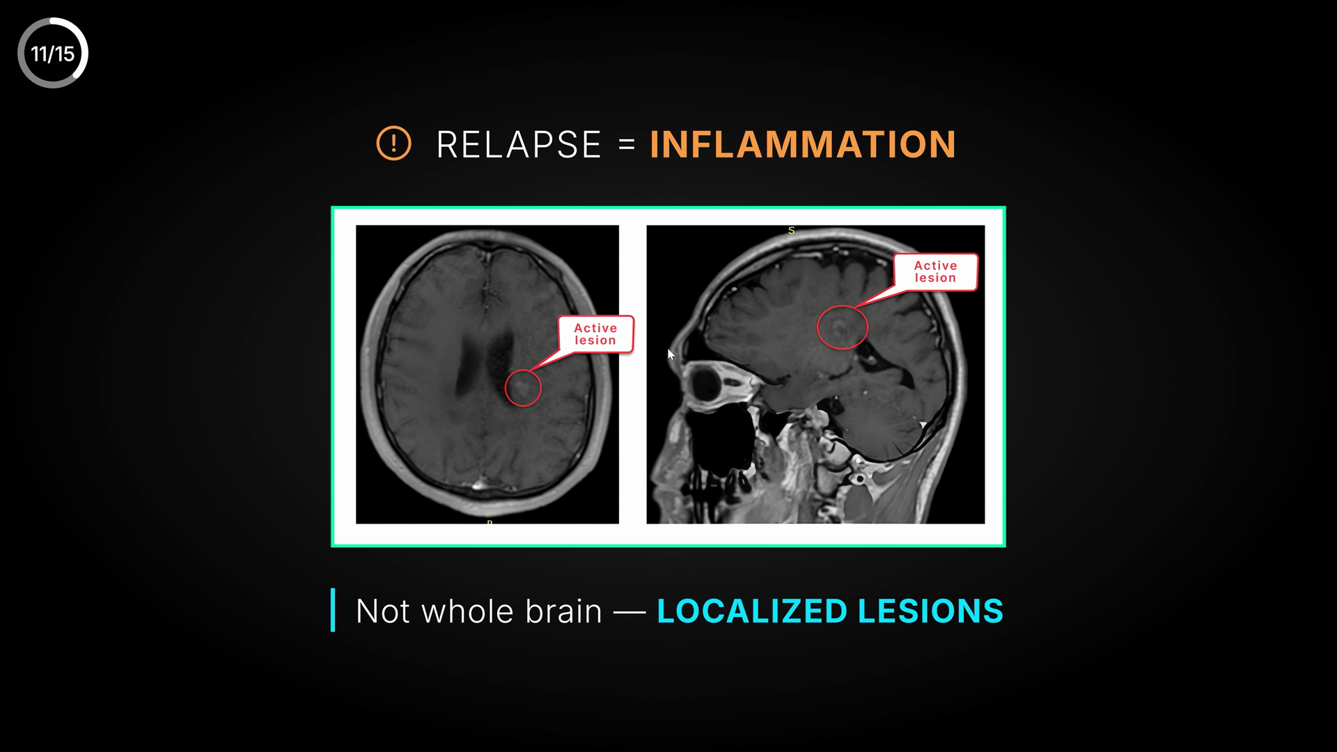
RELAPSE = INFLAMMATION
Active lesion
Active lesion
Not whole brain — LOCALIZED LESIONS
35🟢 Clean
Relapse=inflammation MRI screen is factually correct, but a stray OS mouse-cursor arrow is visible inside the right (sagittal) MRI image.
TextcleanAll English, no Cyrillic. Spelling correct: RELAPSE, INFLAMMATION, 'Active lesion' (x2), 'Not whole brain — LOCALIZED LESIONS'. Em-dash used correctly with spaces. No typos or capitalization issues.
MeaningcleanMatches VO/canon (relapse = CNS inflammation, localized lesions). Amber ‘INFLAMMATION’ + red lesion markers are correct warning colours.
VisualcleanTwo MRI scans with red ‘Active lesion’ callouts. The ‘stray cursor’ the analyzer saw is the callout leader-line/marker, not an OS cursor. Composition is balanced and on-DNA. Clean.

LESIONS ACCUMULATE CONTRAST
36🟡 Polish
"LESIONS ACCUMULATE CONTRAST" — matches VO and canon exactly; clean, minor polish only.
TextcleanSpelling, grammar, capitalization all correct. 'LESIONS ACCUMULATE CONTRAST' — no typo, no Cyrillic leftover, no punctuation/spacing issue. Two-word emphasis split (white LESIONS / amber ACCUMULATE CONTRAST) is clean.
MeaningcleanMatches VO ('these lesions begin to accumulate contrast agent') and medical canon ('lesions ACCUMULATE CONTRAST') exactly. Amber/warn color is defensible: the statement describes active inflammation/relapse (the concerning state), not a calm fact, so warn-amber does not fight meaning. No mislabel, no wrong number, no third-party caption.
VisualpolishSplit template (near-black panel left, doctor right) is consistent. Text is high-contrast and legible, left-of-center, clear of the doctor's face — no safe-zone issue. Hierarchy reads icon -> headline. Two minor polish notes: (1) large empty black above/around the icon leaves the panel a touch under-filled; (2) the generic exclamation-in-circle warning icon is less refined than the azure-DNA medical-iconography standard (Space Grotesk/Orbitron heading look is present and on-brand). Color sits in canon warn-amber, not the azure/indigo accent — consistent with a 'warning/active-disease' beat.

MRI WITH CONTRAST
37🟡 Polish
Clean minimal title card "MRI WITH CONTRAST" — matches VO & canon; only nit is accent reads green-teal vs DNA azure.
TextcleanNo text issues. 'MRI WITH CONTRAST' spelled and capitalized correctly, all English, no Cyrillic leftover, no typo/punctuation/spacing problems.
MeaningcleanMatches VO ('That's why we do MRI with contrast...') and medical canon exactly (canon term: 'MRI WITH CONTRAST'). Accent color does not fight meaning here.
VisualpolishCentered, legible white-on-dark with radial vignette, consistent with azure skin minimal title style. Two nits: (1) the 'MRI' accent reads green-teal (~good #4ADE80) rather than DNA accent azure #4EA8DE — slightly off-palette though not meaning-breaking; (2) lockup is a touch small inside a large empty black field, could scale up ~10-15% for stronger presence. Lime label color (#D4E44B) not used; fine for a title card.
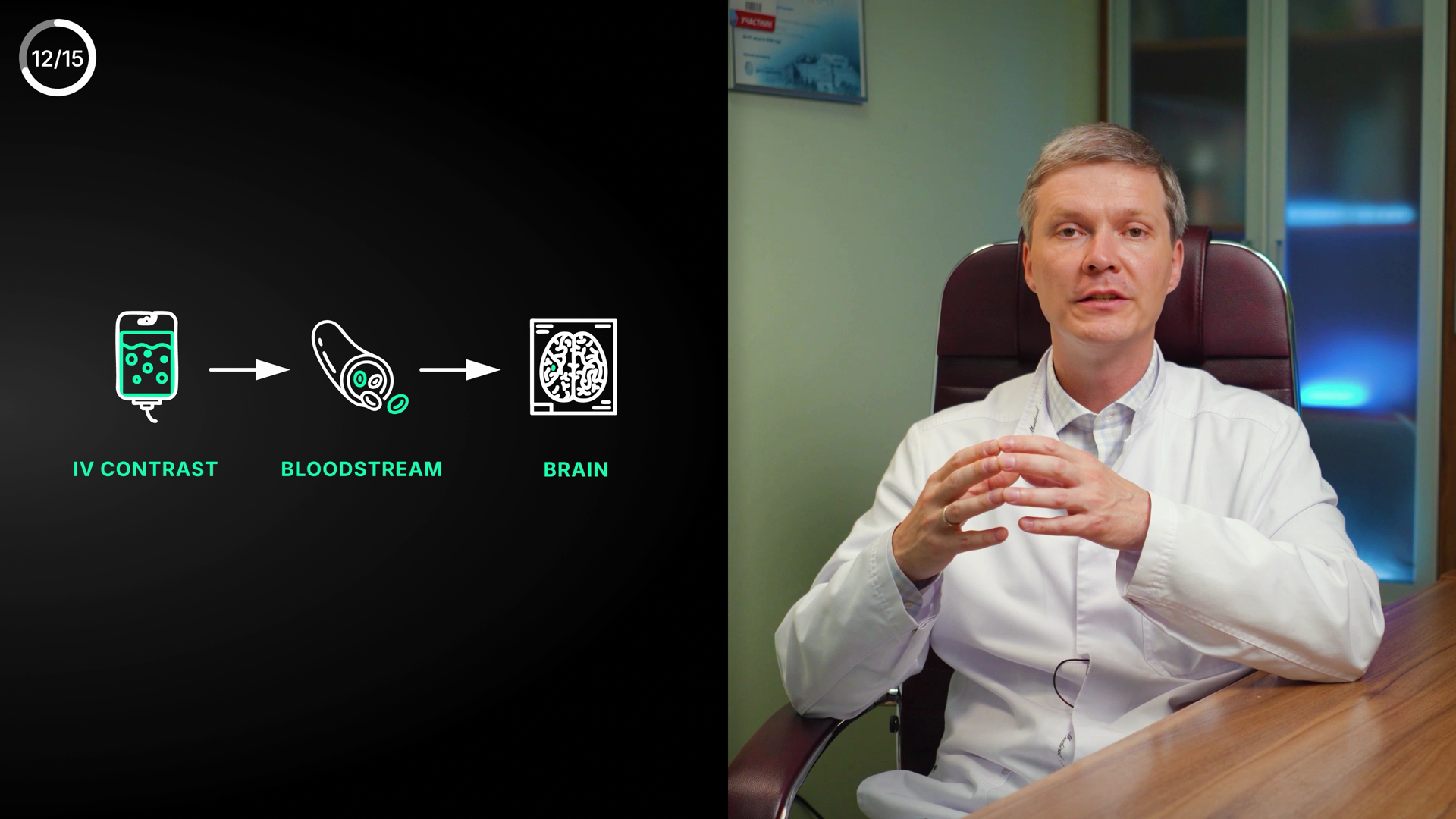
12/15
IV CONTRAST
BLOODSTREAM
BRAIN
38🟡 Polish
Clean English 3-step flow (IV contrast → bloodstream → brain); labels use good-green, a color-vs-meaning + off-DNA-palette nit.
TextcleanAll English, no Cyrillic. 'IV CONTRAST', 'BLOODSTREAM', 'BRAIN' correctly spelled, all-caps, evenly spaced. No typos/grammar/punctuation issues.
MeaningconsiderDiagram (IV contrast → bloodstream → brain) correctly supports the MRI-with-contrast/BBB narrative; slightly upstream of the exact VO sentence (BBB impermeability) but same explanatory beat — defensible, no factual error. Concern: labels are the 'good/recovery' green (~RGB 74,222,128). Per COLOUR RULE green=good/positive, yet the depicted event — contrast entering the brain — is the pathological process (contrast crossing a broken BBB into a lesion). Soft color-vs-meaning tension; green could also read as neutral diagram accent, so consider not error. Icons match labels: IV bag, red blood cells, brain-in-skull. No un-blurred 3rd-party content.
VisualpolishBalanced left-diagram / right-doctor split; icons clean and legible, labels well-aligned and evenly spaced under each step, good contrast on black. Not lost in empty space, sized adequately. No safe-zone issue. Polish: label green (~#4ADE80) is the DNA 'good' token, off-spec for diagram labels — DNA calls for lime #D4E44B labels or azure/indigo #4EA8DE/#8B7FF0 accent. Recommend retint labels to lime/azure to stay on-palette and avoid the good-green reading on a neutral/pathological pathway. Permanent 12/15 counter fine (not flagged).
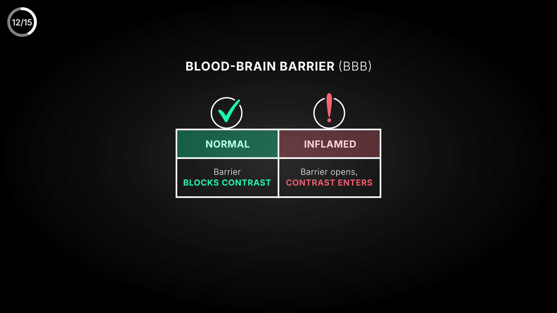
BLOOD-BRAIN BARRIER (BBB)
NORMAL
INFLAMED
Barrier BLOCKS CONTRAST
Barrier opens, CONTRAST ENTERS
39🟡 Polish
BBB normal-vs-inflamed contrast table — accurate, on-message, well-built; only a faint composition imbalance (table sits high, lower third empty).
TextcleanNo spelling/typo/grammar issues. 'BLOOD-BRAIN BARRIER' correctly hyphenated; '(BBB)' abbreviation correct. Comma after 'Barrier opens,' is correct. All-caps emphasis consistent. No Cyrillic leftover. Medical term spelling correct.
MeaningcleanMatches VO ('permeable, substances rush in including contrast') and canon exactly: BBB normally BLOCKS contrast (NORMAL); inflamed BBB OPENS and CONTRAST ENTERS the lesion. Colour rule correct — NORMAL = green/check (intact, healthy), INFLAMED = red/exclamation (warning/relapse). No mislabel, no number error, no third-party caption/logo.
VisualpolishClean two-column comparison with strong hierarchy: icons → colored headers → body lines. Green-vs-red coding reads instantly and is DNA-aligned (good #4ADE80 / danger rose). Legibility good at hi-res. One nit: the whole composition (title + icons + table) sits in the upper ~65% and the lower third is empty black, leaving it slightly top-heavy/floating; nudging the block down or adding breathing room would balance the frame. Header reds skew slightly muted vs full danger #E0607A but stay on-brand. Static, not mid-animation.
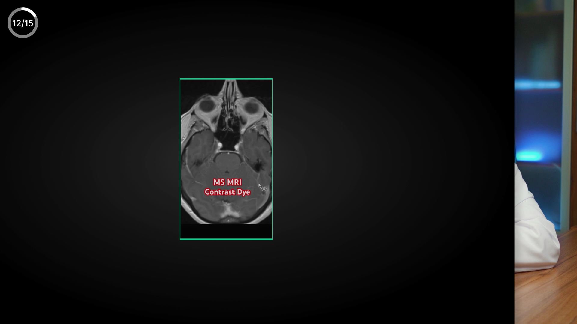
12/15
MS MRI
Contrast Dye
40🟠 Visual fix
Contrast-MRI label matches VO/canon, but a stray screen-recording mouse cursor sits next to "MS MRI" and the panel floats in dead black space.
Textclean"MS MRI" and "Contrast Dye" are correctly spelled English, proper capitalization, no Cyrillic leftover. "Contrast Dye" is a colloquial but acceptable label for the gadolinium agent — not a typo or medical-spelling error.
MeaningcleanVO describes a new lesion enhancing/penetrated by contrast and requiring treatment; canon says relapse = MRI WITH CONTRAST, lesions accumulate contrast. Label "MS MRI / Contrast Dye" matches both. No wrong number/range, no contradiction. Red label here is descriptive text on a grayscale scan, not a good/bad semantic signal, so the colour rule is not violated.
VisualweakThe contrast-MRI scan floats small/portrait in a big black field and the red ‘MS MRI / Contrast Dye’ text sits low-contrast ON the scan — enlarge & lift the label off the image. (The analyzer also suspected a stray screen-rec cursor near the label — I can’t confirm it; eyeball at full res to be safe.)
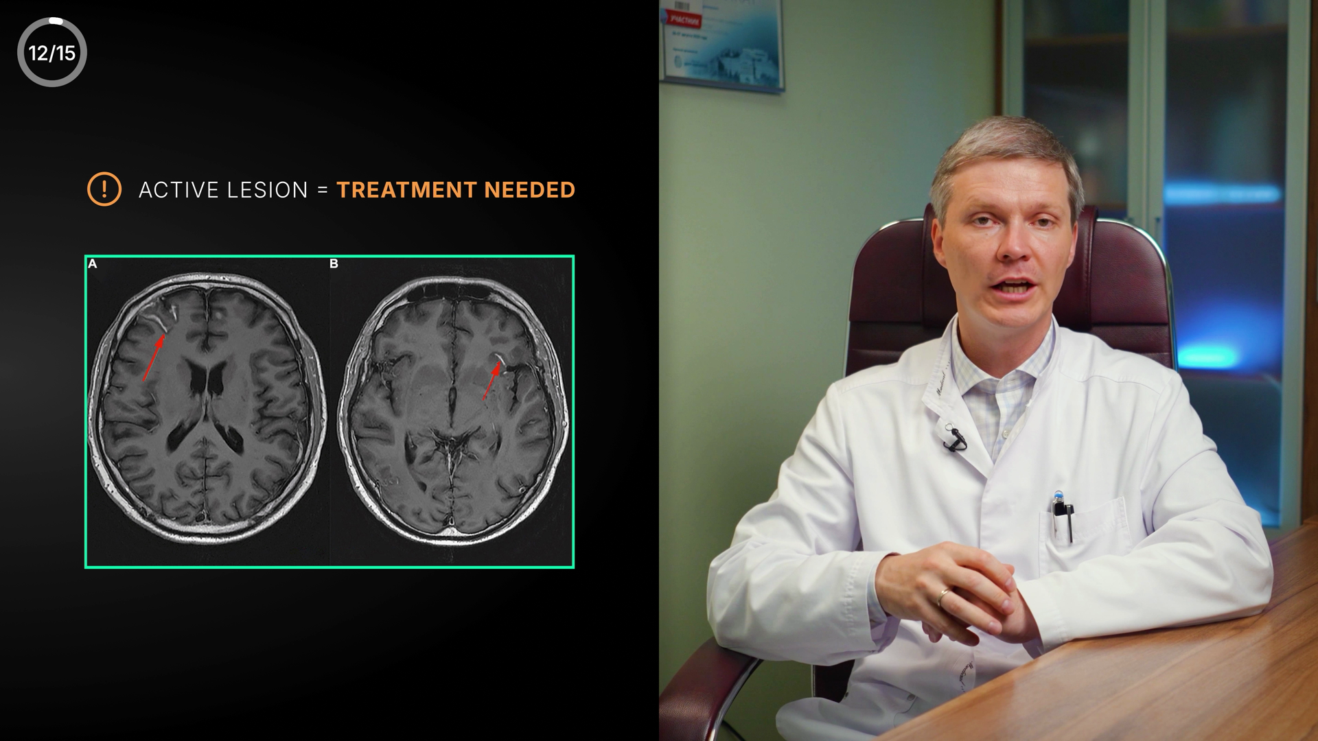
12/15
(!) ACTIVE LESION = TREATMENT NEEDED
A
B
41🟡 Polish
Active-lesion MRI screen (two contrast T1 scans A/B with red arrows) + amber "ACTIVE LESION = TREATMENT NEEDED" — clean text/meaning; only nit is the green frame around a warning-state image.
TextcleanAll English, correct spelling and grammar: 'ACTIVE LESION = TREATMENT NEEDED'. Panel labels A / B clean. No Cyrillic leftover, no typos, proper caps. Amber emphasis on TREATMENT NEEDED, white on ACTIVE LESION. Counter 12/15 is the permanent corner counter (not flagged).
MeaningconsiderMatches VO ('a new lesion forming in the brain... requires treatment') and canon: new lesion = treatment needed; contrast-enhanced T1 MRI showing two lesions with red arrows = active/enhancing lesions. Amber warning icon + amber text correctly signal urgency. ONE color nit: the frame around the MRI is lime/green, but green = good/recovery per the color rule, while this image depicts an active lesion = danger/warning state. The green frame mildly fights the warning meaning (reads more as a neutral image border than a status color, so low severity, but worth a glance). No third-party watermark/caption on the scans.
VisualcleanSplit-screen layout consistent with series: graphic on left half, doctor on right. Clear hierarchy — warning title up top, MRI panel below. A/B labels and red arrows legible at hi-res; arrows clearly point to the lesions. Title is well-sized and high-contrast amber/white on black. MRI box framed with a thin green border, A/B panels balanced. Doctor not occluded by graphics; text stays in left safe zone. Solid azure-DNA polish; not lost in black.
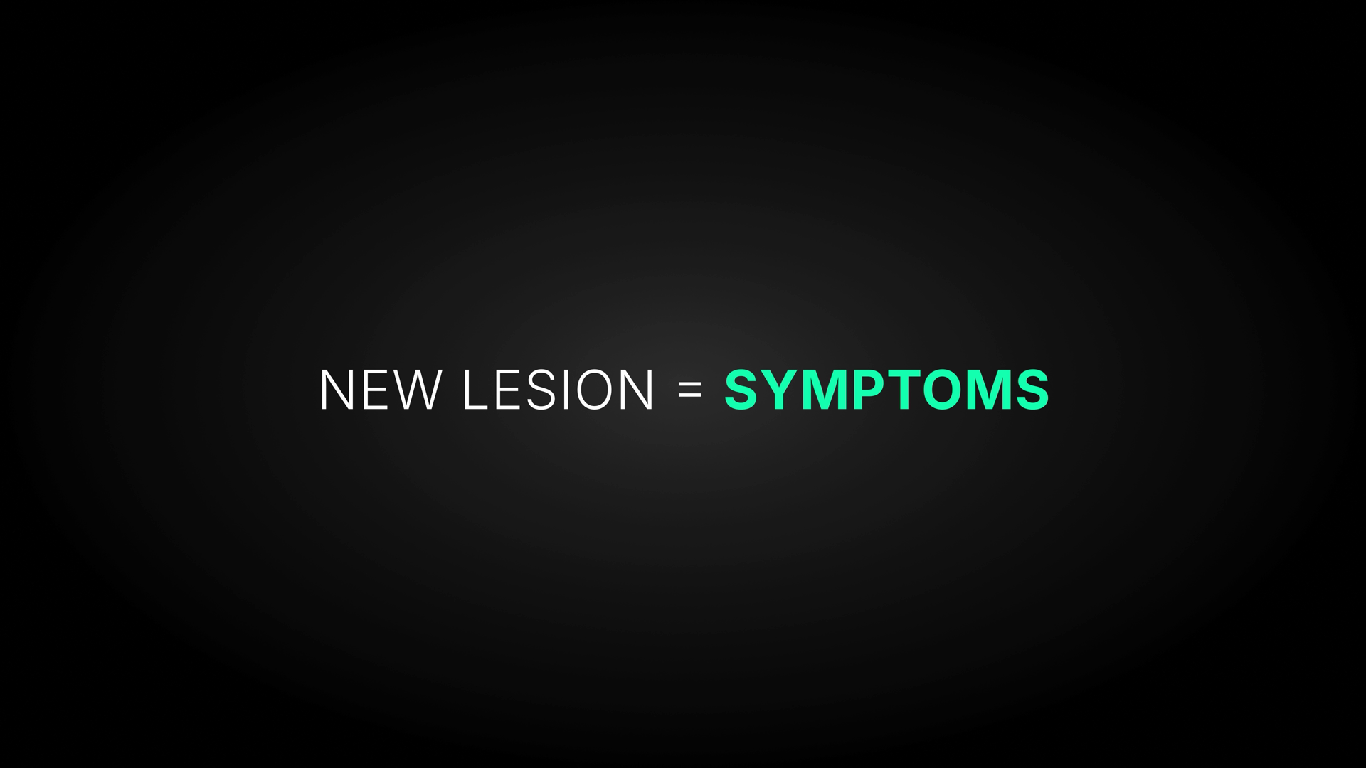
NEW LESION = SYMPTOMS
42🟡 Polish
Clean equation card matching VO/canon, but "SYMPTOMS" (a warning concept) is rendered in good-green, violating the channel colour rule.
TextcleanAll English, all-caps, no typos or Cyrillic. Correct spacing around '='. 'LESION' and 'SYMPTOMS' spelled correctly. Typography matches family. No text issues.
MeaningconsiderWording matches VO ('a new lesion ... carries certain manifestations') and canon ('new lesion = symptoms'). Factually correct. BUT colour-vs-meaning conflict: 'SYMPTOMS' is in good-green (#4ADE80, the recovery/positive colour), while a new lesion producing symptoms = a true-relapse warning state. Per the channel COLOUR RULE green=good, amber/red=warning/urgent — this should be warn-amber or danger, not recovery-green.
VisualpolishSingle centered line, legible, good contrast over the dark vignette, clean white-setup -> green-payoff hierarchy. Sits slightly above true center. Layout is sparse — one short line in a large black field with lots of empty space top/bottom; reads as a punchy reveal but is on the plain side vs RYA-DNA polish. No safe-zone or alignment problems.
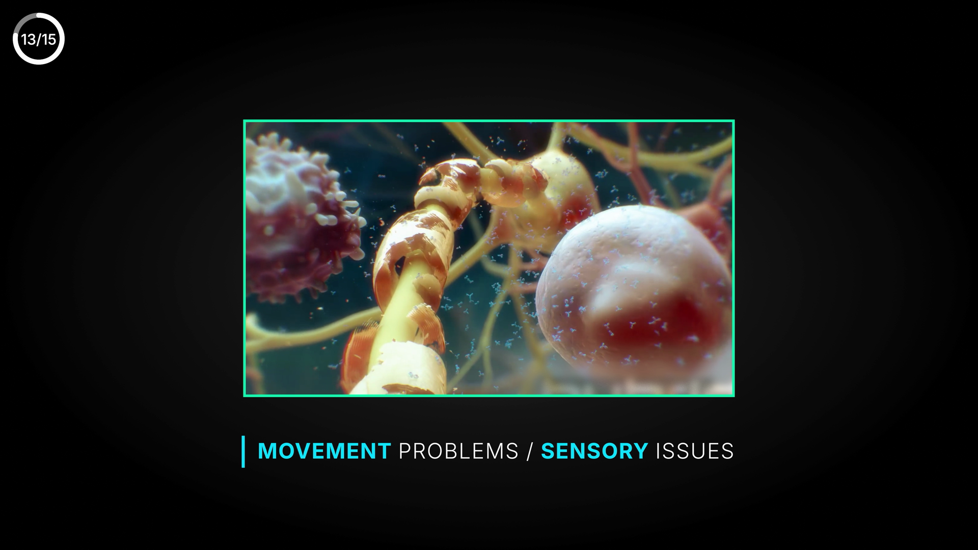
MOVEMENT PROBLEMS
SENSORY ISSUES
43🟢 Clean
Lower-third "MOVEMENT PROBLEMS / SENSORY ISSUES" over demyelinated-nerve render — matches VO and canon, clean.
TextcleanAll English, no Cyrillic leftover. Correct spelling, capitalization and grammar; slash separator properly spaced (space / space). No typos in the two label words MOVEMENT / SENSORY. No medical terms to misspell here.
MeaningcleanCaption pairs movement + sensory symptoms. VO at this moment names 'movement is restored' and 'sensory disturbances', and canon states a new lesion produces movement/sensory symptoms — caption matches both VO and canon. Azure emphasis is neutral/informational, no green-vs-red meaning conflict. Illustration of nerve/lesion is on-topic. No un-blurred third-party caption visible.
VisualcleanStandard YTMSEN layout: framed illustration (azure border) centered over near-black bg, lower-third caption with azure vertical accent bar. Hierarchy clear (key terms in azure, qualifiers in white). Legible size/contrast on dark ground, well inside safe zone, left-aligned to the image edge. Image not lost in empty black — fills upper two-thirds. Matches RYA-DNA. 13/15 corner counter is the permanent element, not an issue.
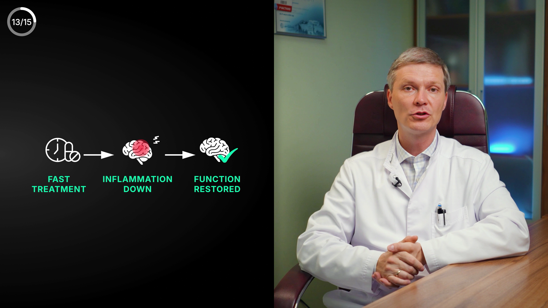
13/15
FAST TREATMENT → INFLAMMATION DOWN → FUNCTION RESTORED
44🟡 Polish
3-step recovery flow (fast treatment → inflammation down → function restored) — matches VO and canon, only minor composition float
TextcleanAll English, no Cyrillic. Spelling correct on all three labels incl. tricky INFLAMMATION (double-M, single-N) and RESTORED. No medical term spelled on screen here (methylprednisolone is VO-only, so no spelling exposure). Consistent ALL-CAPS, no typos/punctuation issues.
MeaningcleanOn-screen causal chain FAST TREATMENT → INFLAMMATION DOWN → FUNCTION RESTORED mirrors VO ('administer methylprednisolone, suppress the inflammation, lesion becomes inactive, function restored') and canon (treat fast → function restored, first-line methylprednisolone). Icon semantics are colour-correct: middle brain is red/inflamed with spark marks = active-lesion danger state; final brain has green checkmark = recovery. Green labels are defensible — whole flow is positive/recovery, and 'inflammation down' is itself a good outcome, so green does not fight meaning. No third-party caption/watermark on the graphic side. N/15 counter ignored as instructed.
VisualpolishHierarchy and legibility are good: large lime/emerald labels, clean white-line icons, clear left-to-right arrow flow, strong contrast on near-black. Color use is on-DNA (azure bg, emerald 'good' green ~RGB33,228,163, red inflamed brain). Main polish issue: the entire graphic (icons + labels) sits low and center-left, leaving roughly the top 40% of the left panel an empty black void — the composition floats low rather than being vertically centered/balanced in the panel. The three columns are evenly spaced and baseline-aligned. Not a transitional frame; fully revealed. Recommend nudging the whole flow up toward vertical center for better balance, but it ships fine as-is.
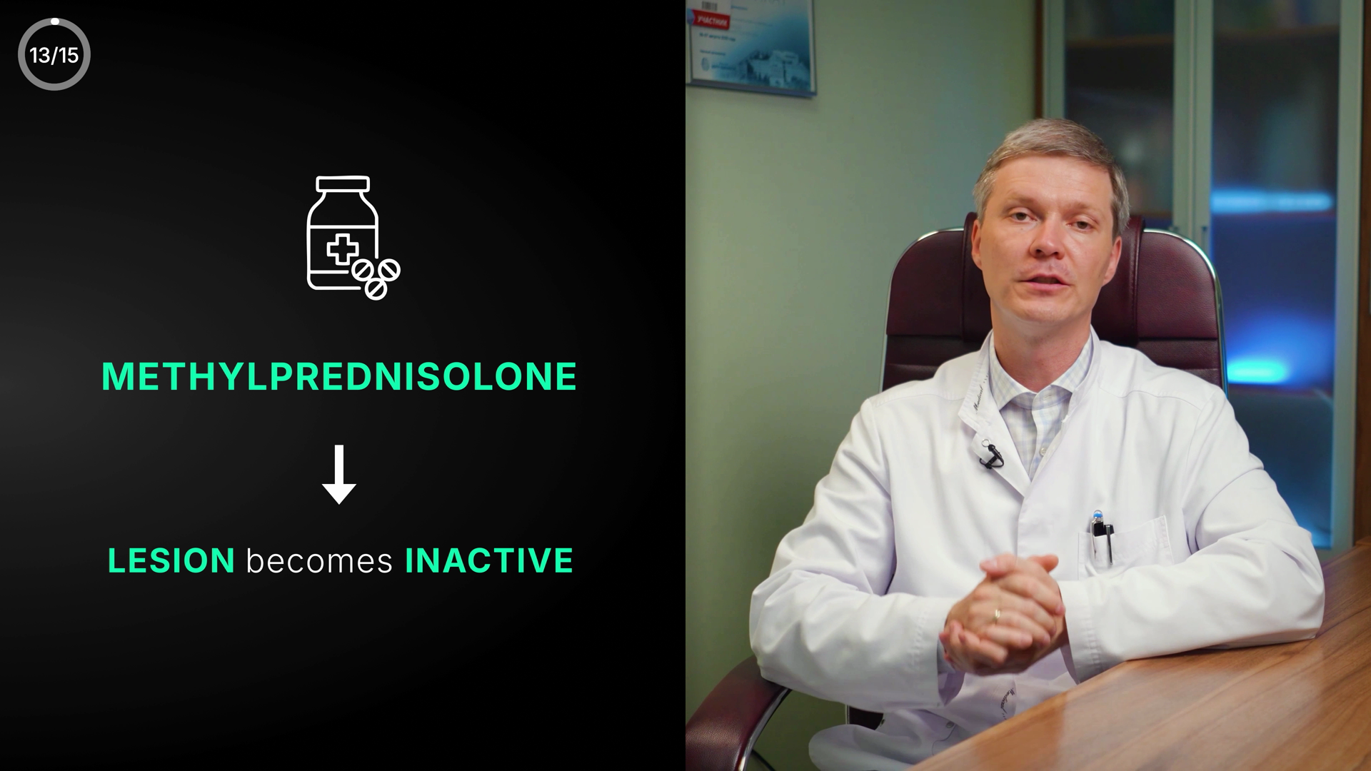
13/15
[pill-bottle icon]
METHYLPREDNISOLONE
↓
LESION becomes INACTIVE
45🟡 Polish
Treatment-outcome card is text- and canon-clean; only flag is an unblurred Cyrillic "УЧАСТНИК" certificate on the office wall behind the doctor.
TextcleanMETHYLPREDNISOLONE spelled exactly correct (verified at 2x: ...PREDNISOLONE, ends SOLONE). 'LESION becomes INACTIVE' correct; sentence-case 'becomes' is intentional lower-case connector. All-caps headings, no typo/punctuation/hyphen issues. No Cyrillic in the DESIGNED on-screen text.
MeaningconsiderDesigned graphic matches canon: first-line = Methylprednisolone; treat fast -> lesion goes inactive/function restored. Green correctly = positive recovery outcome. Screen-vs-VO: VO is already pivoting to 'pseudo-relapses / the key difference is...' while the card still shows the prior true-relapse treatment result — a minor lingering lag, not a contradiction. Separately: the wall certificate behind the doctor shows readable Cyrillic 'УЧАСТНИК' (PARTICIPANT) on a red banner + Cyrillic body text. It is in-scene office set-dressing from the 2023 RU shoot (recurring background, not third-party reference B-roll like the WebMD clip), so it is not a producer-authored caption error, but it is un-blurred Cyrillic visible to an English audience — worth a producer decision.
VisualcleanStrong split layout: left dark panel carries a clean 3-tier vertical flow (pill-bottle icon -> green METHYLPREDNISOLONE -> white down-arrow -> LESION becomes INACTIVE), doctor on right half. Good hierarchy, centered alignment, ample contrast (azure-DNA green #4ADE80 on near-black). Text well inside safe zone, not on the doctor's face. 13/15 corner counter is the permanent counter (not flagged). No empty-black or too-small problems.
PSEUDO-RELAPSE
46🟡 Polish
Clean lime title-card label "PSEUDO-RELAPSE" introducing the pseudo-relapse concept; ships as-is, only a minor polish note on the empty composition.
TextcleanCorrect English medical term, correct hyphenation (PSEUDO-RELAPSE), all-caps, no spelling/typo/spacing issues, no Cyrillic leftover.
MeaningcleanMatches VO (introducing pseudo-relapses) and canon. Green reads as lime label color (#D4E44B labels / good #4ADE80 family); a pseudo-relapse is benign/self-limiting (hours, never >24h), so a calm non-urgent green does NOT fight meaning — no red/amber urgency is warranted here. No number/range shown to mis-state.
VisualpolishSingle centered heading in Space Grotesk-style bold, good contrast on the azure-black radial vignette, legible, on-brand. It is a title-card reveal floating in a large empty black field with no supporting subtitle/definition — slightly under-filled vs RYA-DNA, a polish opportunity, not a defect. Centered and within safe zone; no text on the doctor's face. N/15 counter not present in this crop.
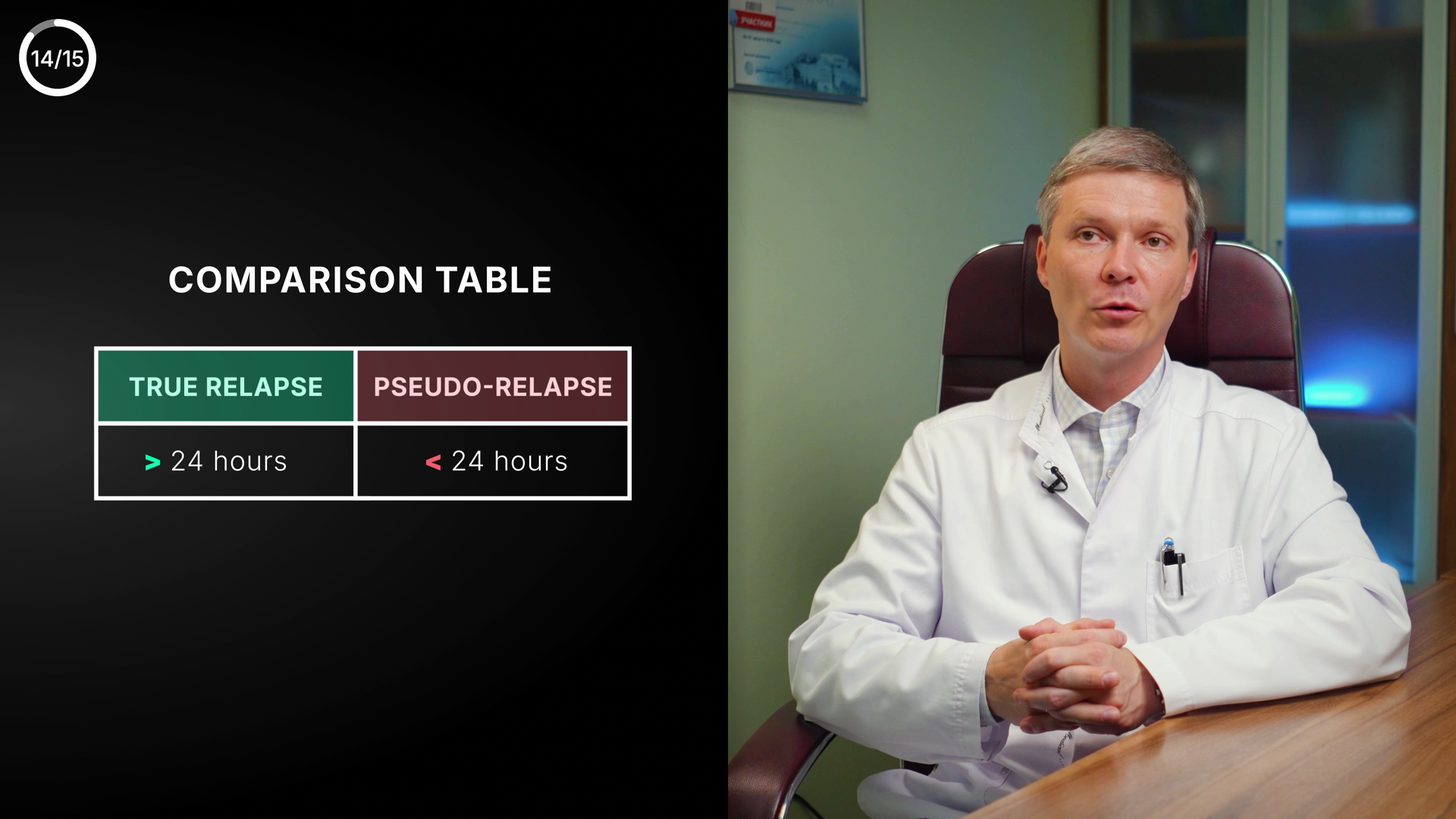
14/15
COMPARISON TABLE
TRUE RELAPSE > 24 hours
PSEUDO-RELAPSE < 24 hours
47🟡 Polish
Comparison table (true vs pseudo-relapse) — text & facts correct, but DNA colour semantics read inverted (dangerous true relapse = green, benign pseudo-relapse = red).
TextcleanAll English, correctly spelled: 'TRUE RELAPSE', 'PSEUDO-RELAPSE' (proper hyphen), '> 24 hours', '< 24 hours'. Correct comparison operators, no typos, no Cyrillic leftover. 'COMPARISON TABLE' heading clean.
MeaningconsiderFacts match VO+canon: pseudo-relapse < 24h ('never more than 24 hours'), true relapse > 24h. Relationship correct. BUT colour-vs-meaning fights the channel COLOUR RULE: the truly dangerous event (TRUE RELAPSE, >24h, needs urgent specialist) is shown calm-GREEN, while the benign transient PSEUDO-RELAPSE is alarm-RED. By DNA semantics (green=good/recovery, red=danger) this is inverted. It reads as a generic 'real vs fake' table convention, not the danger/safe coding the rest of the deck uses — worth a deliberate decision.
VisualcleanBalanced split: table in left third, doctor right, table clear of his face/edges (safe-zone OK). Two-column chips with green/maroon headers have good contrast and legible Montserrat-style caps. Heading hierarchy reads. Table sits in a fair amount of empty black on the left and is a touch small for the panel, but on-brand for the azure/dark skin; alignment of headers and value rows is consistent. Polish-acceptable as-is.
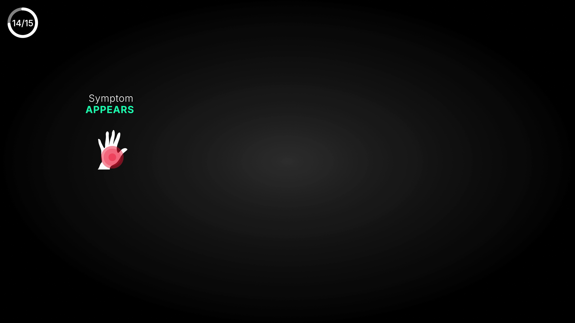
Symptom
APPEARS
[white hand icon with red radiating spot on palm]
14/15 (corner counter)
48🟠 Visual fix
Relapse-cycle "Symptom APPEARS" + numb-hand icon; emphasis word is GREEN, which fights the warning meaning, and the cluster is lost in a large empty black frame.
Textclean"Symptom" and "APPEARS" both correctly spelled English; proper title-case + all-caps emphasis. No Cyrillic leftover, no typos, no punctuation/spacing issues.
MeaningconsiderLabel/icon match the VO (symptom emerging, hand numbness). Only the green ‘APPEARS’ ties into the systemic colour note (a warning word in good-green).
Visualweak‘Symptom APPEARS’ + numb-hand icon is parked upper-left with ~70% of the frame empty black — reads small and unbalanced vs DNA. Centre/enlarge the cluster.
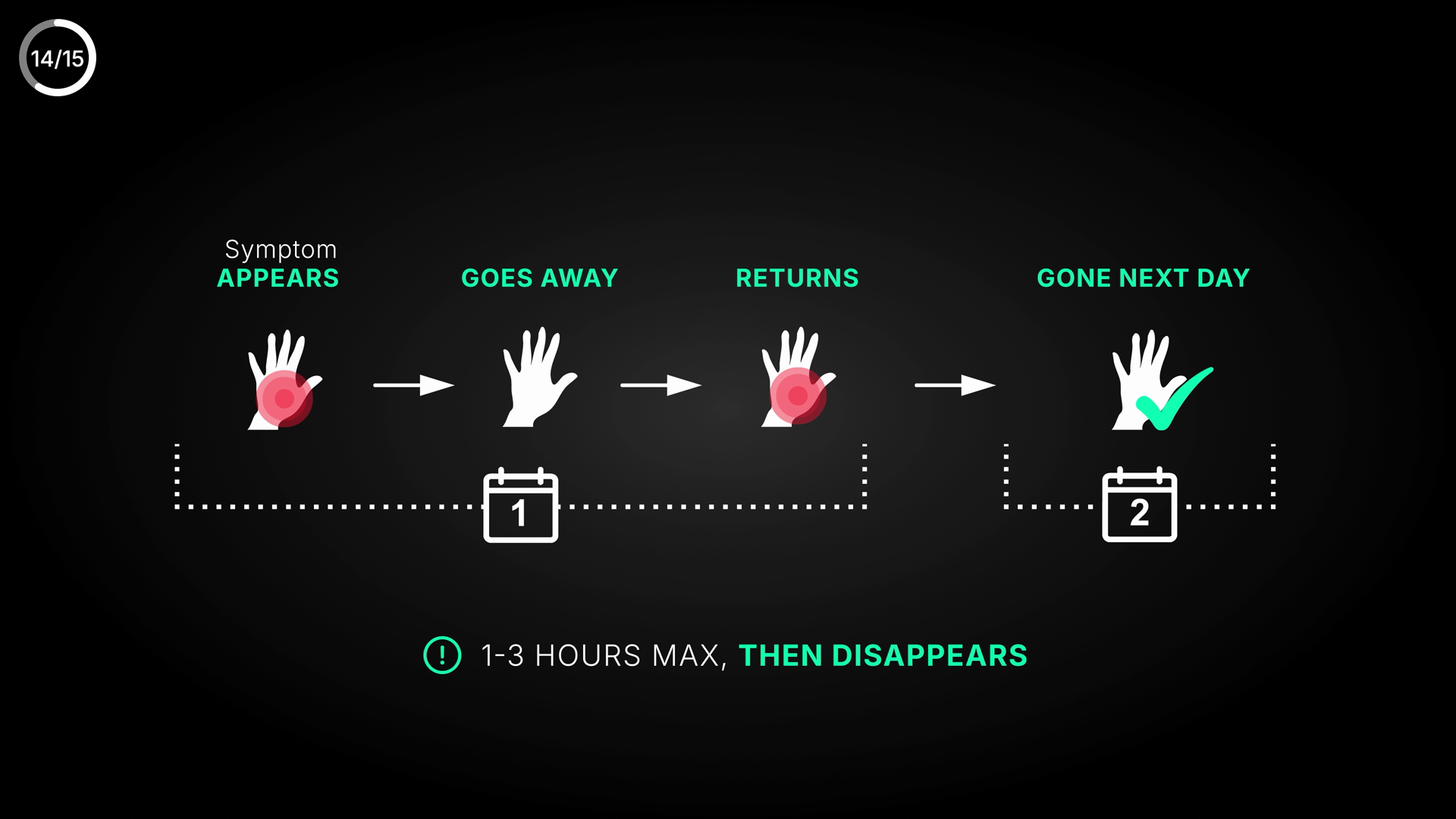
14/15
Symptom APPEARS
GOES AWAY
RETURNS
GONE NEXT DAY
1
2
1-3 HOURS MAX, THEN DISAPPEARS
49🟡 Polish
Pseudo-relapse timeline graphic — clean English text, but "GONE NEXT DAY"/Day-2 calendar mildly fights the "1-3 HOURS MAX" caption and canon.
TextcleanAll text English, correctly spelled and punctuated: Symptom APPEARS / GOES AWAY / RETURNS / GONE NEXT DAY / 1-3 HOURS MAX, THEN DISAPPEARS. No Cyrillic leftover, no typos, hyphen in 1-3 and comma usage correct. Calendar numerals 1 and 2 legible.
MeaningconsiderCore message matches VO+canon: pseudo-relapse is transient, fluctuating, resolves in 1-3 h (caption correct). Hand icons follow colour rule (red glow=symptom present at APPEARS/RETURNS, clean white=GOES AWAY, green check=GONE/recovered). BUT internal tension: endpoint 'GONE NEXT DAY' on a Day-2 calendar implies the symptom carried into a second day (>24h), which contradicts the same screen's '1-3 HOURS MAX' caption and canon ('pseudo-relapse: hours only, never >24h'). The APPEARS->GOES AWAY->RETURNS fluctuation within hours is fine; 'NEXT DAY/Day 2' is the muddying element. Dominant caption still states the right range, so consider not hard error.
VisualcleanStrong RYA-DNA layout: centered horizontal timeline, clear hierarchy (lime/green accent verbs over white 'Symptom' sub-label), consistent hand iconography, arrows pace the steps, dotted baseline ties calendars to days. Good contrast on #0A1420 bg, generous safe-zone, nothing on an edge or face. Colour discipline correct (red=symptom/warning, green=recovery). 14/15 corner counter present and fine. Bottom alert caption with (!) icon well balanced.
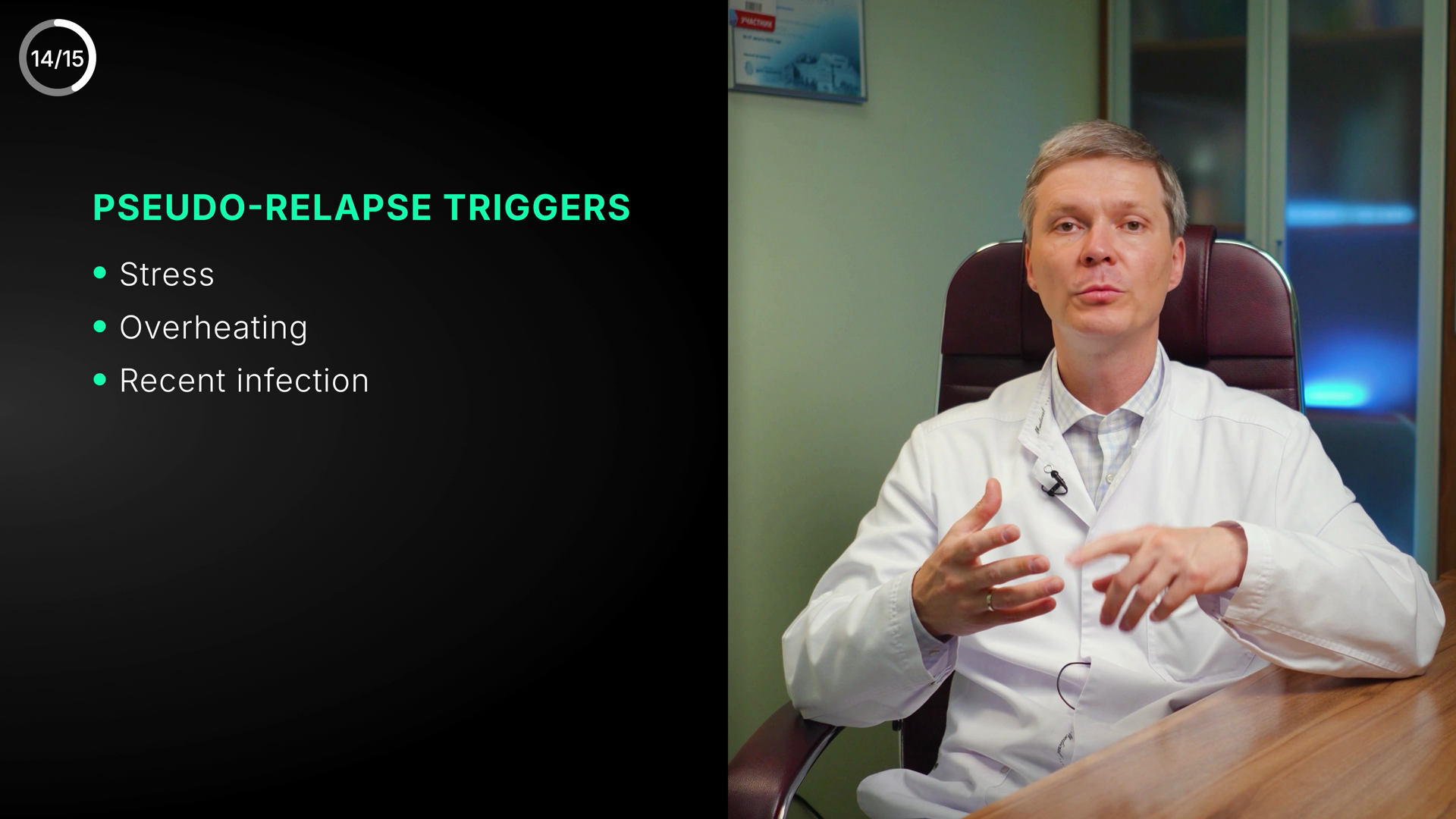
PSEUDO-RELAPSE TRIGGERS
• Stress
• Overheating
• Recent infection
50🟡 Polish
Pseudo-relapse trigger list, fully English and medically accurate — ships clean; only a minor balance note on the empty lower-left.
TextcleanAll English, no Cyrillic leftover. 'PSEUDO-RELAPSE TRIGGERS' correctly hyphenated and all-caps; bullet items 'Stress', 'Overheating', 'Recent infection' spelled correctly with consistent sentence-case capitalization. No typos, no spacing/punctuation issues. Medical term usage correct.
MeaningcleanMatches VO context (pseudo-relapse / 'slight MS activation' that resolves when the triggering factor goes away) and matches canon exactly: pseudo-relapse triggers = stress, overheating, recent infection. Lime label color is neutral-informational, not a green=good signal misused on a danger item, so no color-vs-meaning conflict. No third-party caption/logo visible — clean office B-roll of the neurologist.
VisualpolishClean left-third text panel over azure-DNA dark gradient, good contrast and legibility, heading hierarchy reads well, bullets aligned, text safely off the doctor's face in the right-hand video. Lime heading + white bullets + azure bullet dots are on-brand. Minor: the lower-left quadrant is empty black, so the 3-item list sits high and the block feels slightly top-weighted; tightening vertical centering or adding subtle breathing room would polish balance. 14/15 corner counter is the permanent channel element — not an issue.
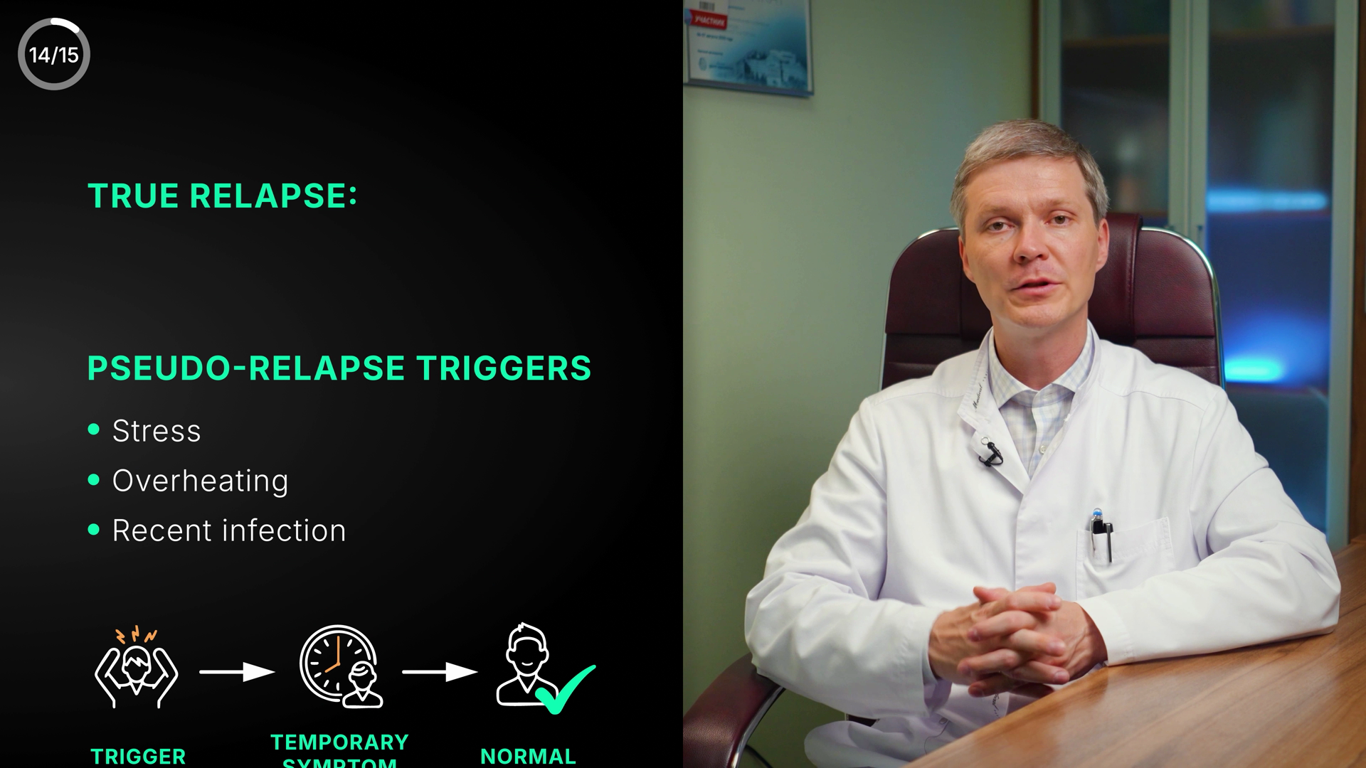
14/15
TRUE RELAPSE:
PSEUDO-RELAPSE TRIGGERS
• Stress
• Overheating
• Recent infection
TRIGGER → TEMPORARY SYMPTOM → NORMAL ✓
51🟠 Visual fix
Pseudo-relapse pathway slide, but dominant orphan heading reads "TRUE RELAPSE:" and both headings are calm-green — mislabel + colour fights meaning.
TextcleanAll English, no Cyrillic. Spelling/typography correct: PSEUDO-RELAPSE hyphenated correctly, 'Recent infection' fine, bullets consistent. No typos in this frame.
MeaningconsiderContent is correct (pseudo triggers: stress/overheating/infection); the issue is the overlapping TRUE-RELAPSE heading during the transition, plus both headers in the same green (systemic colour note).
VisualweakTransition glitch: an orphan ‘TRUE RELAPSE:’ heading sits above the PSEUDO-RELAPSE triggers block with a big empty gap; by ~9:37 it resolves to the full TRUE RELAPSE checklist. Two screens briefly co-exist — tighten the cut so they don’t overlap.
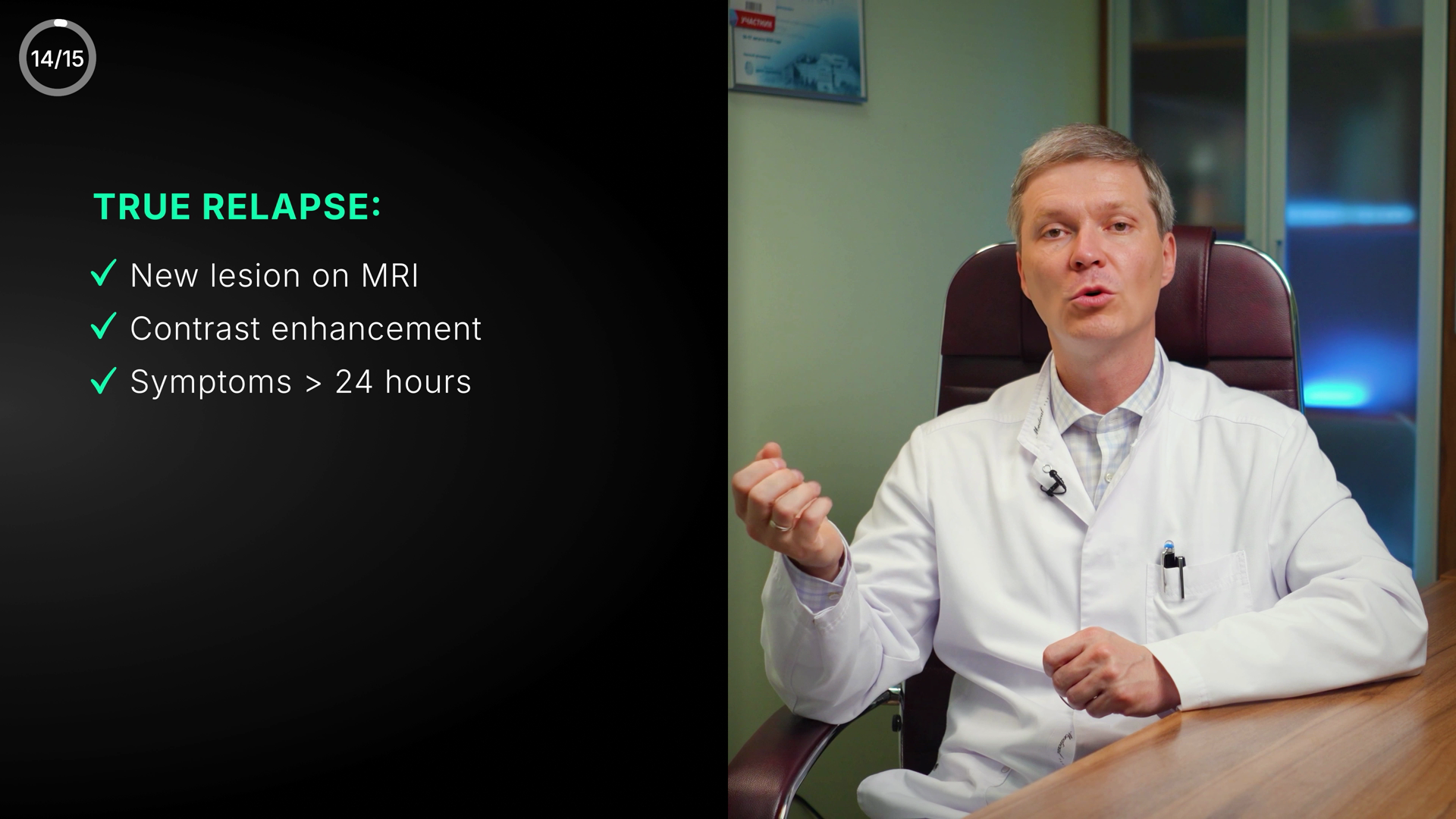
TRUE RELAPSE:
✓ New lesion on MRI
✓ Contrast enhancement
✓ Symptoms > 24 hours
52🟡 Polish
"TRUE RELAPSE" 3-criteria checklist — accurate to VO & canon; only quibble is green checks on a warning-state panel
TextcleanAll English, no Cyrillic leftover. Spelling/grammar correct: 'New lesion on MRI', 'Contrast enhancement', 'Symptoms > 24 hours'. Heading 'TRUE RELAPSE:' correctly capitalized with colon. '>' used as a clean greater-than with proper spacing; 'hours' lowercase consistent. No typos or punctuation issues.
MeaningconsiderMatches VO (contrast enhancement, symptoms > 24h, don't-delay framing) and matches canon exactly: TRUE RELAPSE = new lesion on MRI + contrast enhancement + symptoms > 24 h. No factual error, no wrong number/range. Only tension: per the colour rule green=good/positive, but this panel defines an URGENT alarm condition (true relapse → MS specialist, don't delay). The good-green (#4ADE80) checks could read as reassuring rather than warning. Defensible since green ticks conventionally mean 'criterion confirmed/met'; warn-amber would arguably better signal urgency. Consider, not error.
VisualcleanClean left-panel layout against azure-tinted black bg; doctor on right, no text overlapping his face or in unsafe edge zone. Strong hierarchy: lime/cyan 'TRUE RELAPSE:' heading sits above three left-aligned, evenly-spaced bullet rows with consistent check glyphs. Good contrast and legibility at this size; not lost in empty black. Aligned and balanced, on-DNA. N/15 counter (14/15) top-left is the permanent corner counter — not flagged. Minor polish only: the three lines sit a touch high/left of vertical center, but acceptable.

DON'T DELAY!
SYMPTOMS > 24 HOURS
= SEE MS SPECIALIST
53🟢 Clean
Closing urgency card "DON'T DELAY! / SYMPTOMS > 24 HOURS = SEE MS SPECIALIST" — clean and on-message; only a minor colour-cue nuance.
TextcleanAll English, no Cyrillic. Correct apostrophe in DON'T (straight apostrophe consistent with the warning style). Spacing/operator '> 24 HOURS' and '= SEE MS SPECIALIST' clean. No typos, grammar, or medical-term spelling issues (no drug/condition terms on this card to misspell).
MeaningcleanMatches VO (see an MS specialist right away; >24h confirms a relapse) and matches canon close: DON'T DELAY; symptom >24h -> MS specialist immediately. Amber '!' icon correctly signals warning/urgent. Note for consideration: the action line '= SEE MS SPECIALIST' is rendered in the green/teal accent (#4ADE80-ish / azure), which per the colour rule reads as good/positive rather than urgent — the CTA color is slightly soft for an urgency card, but it does not contradict the meaning. No third-party caption/logo issue; the wall poster behind the doctor is real-environment, not an inserted B-roll caption.
VisualcleanBalanced split layout: left dark panel holds icon -> 'DON'T DELAY!' -> outlined spec box, doctor on right; clear top-to-bottom hierarchy. Strong contrast and legibility, text well within safe zone and off the doctor's face. Amber warning icon anchors the panel and matches the warn token. On-brand azure/teal box outline on #0A1420 bg. Polish nit only: the '= SEE MS SPECIALIST' line in teal-green slightly undercuts the danger/urgency hierarchy that the amber icon + 'DON'T DELAY!' establish; an amber/danger accent on the action line would read more urgent. 15/15 corner counter is the permanent channel counter — not an issue.

EARLY TREATMENT
= BETTER RECOVERY
54🟡 Polish
Closing payoff card "EARLY TREATMENT = BETTER RECOVERY" with green checkmark — correct and on-message, but loose/empty left-half layout.
Textclean"EARLY TREATMENT = BETTER RECOVERY" — spelling, grammar, all-caps consistent, no typos. Fully English, no Cyrillic leftover. Equals sign spacing fine.
MeaningcleanMatches canon close verbatim (EARLY TREATMENT = BETTER RECOVERY) and supports the VO (confirmed relapse → immediate therapy to best restore function). Colour rule respected: green checkmark + green "= BETTER RECOVERY" = positive/recovery; white headline as neutral lead. No contradiction, no mislabel.
VisualpolishLegible, good contrast on black gradient panel, hierarchy reads (white lead → green payoff). But composition is loose: icon floats with a wide gap above the two text lines, and the whole lower-left quadrant is empty black — the block sits high and feels under-filled. Headline left edge runs fairly close to frame edge. Green reads as a brighter spring/teal than DNA good #4ADE80 (minor palette drift, acceptable for positive payoff). Tighten icon-to-text spacing / vertically center the group for more polish.
YTMSEN · Multiple Sclerosis (EN re-version) · full screen audit · 9 Jun 2026 · powered by RYA.AE