Companion to the cut-list: the on-screen graphics that are missing or worth upgrading to RYA-DNA quality, packaged for Claude Design. 1 to create · 6 to upgrade. One MASTER prompt below covers the whole set; each card also has its own slide-spec to copy. Design system: RYA DNA, rendered in the YTMSEN azure skin.
✨ MASTER prompt → Claude Design
You are designing on-screen graphics (overlays) for **YTMSEN** — the English re-version of a Multiple-Sclerosis education channel: a neurologist talking-head with an English voiceover. Use the **RYA.AE screen-type design system** as the structural reference (https://romansergeevcom.github.io/ytrya-dna/) but render everything in the **YTMSEN AZURE skin, NOT the lime one**.

YTMSEN palette:
• Background #0A1420 → panel #0F1E2C → card #13283A
• Primary accent AZURE #4EA8DE · secondary INDIGO #8B7FF0
• Lime #D4E44B only for a medical-term label chip (sparingly)
• Good/positive #4ADE80 · Warning/urgent #F59E0B · Danger #E0607A
• Text #FFFFFF · muted #7E99A8
Fonts: headings = Space Grotesk / Orbitron (UPPERCASE for section titles); body = Montserrat.

Canvas: 1920×1080 (16:9). Two overlay modes:
• FULL-COVER — no speaker (titles, charts, diagrams, comparisons).
• SIDE-SLIDE / PiP — content on the LEFT ~55%, the doctor stays visible on the RIGHT ~45%; never cover his face.
Keep a clean safe-zone; generous negative space but charts should fill the frame (current charts are too small/sparse). These are clean vector infographics & typographic layouts — NO photoreal medical art (that is produced separately).

Produce the slides below. For each, follow its named RYA DNA screen-type. Deliver each as its own standalone 16:9 frame; keep one consistent visual language across the set so they feel like one channel.

SLIDE 1 — Speaker Intro — the neurologist  [Speaker Intro, PiP lower-center bar over talking head]
  Voiceover: In this video, we'll answer some questions… (0:00–0:16)
  On-screen text:
    • Dr. Sergey Petrov
    • Neurologist · MS Clinic Director
  Layout: Glass bar low-center over the doctor: round portrait (azure ring) + name in Orbitron caps + role in Montserrat. Appears ~3–5 s during the intro, once. US-localized: no patronymic; ‘главврач его клиники’ → ‘MS Clinic Director’ (his own private clinic — ‘Clinic’ reads private/relatable in the US, not the institutional ‘Center’; ‘Director’ for the head doctor). ‘Moscow’ dropped on purpose — geo-friction for a US audience and the clinic isn’t a US-known brand; the authority is ‘runs his own MS clinic’. Swaps: if he founded/owns it → ‘MS Clinic Founder’ (strongest US signal); to keep the real brand → ‘Founder, Moscow Multiple Sclerosis Clinic’.

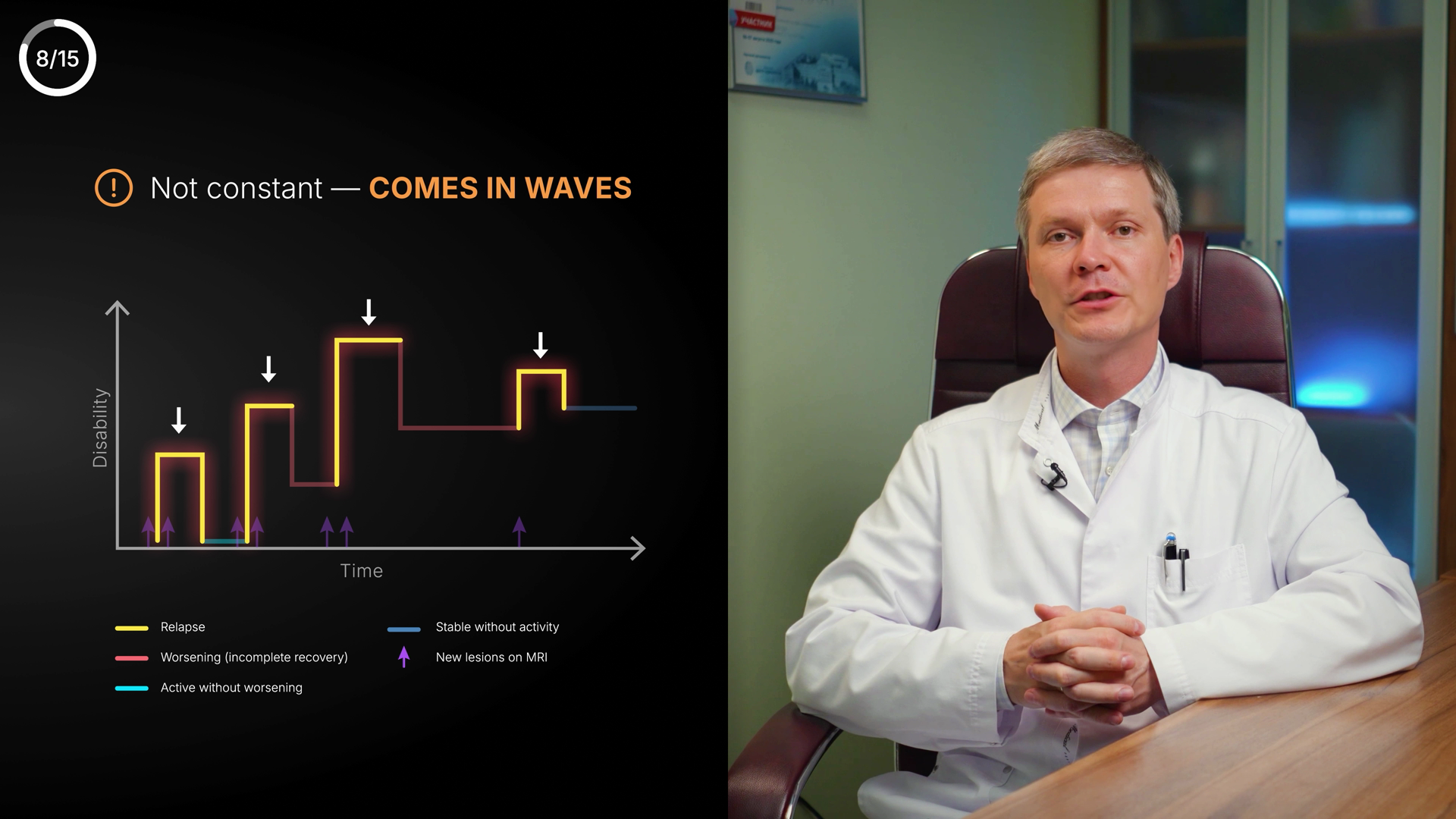
SLIDE 2 — MS course — relapsing–remitting curve  [Chart — Curve, Full-cover]
  Voiceover: MS doesn't progress steadily; it's a relapsing-remitting course… lasts more than 24 hours → see an MS specialist. (5:44–6:47)
  On-screen text:
    • RELAPSING–REMITTING COURSE
    • peaks = relapses · baseline = remission
    • A symptom lasting > 24 h → see an MS specialist
  Layout: Big full-frame curve. Y = disability/activity, X = time. Amber spikes labelled “relapse”, teal flat stretches labelled “remission”. Clean axis labels + small legend. Fill the frame — current version is tiny.

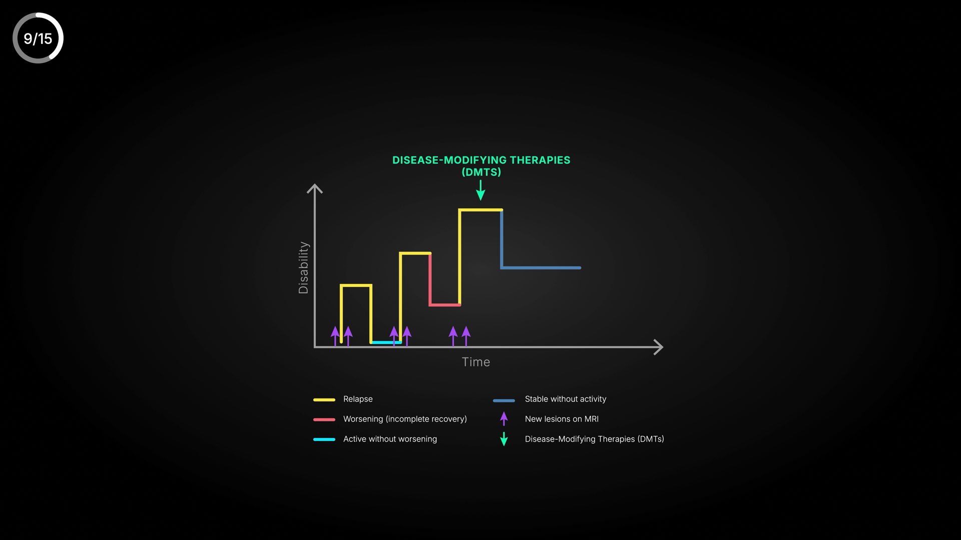
SLIDE 3 — DMTs effect — longer remission  [Chart — Curve (two trajectories), Full-cover]
  Voiceover: Extend remission with disease-modifying therapies (DMTs). The longer we maintain it, the lower the chance of disability. (6:47–7:27)
  On-screen text:
    • DISEASE-MODIFYING THERAPIES (DMTs)
    • with DMTs → longer, flatter remission
    • Longer remission = lower disability risk
  Layout: Two trajectories: ‘no DMTs’ (frequent amber spikes, rising baseline) vs ‘with DMTs’ (few spikes, flat low baseline). Legend tidy. Use ‘DMTs’ everywhere (lowercase s). The ‘lower disability risk’ line is POSITIVE — use a check/positive cue, not an amber “!”.

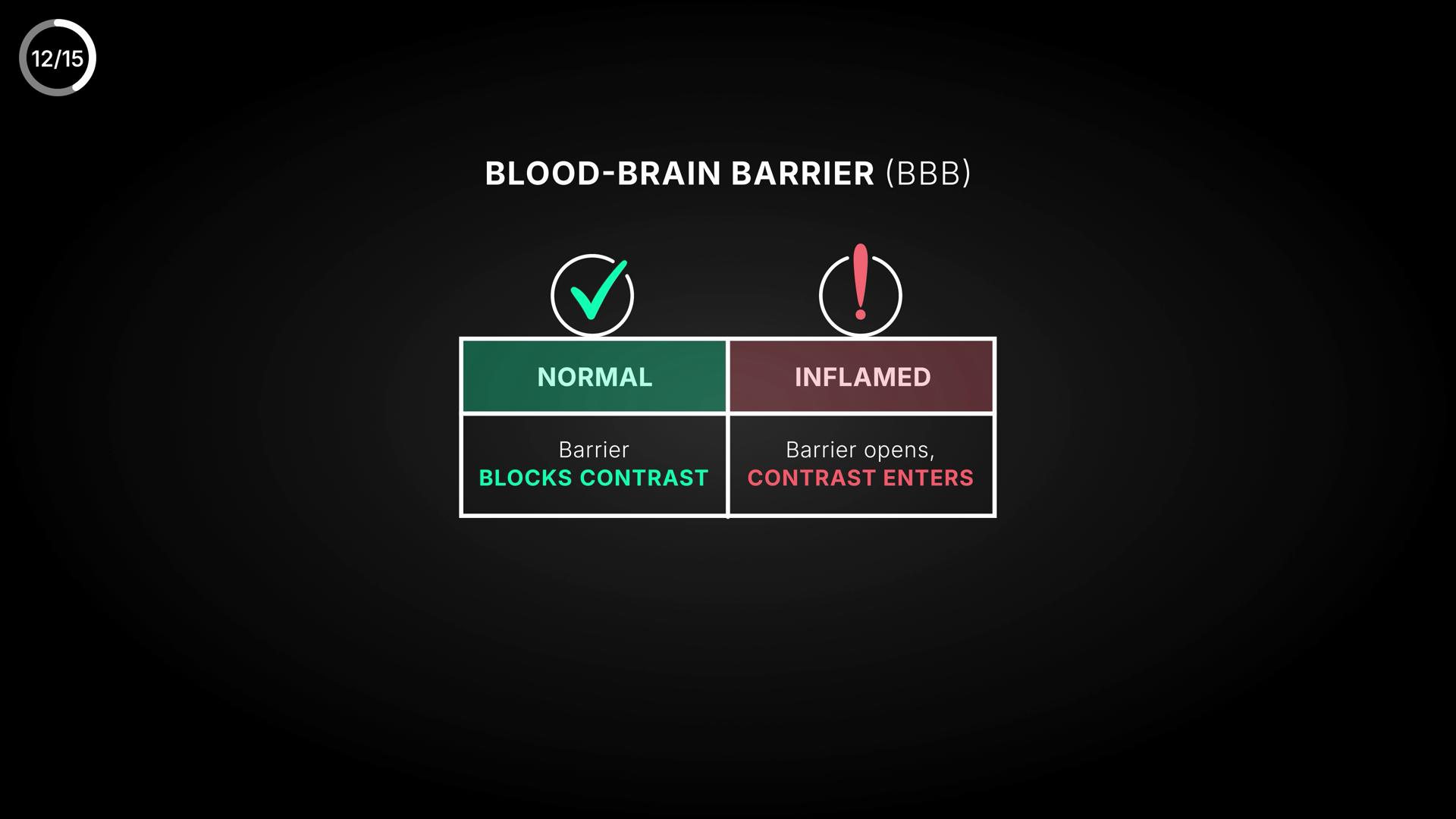
SLIDE 4 — Blood–brain barrier: normal vs inflamed  [Comparison / two-state diagram, Full-cover]
  Voiceover: The blood-brain barrier is impermeable to most molecules; where inflammation develops it becomes permeable and contrast rushes in. (8:30–9:14)
  On-screen text:
    • BLOOD–BRAIN BARRIER (BBB)
    • NORMAL: barrier blocks contrast
    • INFLAMED: barrier opens → contrast enters the lesion
  Layout: Two panels. LEFT ‘Normal’: a tight vessel wall, amber contrast dots bouncing off. RIGHT ‘Inflamed’: a gap in the wall, dots leaking into a glowing lesion. Vessel teal/azure, contrast dots amber. Schematic, not photoreal.

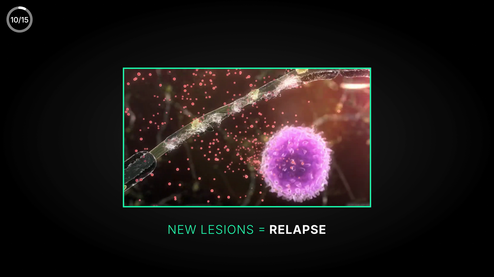
SLIDE 5 — Why relapses happen — 4-step flow  [Flow / Process (or Step Cards), Full-cover]
  Voiceover: A sudden immune activation begins, immune cells enter the brain, form new lesions, then everything subsides. That's a relapse. (7:27–8:06)
  On-screen text:
    • AUTOIMMUNE — periodic attacks
    • 1 Immune activates → 2 Cells enter brain → 3 New lesions form → 4 Subsides
    • New lesions = relapse
  Layout: Four blocks left-to-right with azure arrows; step 3 (new lesions) emphasised in amber. Header chip ‘AUTOIMMUNE’. Bottom takeaway ‘New lesions = relapse’.

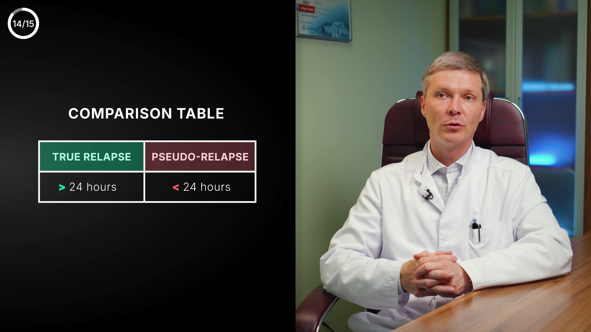
SLIDE 6 — True vs pseudo-relapse (fix colours)  [Comparison, Full-cover]
  Voiceover: A true relapse: new lesion, contrast enhancement, > 24 h. A pseudo-relapse: only hours, never more than 24, triggered by stress/overheating/infection. (9:51–11:01)
  On-screen text:
    • TRUE RELAPSE — urgent
    • New lesion on MRI · Contrast enhancement · > 24 hours
    • PSEUDO-RELAPSE — benign
    • No new lesion · 1–3 h (< 24 h) · triggers: stress, overheating, infection
  Layout: Two panels. FIX the colour logic: the URGENT TRUE RELAPSE = amber/alert header; the BENIGN PSEUDO-RELAPSE = calm teal/neutral. (Current table has it inverted: true=green, pseudo=red.) Three matched rows each.

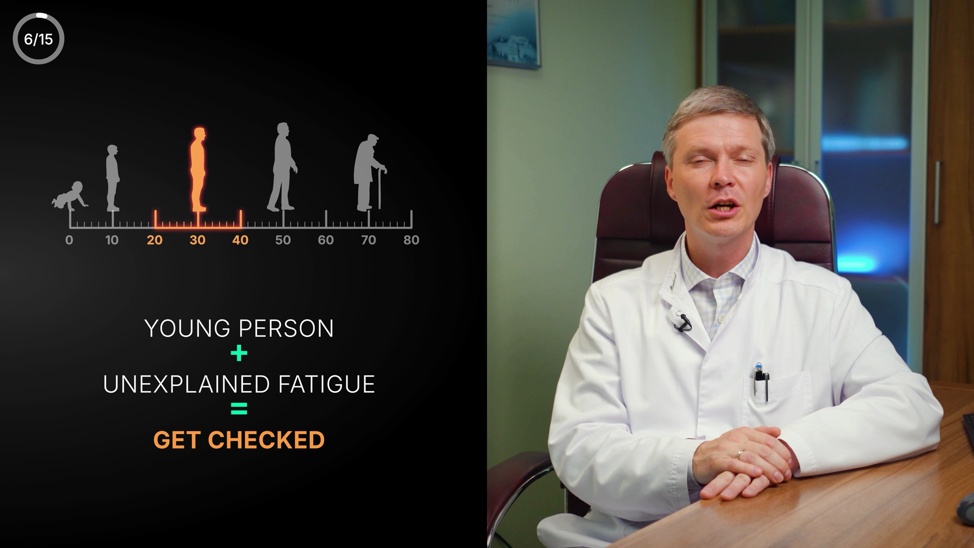
SLIDE 7 — Age of onset (align 20–30 / 20–40)  [Chart / Metaphor scale, Side-slide (figure left, speaker right)]
  Voiceover: If a young person between 20 and 30 starts experiencing dysfunction… see a neurologist, don't wait. (4:49–5:44)
  On-screen text:
    • Typical MS onset
    • [highlight 20–30 to match VO — or keep 20–40 and adjust the VO]
    • Young person + new symptoms → get checked
  Layout: Horizontal age axis 0–80; highlight the onset window with an azure band; a figure inside it. DECIDE the range: 20–30 (matches the VO) OR the broader real-world 20–40 (then tweak the VO). Don't ship screen and VO contradicting.
bg #0A1420panel #0F1E2Ccard #13283Aazure / primary #4EA8DEindigo / secondary #8B7FF0lime label #D4E44Bgood #4ADE80warn/urgent #F59E0Bdanger #E0607Atext #FFFFFFmuted #7E99A8
🖼 Screens to create / upgrade (7)
DOCTOR

RELAPSING–REMITTING COURSE
relapses (amber) · remission (flat)
DISEASE-MODIFYING THERAPIES (DMTs)
no DMTs · with DMTs ✓ lower risk
NORMAL
▮▮▮▮▮ •• ⟵
barrier blocks contrast
barrier blocks contrast
INFLAMED
▮▮ ▮▮ ••→●
contrast leaks to lesion
contrast leaks to lesion
AUTOIMMUNE · periodic attacks
1 Immune
activates→2 Cells
enter brain→3 New
lesions→4 Subsides
activates→2 Cells
enter brain→3 New
lesions→4 Subsides
New lesions = relapse
TRUE RELAPSE · urgent
New lesion on MRI
Contrast enhancement
> 24 hours
Contrast enhancement
> 24 hours
PSEUDO · benign
No new lesion
1–3 h (< 24 h)
triggers: stress · heat · infection
1–3 h (< 24 h)
triggers: stress · heat · infection
🧍
01020304050607080
Young person + new symptoms → get checked
YTMSEN · Multiple Sclerosis (EN re-version) · Claude Design brief · 9 Jun 2026 · powered by RYA.AE
Photoreal medical illustration (myelin/T-cells, brain lesions, MRI) is produced separately (Gemini/Kling), not here.
Photoreal medical illustration (myelin/T-cells, brain lesions, MRI) is produced separately (Gemini/Kling), not here.