MASTER PROMPT
You are designing on-screen visual explanations for **YTRSCEN — "RomanSergeevCom [En]"**, Roman Sergeev's English channel of critical book reviews & visual explanations of non-fiction. This deck covers the book **"The End of Procrastination"** by Petr Ludwig. Your job: turn the book's core ideas into clean, **animation-ready infographics** that explain — and where needed, critically correct — each concept.

STYLE — match the **yt.rya.ae portal** (this IS the channel's visual DNA):
• Near-black editorial base #0B0D12 → panel #12141C → card #171A23; hairline borders #2A2E3A.
• ONE warm accent: amber #E0A82E (deeper #C9A227) — used sparingly for keylines / emphasis.
• Semantic: good #4ADE80, warn #F59E0B, danger/myth #E0607A.
• Text off-white #F2F0EA, dim #C2BEB2, muted #8B8678.
• Type: Space Grotesk (headings, tight, occasional UPPERCASE micro-labels) + Inter (body).
• Glass cards, generous negative space, restrained and intelligent — this is analysis, not hype. Clean vector infographics, charts and diagrams. NO photoreal, NO stock-art clichés.

CANVAS: 1920×1080 (16:9). Two layout modes:
• FULL-COVER — no host on screen (titles, diagrams, charts, comparisons).
• SIDE-SLIDE — content on the LEFT ~55%, keep the RIGHT ~45% clear for Roman's talking head (added later).

DELIVERABLE: each idea below as its own standalone 16:9 frame, with a noted build/motion (this becomes animation). Keep ONE consistent visual language across the set so they read as a single channel.

CRITICAL-REVIEW LAYER (important — this channel adds value, it doesn't just summarise): several of the book's visual claims are scientifically contested in 2026 (willpower-as-a-muscle, ego-depletion as a draining "glass", the smooth Dunning–Kruger "curve", the goal-vs-journey dichotomy). For those, design a **two-state treatment**: the book's version (label it as the book's claim / "myth") and Roman's 2026 correction beside it. The per-card notes tell you which need this.

Below: a palette block, then one card per idea (source reference image + what it shows + how to explain it + the critical angle). Build the MUST cards first.
Palette · yt.rya.ae portal
base
#0B0D12panel#12141Ccard#171A23border#2A2E3Aamber / accent#E0A82Eamber deep#C9A227good#4ADE80warn#F59E0Bdanger#E0607Atext#F2F0EAdim#C2BEB2muted#8B8678Ideas to build — source diagram → explanation (24 must-build first)
03Things I Should / Would Like / Procrastinate-Do (Three Circles)
must
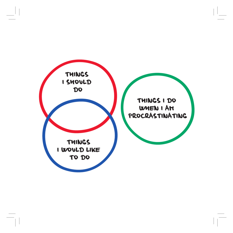
DEPICTS
Three hand-drawn marker circles. A red circle labeled "THINGS I SHOULD DO" overlaps a blue circle labeled "THINGS I WOULD LIKE TO DO" — their intersection is the unlabeled sweet spot where obligation meets desire. A separate green circle, set apart on the right, is labeled "THINGS I DO WHEN I AM PROCRASTINATING," visually isolated from the other two to show procrastination falls outside both the should and the want-to.
EXPLAIN AS
Strong full-cover explainer to open the procrastination problem: animate the green circle drifting away from the overlap to show how procrastination escapes the "should + want" zone. Good recurring b-roll motif when narrating the gap between intention and action.
ANIMATION
Red and blue circles slide together to form a Venn overlap (the "sweet spot" glows); then the green procrastination circle drifts in from off-screen but bounces away from the overlap, never connecting — visually it can't reach the should/want zone.
CRITICAL ANGLE
The diagram implies procrastination is a clean separate category of "fun escape" activities, but research (Sirois, Pychyl) frames procrastination as mood-repair / emotion regulation, not simply doing pleasurable alternatives — people often procrastinate into low-value, non-enjoyable activities too. The neat non-overlap oversimplifies.
Idea: Things I Should / Would Like / Procrastinate-Do (Three Circles)  (book page 18, area: Motivation, tool: —)
What it shows: Three hand-drawn marker circles. A red circle labeled "THINGS I SHOULD DO" overlaps a blue circle labeled "THINGS I WOULD LIKE TO DO" — their intersection is the unlabeled sweet spot where obligation meets desire. A separate green circle, set apart on the right, is labeled "THINGS I DO WHEN I AM PROCRASTINATING," visually isolated from the other two to show procrastination falls outside both the should and the want-to.
Explain as: Strong full-cover explainer to open the procrastination problem: animate the green circle drifting away from the overlap to show how procrastination escapes the "should + want" zone. Good recurring b-roll motif when narrating the gap between intention and action.
Animation/build: Red and blue circles slide together to form a Venn overlap (the "sweet spot" glows); then the green procrastination circle drifts in from off-screen but bounces away from the overlap, never connecting — visually it can't reach the should/want zone.
CRITICAL (two-state myth→reality): The diagram implies procrastination is a clean separate category of "fun escape" activities, but research (Sirois, Pychyl) frames procrastination as mood-repair / emotion regulation, not simply doing pleasurable alternatives — people often procrastinate into low-value, non-enjoyable activities too. The neat non-overlap oversimplifies.
Render 16:9, yt.rya.ae style (near-black, amber accent, Space Grotesk/Inter, clean vector).
04Tasks vs Time vs Solution Strip
must
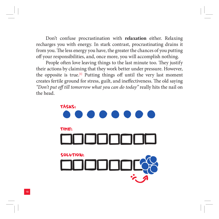
DEPICTS
Three hand-drawn rows under red labels. "TASKS:" = a row of 8 solid blue dots (the things you must do). "TIME:" = a row of 8 empty black-outlined squares (your available time slots/days). "SOLUTION:" = the same row of squares, but the first six are empty and the last two slots are crammed with a dense cluster of blue dots, with a red curved arrow pointing back to the start — the procrastinator's tasks all piled up at the deadline instead of spread across time.
EXPLAIN AS
Full-cover explainer / animated build: drop the 8 task-dots one per time-slot (the ideal), then re-run it as the procrastinator's reality — dots stay empty until they avalanche into the final two slots. Strong comparison visual for the "last-minute" myth.
ANIMATION
Animate two passes on the same time-row: pass 1 distributes 8 blue dots evenly into the 8 squares (calm); pass 2 leaves slots empty, then on the deadline the red arrow whips and all 8 dots crash-pile into the last two boxes, overflowing — visualizing stress/guilt/ineffectiveness.
CRITICAL ANGLE
The book asserts "people work better under pressure... the opposite is true." That's directionally supported (last-minute work raises error rate and stress for most tasks), but it's overstated as universal — moderate deadline pressure (Yerkes-Dodson) genuinely lifts performance for some people/tasks, so the flat "the opposite is true" claim doesn't fully survive a nuance-check.
Idea: Tasks vs Time vs Solution Strip  (book page 19, area: Discipline, tool: —)
What it shows: Three hand-drawn rows under red labels. "TASKS:" = a row of 8 solid blue dots (the things you must do). "TIME:" = a row of 8 empty black-outlined squares (your available time slots/days). "SOLUTION:" = the same row of squares, but the first six are empty and the last two slots are crammed with a dense cluster of blue dots, with a red curved arrow pointing back to the start — the procrastinator's tasks all piled up at the deadline instead of spread across time.
Explain as: Full-cover explainer / animated build: drop the 8 task-dots one per time-slot (the ideal), then re-run it as the procrastinator's reality — dots stay empty until they avalanche into the final two slots. Strong comparison visual for the "last-minute" myth.
Animation/build: Animate two passes on the same time-row: pass 1 distributes 8 blue dots evenly into the 8 squares (calm); pass 2 leaves slots empty, then on the deadline the red arrow whips and all 8 dots crash-pile into the last two boxes, overflowing — visualizing stress/guilt/ineffectiveness.
CRITICAL (two-state myth→reality): The book asserts "people work better under pressure... the opposite is true." That's directionally supported (last-minute work raises error rate and stress for most tasks), but it's overstated as universal — moderate deadline pressure (Yerkes-Dodson) genuinely lifts performance for some people/tasks, so the flat "the opposite is true" claim doesn't fully survive a nuance-check.
Render 16:9, yt.rya.ae style (near-black, amber accent, Space Grotesk/Inter, clean vector).
07Personal-Development Equation (= Motivation + Discipline + Outcomes + Objectivity)
must
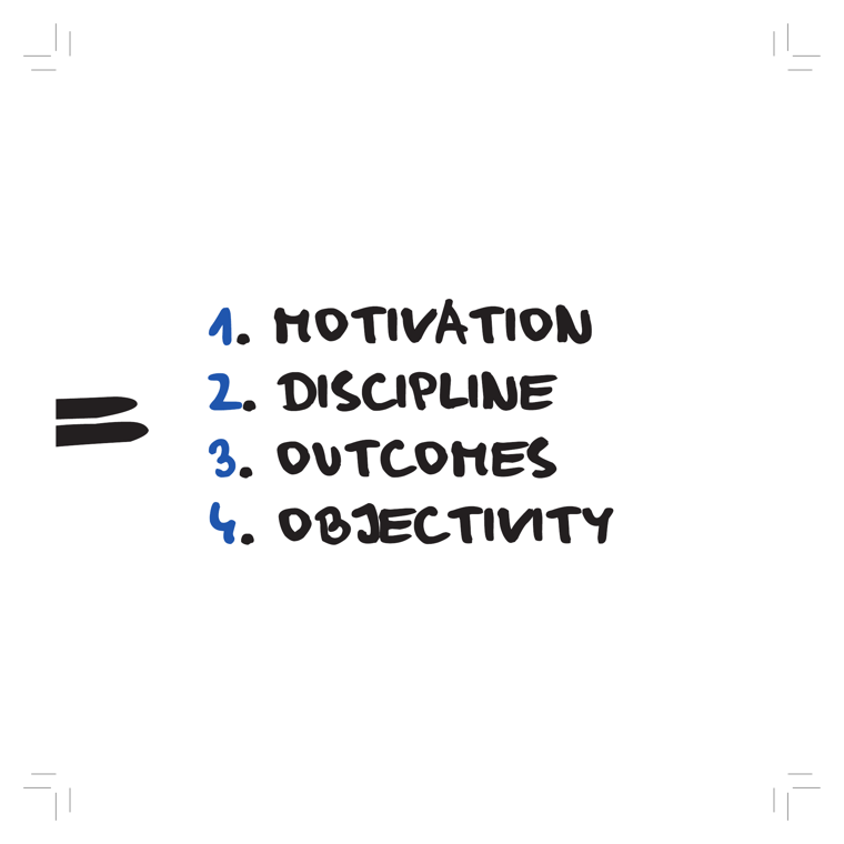
DEPICTS
A bold hand-drawn equals sign on the left points to a four-item numbered list set in marker-style caps: 1. MOTIVATION, 2. DISCIPLINE, 3. OUTCOMES, 4. OBJECTIVITY. The numbers are blue, the words black, on plain white. No icons, arrows, or metaphor imagery — it is the bare statement of the book's core four-component equation, the spine the whole system hangs on.
EXPLAIN AS
Full-cover explainer / system map: Roman introduces the book's four-pillar architecture, then animates each pillar lighting up in sequence as he previews the chapters. Reusable as a recurring framing card whenever he returns to 'where are we in the system.' Because the book itself repeats this graphic on pages 33/34/45, it is a natural backbone motif for the video.
ANIMATION
Start with the lone '=' sign, then have the four lines write on one by one (blue number first, word after), each accompanied by a small pillar rising at the bottom to build a four-column 'system' base; on the repeat-page callback, the same four pillars slide back in pre-built to signal 'we've seen this before.'
CRITICAL ANGLE
The equation is presented as if these four are an exhaustive, scientifically derived formula for 'personal development,' but it's an authorial framing device, not a validated model — there's no equation, no weights, no evidence the four are necessary-and-sufficient. The reliance on 'discipline/willpower' as a separable pillar also leans on the willpower-as-finite-resource (ego-depletion) view that failed major replication. Roman can flag that it's a useful mnemonic, not a measured law.
Idea: Personal-Development Equation (= Motivation + Discipline + Outcomes + Objectivity)  (book page 34, area: Meta/System, tool: —)
What it shows: A bold hand-drawn equals sign on the left points to a four-item numbered list set in marker-style caps: 1. MOTIVATION, 2. DISCIPLINE, 3. OUTCOMES, 4. OBJECTIVITY. The numbers are blue, the words black, on plain white. No icons, arrows, or metaphor imagery — it is the bare statement of the book's core four-component equation, the spine the whole system hangs on.
Explain as: Full-cover explainer / system map: Roman introduces the book's four-pillar architecture, then animates each pillar lighting up in sequence as he previews the chapters. Reusable as a recurring framing card whenever he returns to 'where are we in the system.' Because the book itself repeats this graphic on pages 33/34/45, it is a natural backbone motif for the video.
Animation/build: Start with the lone '=' sign, then have the four lines write on one by one (blue number first, word after), each accompanied by a small pillar rising at the bottom to build a four-column 'system' base; on the repeat-page callback, the same four pillars slide back in pre-built to signal 'we've seen this before.'
CRITICAL (two-state myth→reality): The equation is presented as if these four are an exhaustive, scientifically derived formula for 'personal development,' but it's an authorial framing device, not a validated model — there's no equation, no weights, no evidence the four are necessary-and-sufficient. The reliance on 'discipline/willpower' as a separable pillar also leans on the willpower-as-finite-resource (ego-depletion) view that failed major replication. Roman can flag that it's a useful mnemonic, not a measured law.
Render 16:9, yt.rya.ae style (near-black, amber accent, Space Grotesk/Inter, clean vector).
11Objectivity: Present Self Aiming at the Future
must
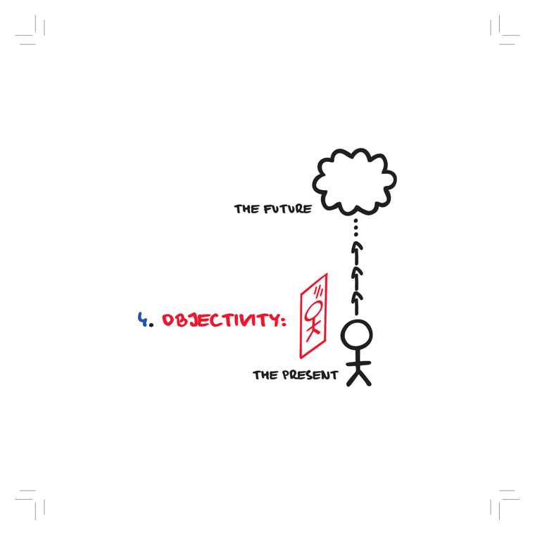
DEPICTS
A stick figure stands on the ground labeled "THE PRESENT," holding/standing beside a red sheet of paper (a list/scorecard with an "OK" mark and edits). A column of upward-pointing arrows rises from the figure toward a dotted line that leads into a thought-cloud labeled "THE FUTURE." The red "4. OBJECTIVITY:" heading sits to the left, marking this as the fourth system area.
EXPLAIN AS
Full-cover explainer to open the fourth pillar: animate the present-self looking at a paper scorecard and projecting upward arrows toward an imagined future, framing objectivity as honest self-review (the "Meeting With Myself" tool) bridging present reality and future goals.
ANIMATION
Build bottom-up: stick figure fades in on "THE PRESENT" ground, the red OK/scorecard sheet flips up beside him, then the stacked arrows shoot up one by one along the dotted path until the "THE FUTURE" thought-cloud pops into view, closing the present-to-future loop.
CRITICAL ANGLE
The graphic implies steady, rational arrows carry you from honest present self-assessment to a clear future — but self-review is biased: people systematically over-rate themselves (above-average effect) or fall into rumination, so "objectivity" via self-scoring is far less reliable than the clean upward arrows suggest. Worth flagging that true objectivity usually needs external feedback/data, not solitary self-meeting.
Idea: Objectivity: Present Self Aiming at the Future  (book page 42, area: Objectivity, tool: Meeting With Myself)
What it shows: A stick figure stands on the ground labeled "THE PRESENT," holding/standing beside a red sheet of paper (a list/scorecard with an "OK" mark and edits). A column of upward-pointing arrows rises from the figure toward a dotted line that leads into a thought-cloud labeled "THE FUTURE." The red "4. OBJECTIVITY:" heading sits to the left, marking this as the fourth system area.
Explain as: Full-cover explainer to open the fourth pillar: animate the present-self looking at a paper scorecard and projecting upward arrows toward an imagined future, framing objectivity as honest self-review (the "Meeting With Myself" tool) bridging present reality and future goals.
Animation/build: Build bottom-up: stick figure fades in on "THE PRESENT" ground, the red OK/scorecard sheet flips up beside him, then the stacked arrows shoot up one by one along the dotted path until the "THE FUTURE" thought-cloud pops into view, closing the present-to-future loop.
CRITICAL (two-state myth→reality): The graphic implies steady, rational arrows carry you from honest present self-assessment to a clear future — but self-review is biased: people systematically over-rate themselves (above-average effect) or fall into rumination, so "objectivity" via self-scoring is far less reliable than the clean upward arrows suggest. Worth flagging that true objectivity usually needs external feedback/data, not solitary self-meeting.
Render 16:9, yt.rya.ae style (near-black, amber accent, Space Grotesk/Inter, clean vector).
14Goal-Junkie Cycle (Hedonic Adaptation Loop)
must
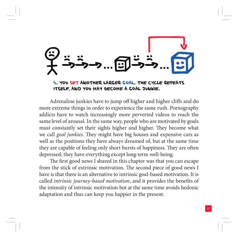
DEPICTS
A hand-drawn cartoon strip: a frowning stick figure, then a row of small smiling cubes shrinking with arrows and "..." between them, ending in a large blue smiling cube. A red looping arrow runs from the big cube back to the start, signalling repetition. Caption (step 4): "You set another larger goal, the cycle repeats itself, and you may become a goal junkie."
EXPLAIN AS
Full-cover explainer / looping animation b-roll: the red return-arrow makes it a natural endless-loop GIF showing how each achieved goal fades and a bigger one is set — illustrates hedonic adaptation and the "always chasing, never satisfied" trap of extrinsic goal-based motivation.
ANIMATION
Loop build: cube achieved -> shrinks/fades (joy decays) -> red arrow sweeps back to spawn a NEW larger cube; tighten the loop each cycle so it visibly accelerates, then hold on a desaturated frowning figure to land "everything except long-term well-being."
CRITICAL ANGLE
Hedonic adaptation is well-supported, but the "goal junkie" framing is moralized pop-psychology, not a measured construct; equating goal-pursuit with addiction (adrenaline/porn analogies in the text) is rhetorical, not clinical. The book also REPEATS this same graphic across pages [52,58], so on-screen Roman should note the duplication rather than treat it as two distinct diagrams.
Idea: Goal-Junkie Cycle (Hedonic Adaptation Loop)  (book page 58, area: Motivation, tool: —)
What it shows: A hand-drawn cartoon strip: a frowning stick figure, then a row of small smiling cubes shrinking with arrows and "..." between them, ending in a large blue smiling cube. A red looping arrow runs from the big cube back to the start, signalling repetition. Caption (step 4): "You set another larger goal, the cycle repeats itself, and you may become a goal junkie."
Explain as: Full-cover explainer / looping animation b-roll: the red return-arrow makes it a natural endless-loop GIF showing how each achieved goal fades and a bigger one is set — illustrates hedonic adaptation and the "always chasing, never satisfied" trap of extrinsic goal-based motivation.
Animation/build: Loop build: cube achieved -> shrinks/fades (joy decays) -> red arrow sweeps back to spawn a NEW larger cube; tighten the loop each cycle so it visibly accelerates, then hold on a desaturated frowning figure to land "everything except long-term well-being."
CRITICAL (two-state myth→reality): Hedonic adaptation is well-supported, but the "goal junkie" framing is moralized pop-psychology, not a measured construct; equating goal-pursuit with addiction (adrenaline/porn analogies in the text) is rhetorical, not clinical. The book also REPEATS this same graphic across pages [52,58], so on-screen Roman should note the duplication rather than treat it as two distinct diagrams.
Render 16:9, yt.rya.ae style (near-black, amber accent, Space Grotesk/Inter, clean vector).
15Personal Vision as a Magnet (Journey-Based Motivation)
must
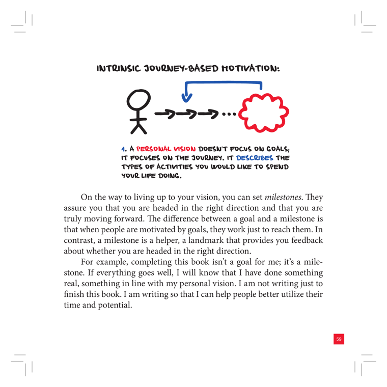
DEPICTS
A hand-drawn stick figure on the left under the heading "INTRINSIC JOURNEY-BASED MOTIVATION:". A series of black arrows (→ → → …) leads rightward from the figure toward a red scribbled cloud — the "personal vision." A blue curved arrow loops back from the cloud down toward the path, implying the vision pulls/guides the person forward like a magnet. Caption: "A PERSONAL VISION doesn't focus on goals, it focuses on the journey. It describes the types of activities you would like to spend your life doing."
EXPLAIN AS
Full-cover explainer to open the Motivation section: animate the stick figure walking arrow-by-arrow toward the cloud while the blue "pull" arc draws the figure forward. Good anchor visual that recurs (book repeats it on pp. 30/60/66/166), so reuse as a recurring motif/b-roll callback throughout the video whenever "vision vs goals" comes up.
ANIMATION
Stick figure steps forward one arrow at a time (staggered pop-in); the red cloud pulses/breathes, and the blue arc sweeps from cloud back to the figure on each step, "tugging" it closer — like a magnet field line snapping into place.
CRITICAL ANGLE
The graphic sells "journey over goals" as obviously superior, but the science is mixed: process/approach goals and specific outcome goals both reliably boost performance (Locke & Latham), and a vague "vision cloud" with no measurable target is exactly the kind of fuzzy intention that fails to change behavior. Roman can flag that the book repeats this image 4 times — repetition as persuasion, not new evidence — and that "vision pulls you like a magnet" is motivational metaphor, not a mechanism.
Idea: Personal Vision as a Magnet (Journey-Based Motivation)  (book page 60, area: Motivation, tool: Personal Vision)
What it shows: A hand-drawn stick figure on the left under the heading "INTRINSIC JOURNEY-BASED MOTIVATION:". A series of black arrows (→ → → …) leads rightward from the figure toward a red scribbled cloud — the "personal vision." A blue curved arrow loops back from the cloud down toward the path, implying the vision pulls/guides the person forward like a magnet. Caption: "A PERSONAL VISION doesn't focus on goals, it focuses on the journey. It describes the types of activities you would like to spend your life doing."
Explain as: Full-cover explainer to open the Motivation section: animate the stick figure walking arrow-by-arrow toward the cloud while the blue "pull" arc draws the figure forward. Good anchor visual that recurs (book repeats it on pp. 30/60/66/166), so reuse as a recurring motif/b-roll callback throughout the video whenever "vision vs goals" comes up.
Animation/build: Stick figure steps forward one arrow at a time (staggered pop-in); the red cloud pulses/breathes, and the blue arc sweeps from cloud back to the figure on each step, "tugging" it closer — like a magnet field line snapping into place.
CRITICAL (two-state myth→reality): The graphic sells "journey over goals" as obviously superior, but the science is mixed: process/approach goals and specific outcome goals both reliably boost performance (Locke & Latham), and a vague "vision cloud" with no measurable target is exactly the kind of fuzzy intention that fails to change behavior. Roman can flag that the book repeats this image 4 times — repetition as persuasion, not new evidence — and that "vision pulls you like a magnet" is motivational metaphor, not a mechanism.
Render 16:9, yt.rya.ae style (near-black, amber accent, Space Grotesk/Inter, clean vector).
16Joy vs Flow: One Spike vs Sustained Spikes
must
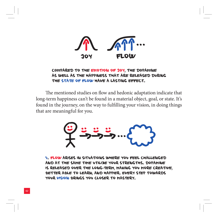
DEPICTS
Two hand-drawn bell-curve mounds side by side. Left, labeled "JOY", has a single red up-arrow at its peak — one isolated dopamine spike. Right, labeled "FLOW", has a cluster of red up-arrows trailing off with an ellipsis — many sustained spikes over time. Below, a stick figure with red arrows (→ → →) progressing toward a blue cloud (vision/mastery), captioned that flow arises when challenged while using your strengths, releasing dopamine long-term.
EXPLAIN AS
Full-cover explainer or side-by-side comparison b-roll: animate JOY's single spike fading vs FLOW's repeated, sustained spikes, then the stick-figure journey arrows building toward the vision cloud. Strong visual to contrast one-off pleasure (hedonic) with durable engagement.
ANIMATION
Draw the JOY mound with a single arrow that shoots up then dims/falls; then on FLOW, sequentially pop multiple red arrows that keep recurring along a flat-topped plateau, while the stick figure walks the →→→ path and the blue vision cloud blooms at the end.
CRITICAL ANGLE
The clean "one dopamine spike = fleeting joy vs many spikes = lasting flow" story is a pop-neuroscience simplification. Dopamine is more about reward-prediction and motivation than a literal "happiness chemical," and flow research (Csikszentmihalyi) is largely self-report, not neat dopamine-curve evidence. Hedonic adaptation is real, but the tidy curve metaphor overstates how well the brain mechanism is understood.
Idea: Joy vs Flow: One Spike vs Sustained Spikes  (book page 63, area: Motivation, tool: Flow-list)
What it shows: Two hand-drawn bell-curve mounds side by side. Left, labeled "JOY", has a single red up-arrow at its peak — one isolated dopamine spike. Right, labeled "FLOW", has a cluster of red up-arrows trailing off with an ellipsis — many sustained spikes over time. Below, a stick figure with red arrows (→ → →) progressing toward a blue cloud (vision/mastery), captioned that flow arises when challenged while using your strengths, releasing dopamine long-term.
Explain as: Full-cover explainer or side-by-side comparison b-roll: animate JOY's single spike fading vs FLOW's repeated, sustained spikes, then the stick-figure journey arrows building toward the vision cloud. Strong visual to contrast one-off pleasure (hedonic) with durable engagement.
Animation/build: Draw the JOY mound with a single arrow that shoots up then dims/falls; then on FLOW, sequentially pop multiple red arrows that keep recurring along a flat-topped plateau, while the stick figure walks the →→→ path and the blue vision cloud blooms at the end.
CRITICAL (two-state myth→reality): The clean "one dopamine spike = fleeting joy vs many spikes = lasting flow" story is a pop-neuroscience simplification. Dopamine is more about reward-prediction and motivation than a literal "happiness chemical," and flow research (Csikszentmihalyi) is largely self-report, not neat dopamine-curve evidence. Hedonic adaptation is real, but the tidy curve metaphor overstates how well the brain mechanism is understood.
Render 16:9, yt.rya.ae style (near-black, amber accent, Space Grotesk/Inter, clean vector).
17Results ↔ Happiness Reversed Loop
must
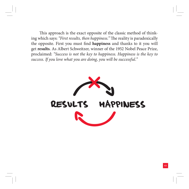
DEPICTS
Two hand-lettered words, "RESULTS" (left) and "HAPPINESS" (right), connected in a circular loop by two curved arrows. The top black arrow points from RESULTS toward HAPPINESS but is crossed out with a red X, marking the conventional "first results, then happiness" direction as wrong. The bottom red arrow points from HAPPINESS back to RESULTS, asserting the correct causal order: happiness drives results. Accompanying text quotes Albert Schweitzer ("Success is not the key to happiness. Happiness is the key to success").
EXPLAIN AS
Full-cover explainer: animate the crossed-out top arrow first (the myth "results → happiness"), then reveal the red bottom arrow flipping the causality (happiness → results). Strong as a comparison cold-open or thesis card framing the book's core motivation claim.
ANIMATION
Loop animates in two beats: black arrow draws RESULTS→HAPPINESS, then a red X slams over it; beat two, the red arrow sweeps HAPPINESS→RESULTS and the two words pulse, settling into a continuously rotating cycle to hint the real bidirectional feedback.
CRITICAL ANGLE
The clean one-way "happiness → results" arrow oversells the science. The positive-affect/success literature (Lyubomirsky, King & Diener 2005) shows a real but modest correlation and is largely correlational; causality runs both ways, and several positive-psychology effect sizes shrank after the replication crisis. Schweitzer-quote authority ≠ evidence. Honest redraw should keep BOTH arrows (a feedback loop), not crossing one out as simply "false."
Idea: Results ↔ Happiness Reversed Loop  (book page 64, area: Motivation, tool: —)
What it shows: Two hand-lettered words, "RESULTS" (left) and "HAPPINESS" (right), connected in a circular loop by two curved arrows. The top black arrow points from RESULTS toward HAPPINESS but is crossed out with a red X, marking the conventional "first results, then happiness" direction as wrong. The bottom red arrow points from HAPPINESS back to RESULTS, asserting the correct causal order: happiness drives results. Accompanying text quotes Albert Schweitzer ("Success is not the key to happiness. Happiness is the key to success").
Explain as: Full-cover explainer: animate the crossed-out top arrow first (the myth "results → happiness"), then reveal the red bottom arrow flipping the causality (happiness → results). Strong as a comparison cold-open or thesis card framing the book's core motivation claim.
Animation/build: Loop animates in two beats: black arrow draws RESULTS→HAPPINESS, then a red X slams over it; beat two, the red arrow sweeps HAPPINESS→RESULTS and the two words pulse, settling into a continuously rotating cycle to hint the real bidirectional feedback.
CRITICAL (two-state myth→reality): The clean one-way "happiness → results" arrow oversells the science. The positive-affect/success literature (Lyubomirsky, King & Diener 2005) shows a real but modest correlation and is largely correlational; causality runs both ways, and several positive-psychology effect sizes shrank after the replication crisis. Schweitzer-quote authority ≠ evidence. Honest redraw should keep BOTH arrows (a feedback loop), not crossing one out as simply "false."
Render 16:9, yt.rya.ae style (near-black, amber accent, Space Grotesk/Inter, clean vector).
19Personal Vision: 5-Step Roadmap
must
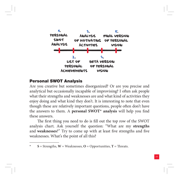
DEPICTS
A hand-drawn horizontal timeline (a thick black arrow) with five red tick-marks, each numbered and labeled, alternating above/below the line. The five steps read: 1. Personal SWOT Analysis, 2. List of Personal Achievements, 3. Analysis of Motivating Activities, 4. Beta Version of Personal Vision, 5. Final Version of Personal Vision. Below sits the section heading "Personal SWOT Analysis" and body text, with a footnote defining SWOT (S=Strengths, W=Weaknesses, O=Opportunities, T=Threats). The pre-classified hint ("four-quadrant SWOT grid") is WRONG for this page — no grid is drawn here; it is a linear process roadmap. The graphic is repeated across pages 78-79.
EXPLAIN AS
Full-cover explainer / animated build: reveal the five timeline nodes one by one to walk the viewer through the book's method for constructing a Personal Vision (SWOT to achievements to motivating activities to beta vision to final vision). Good chapter-opener b-roll for the Motivation area.
ANIMATION
Draw the black timeline arrow left-to-right, then pop each red node with its numbered label in sequence (1 to 5), the label cards rising above and dropping below the line alternately, ending with node 5 "Final Version" pulsing to signal the destination.
CRITICAL ANGLE
The roadmap implies a clean linear pipeline where a self-assessment SWOT mechanically yields a stable "Personal Vision." Self-report SWOT is prone to self-serving bias and poor self-insight (people are weak at naming their own strengths/weaknesses), and "vision-setting" as a motivation driver has thin causal evidence. The neat 5-step arrow oversells determinism in what is really an iterative, fuzzy process — worth flagging the false precision.
Idea: Personal Vision: 5-Step Roadmap  (book page 78, area: Motivation, tool: Personal Vision)
What it shows: A hand-drawn horizontal timeline (a thick black arrow) with five red tick-marks, each numbered and labeled, alternating above/below the line. The five steps read: 1. Personal SWOT Analysis, 2. List of Personal Achievements, 3. Analysis of Motivating Activities, 4. Beta Version of Personal Vision, 5. Final Version of Personal Vision. Below sits the section heading "Personal SWOT Analysis" and body text, with a footnote defining SWOT (S=Strengths, W=Weaknesses, O=Opportunities, T=Threats). The pre-classified hint ("four-quadrant SWOT grid") is WRONG for this page — no grid is drawn here; it is a linear process roadmap. The graphic is repeated across pages 78-79.
Explain as: Full-cover explainer / animated build: reveal the five timeline nodes one by one to walk the viewer through the book's method for constructing a Personal Vision (SWOT to achievements to motivating activities to beta vision to final vision). Good chapter-opener b-roll for the Motivation area.
Animation/build: Draw the black timeline arrow left-to-right, then pop each red node with its numbered label in sequence (1 to 5), the label cards rising above and dropping below the line alternately, ending with node 5 "Final Version" pulsing to signal the destination.
CRITICAL (two-state myth→reality): The roadmap implies a clean linear pipeline where a self-assessment SWOT mechanically yields a stable "Personal Vision." Self-report SWOT is prone to self-serving bias and poor self-insight (people are weak at naming their own strengths/weaknesses), and "vision-setting" as a motivation driver has thin causal evidence. The neat 5-step arrow oversells determinism in what is really an iterative, fuzzy process — worth flagging the false precision.
Render 16:9, yt.rya.ae style (near-black, amber accent, Space Grotesk/Inter, clean vector).
20Flow Channel Quadrant (Challenge vs Skills)
must
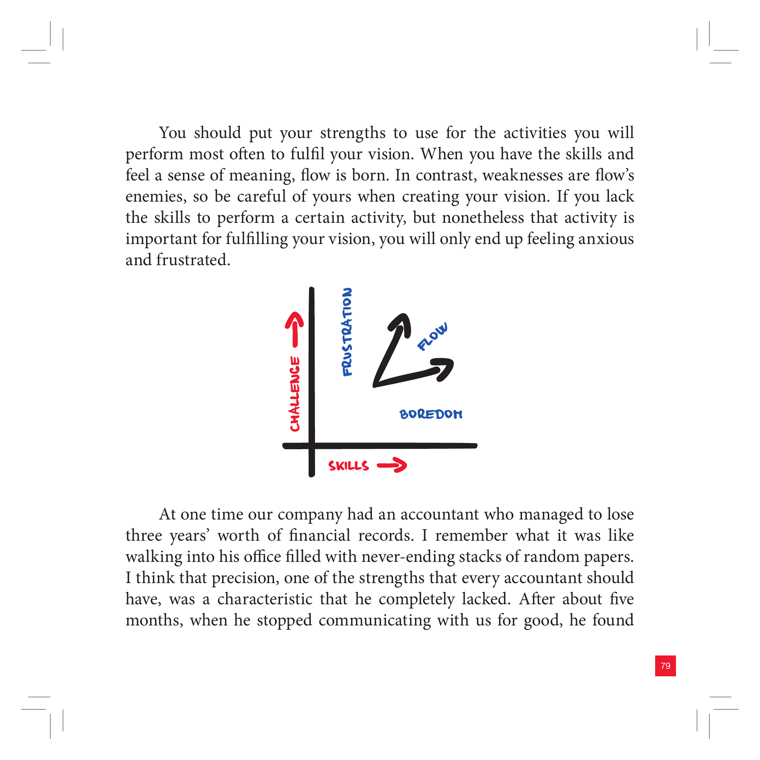
DEPICTS
A hand-drawn 2-axis chart: vertical axis labeled CHALLENGE (red up-arrow), horizontal axis labeled SKILLS (red right-arrow). The upper-left zone is labeled FRUSTRATION, the lower-right zone is labeled BOREDOM, and a black diagonal arrow rising through the middle is labeled FLOW. It maps the classic Csikszentmihalyi flow model where high challenge + low skill = frustration/anxiety, low challenge + high skill = boredom, and balance = flow.
EXPLAIN AS
Full-cover explainer animatable as a build: draw axes, drop in the two failure-mode labels (Frustration / Boredom), then sweep the diagonal Flow arrow up the middle. Good b-roll under VO about matching task difficulty to skill level; supports the Flow-list tool segment.
ANIMATION
Animate the diagonal Flow channel sweeping upward between the two danger zones, with Frustration (top-left) and Boredom (bottom-right) zones fading/pulsing red as the arrow passes the balance line.
CRITICAL ANGLE
Flow as a 2x2 of challenge vs skill is a popular simplification; Csikszentmihalyi's later 8-channel model and replication concerns mean "balance = flow" is more heuristic than measured. The diagram also implies flow is mainly a difficulty-tuning problem, ignoring autotelic personality, intrinsic motivation, and weak experimental control over the state.
Idea: Flow Channel Quadrant (Challenge vs Skills)  (book page 80, area: Outcomes, tool: Flow-list)
What it shows: A hand-drawn 2-axis chart: vertical axis labeled CHALLENGE (red up-arrow), horizontal axis labeled SKILLS (red right-arrow). The upper-left zone is labeled FRUSTRATION, the lower-right zone is labeled BOREDOM, and a black diagonal arrow rising through the middle is labeled FLOW. It maps the classic Csikszentmihalyi flow model where high challenge + low skill = frustration/anxiety, low challenge + high skill = boredom, and balance = flow.
Explain as: Full-cover explainer animatable as a build: draw axes, drop in the two failure-mode labels (Frustration / Boredom), then sweep the diagonal Flow arrow up the middle. Good b-roll under VO about matching task difficulty to skill level; supports the Flow-list tool segment.
Animation/build: Animate the diagonal Flow channel sweeping upward between the two danger zones, with Frustration (top-left) and Boredom (bottom-right) zones fading/pulsing red as the arrow passes the balance line.
CRITICAL (two-state myth→reality): Flow as a 2x2 of challenge vs skill is a popular simplification; Csikszentmihalyi's later 8-channel model and replication concerns mean "balance = flow" is more heuristic than measured. The diagram also implies flow is mainly a difficulty-tuning problem, ignoring autotelic personality, intrinsic motivation, and weak experimental control over the state.
Render 16:9, yt.rya.ae style (near-black, amber accent, Space Grotesk/Inter, clean vector).
23Elephant & Rider: Cognitive Resources Depleting
must
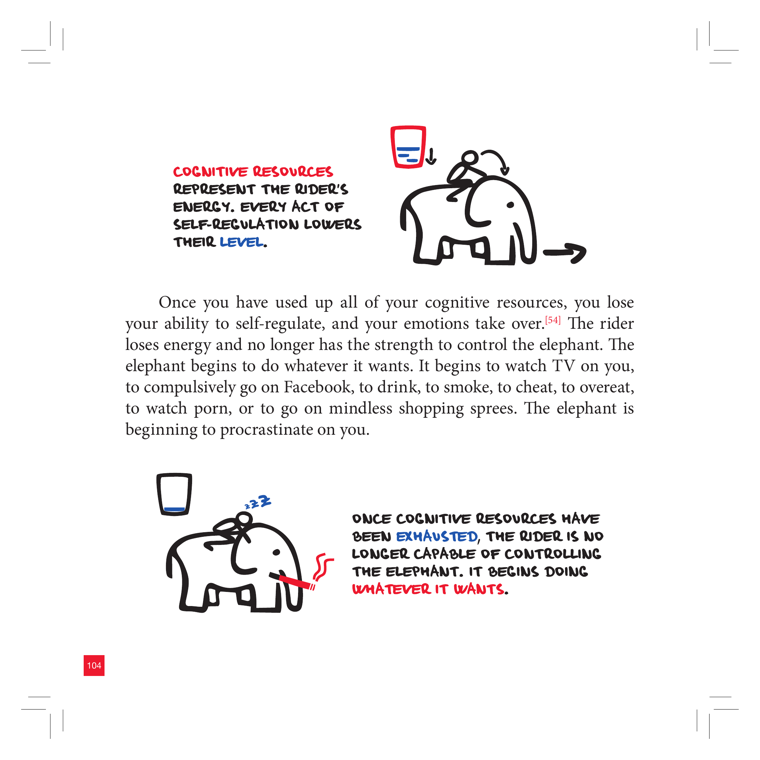
DEPICTS
Two hand-drawn states of the same rider-on-elephant scene, each with a red handwritten callout. Top: a small rider sits on an elephant beside a battery/glass icon shown full; callout reads "Cognitive resources represent the rider's energy. Every act of self-regulation lowers their LEVEL." Bottom: the rider is slumped/asleep (Zzz) on the elephant beside an empty battery icon, with a red squiggle showing the elephant breaking loose; callout reads "Once cognitive resources have been EXHAUSTED, the rider is no longer capable of controlling the elephant. It begins doing WHATEVER IT WANTS."
EXPLAIN AS
Full-cover explainer / two-state before-after build: drop the full-battery rider-in-control state, then dissolve to the empty-battery slumped-rider state to dramatize willpower depletion. Strong b-roll for any segment on self-control running out by evening.
ANIMATION
Animate the battery/glass icon draining from full to empty in sync with the rider slumping over and the elephant straining its leash until it snaps free and charges off-frame.
CRITICAL ANGLE
This is the book's clearest commitment to the willpower-as-a-finite-fuel-tank (ego-depletion) model: the rider runs on a draining battery/glass of cognitive resources. That exact claim is the one that failed to replicate — the 2016 Hagger multi-lab registered replication found near-zero ego-depletion, and Job/Dweck showed the effect depends on whether you BELIEVE willpower is limited. So the depleting-battery icon is the contested visual; Roman can flag that the metaphor is intuitive but the literal "energy meter empties" mechanism is among the most disputed in the book.
Idea: Elephant & Rider: Cognitive Resources Depleting  (book page 105, area: Discipline, tool: —)
What it shows: Two hand-drawn states of the same rider-on-elephant scene, each with a red handwritten callout. Top: a small rider sits on an elephant beside a battery/glass icon shown full; callout reads "Cognitive resources represent the rider's energy. Every act of self-regulation lowers their LEVEL." Bottom: the rider is slumped/asleep (Zzz) on the elephant beside an empty battery icon, with a red squiggle showing the elephant breaking loose; callout reads "Once cognitive resources have been EXHAUSTED, the rider is no longer capable of controlling the elephant. It begins doing WHATEVER IT WANTS."
Explain as: Full-cover explainer / two-state before-after build: drop the full-battery rider-in-control state, then dissolve to the empty-battery slumped-rider state to dramatize willpower depletion. Strong b-roll for any segment on self-control running out by evening.
Animation/build: Animate the battery/glass icon draining from full to empty in sync with the rider slumping over and the elephant straining its leash until it snaps free and charges off-frame.
CRITICAL (two-state myth→reality): This is the book's clearest commitment to the willpower-as-a-finite-fuel-tank (ego-depletion) model: the rider runs on a draining battery/glass of cognitive resources. That exact claim is the one that failed to replicate — the 2016 Hagger multi-lab registered replication found near-zero ego-depletion, and Job/Dweck showed the effect depends on whether you BELIEVE willpower is limited. So the depleting-battery icon is the contested visual; Roman can flag that the metaphor is intuitive but the literal "energy meter empties" mechanism is among the most disputed in the book.
Render 16:9, yt.rya.ae style (near-black, amber accent, Space Grotesk/Inter, clean vector).
24Habit Disruption Recovery Chart
must
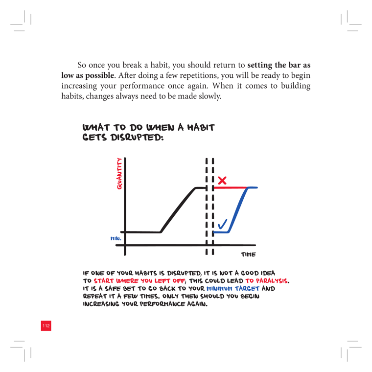
DEPICTS
A hand-drawn line chart titled "What to do when a habit gets disrupted." Y-axis = QUANTITY (with a "MIN." baseline marked in blue), X-axis = TIME. A black curve rises from the minimum, climbs to a plateau, then hits a vertical dashed-line break (the disruption point). From there two paths diverge: a red line jumps straight back to the previous high level marked with a red ✗, and a blue line drops back down to the MIN. baseline and re-climbs gradually, marked with a blue ✓. Caption: don't restart where you left off (paralysis) — go back to your minimum target, repeat a few times, then increase.
EXPLAIN AS
Full-cover explainer: animate the black curve building up, then the disruption break, then race the red (wrong/✗) vs blue (right/✓) recovery paths side by side. Strong comparison visual for the "after a break, restart small" lesson.
ANIMATION
Draw the black habit curve climbing left-to-right; snap a dashed "disruption" break; then fork — red line leaps to the old peak and a red ✗ stamps in while it visibly stalls/flatlines, while the blue line dips to MIN. and re-ramps smoothly with a green-blue ✓ landing on top.
CRITICAL ANGLE
The "set the bar as low as possible" / minimum-target restart advice is consistent with behavior-design research (BJ Fogg's Tiny Habits, implementation-intention literature) and survives a 2026 check — it's a reasonable claim. The contestable part is the implicit framing that returning at full intensity causes "paralysis"; that's a plausible heuristic but presented as a sharp binary (✗ vs ✓) without data — real recovery is a gradient, not two clean curves.
Idea: Habit Disruption Recovery Chart  (book page 113, area: Discipline, tool: Hamster-restart)
What it shows: A hand-drawn line chart titled "What to do when a habit gets disrupted." Y-axis = QUANTITY (with a "MIN." baseline marked in blue), X-axis = TIME. A black curve rises from the minimum, climbs to a plateau, then hits a vertical dashed-line break (the disruption point). From there two paths diverge: a red line jumps straight back to the previous high level marked with a red ✗, and a blue line drops back down to the MIN. baseline and re-climbs gradually, marked with a blue ✓. Caption: don't restart where you left off (paralysis) — go back to your minimum target, repeat a few times, then increase.
Explain as: Full-cover explainer: animate the black curve building up, then the disruption break, then race the red (wrong/✗) vs blue (right/✓) recovery paths side by side. Strong comparison visual for the "after a break, restart small" lesson.
Animation/build: Draw the black habit curve climbing left-to-right; snap a dashed "disruption" break; then fork — red line leaps to the old peak and a red ✗ stamps in while it visibly stalls/flatlines, while the blue line dips to MIN. and re-ramps smoothly with a green-blue ✓ landing on top.
CRITICAL (two-state myth→reality): The "set the bar as low as possible" / minimum-target restart advice is consistent with behavior-design research (BJ Fogg's Tiny Habits, implementation-intention literature) and survives a 2026 check — it's a reasonable claim. The contestable part is the implicit framing that returning at full intensity causes "paralysis"; that's a plausible heuristic but presented as a sharp binary (✗ vs ✓) without data — real recovery is a gradient, not two clean curves.
Render 16:9, yt.rya.ae style (near-black, amber accent, Space Grotesk/Inter, clean vector).
25Breaking Bad Habits Decline Chart
must
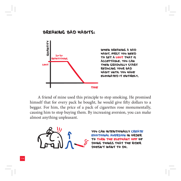
DEPICTS
A hand-drawn line chart titled "Breaking Bad Habits." Y-axis = Quantity, X-axis = Time. A red line starts flat at a high horizontal level labeled "Limit" (annotated "20-30 repetitions"), holds briefly, then declines steeply to zero — the staged reduction of a bad habit until eliminated. Below, an inset shows the elephant metaphor: an elephant tugged on a string with an upward arrow and a red squiggle/spark, captioned that you can intentionally create emotional aversion to "turn the elephant off" from doing things the rider doesn't want.
EXPLAIN AS
Full-cover explainer: animate the red line setting a "limit" cap then ramping down to zero to illustrate the taper-don't-quit-cold method (smoking example). Elephant inset works as a separate b-roll metaphor card on emotional aversion / making a habit unpleasant.
ANIMATION
Draw the red line in: hold flat at the "Limit" line while a counter ticks "20-30 repetitions," then animate it sliding down the ramp to the X-axis as the word "eliminated" lands; the elephant inset fades in with the red aversion spark flicking on.
CRITICAL ANGLE
The "set a limit, then gradually reduce" tapering curve is plausible behaviorally, but the smoking anecdote (pay a beggar $50 per pack) is a single n=1 aversion story dressed as a method — aversion/punishment-based change has weaker, less durable evidence than reinforcement of replacement behaviors, and the clean monotonic decline hides real-world relapse. Worth flagging the gap between the tidy chart and messy quit data.
Idea: Breaking Bad Habits Decline Chart  (book page 115, area: Discipline, tool: Habit-list)
What it shows: A hand-drawn line chart titled "Breaking Bad Habits." Y-axis = Quantity, X-axis = Time. A red line starts flat at a high horizontal level labeled "Limit" (annotated "20-30 repetitions"), holds briefly, then declines steeply to zero — the staged reduction of a bad habit until eliminated. Below, an inset shows the elephant metaphor: an elephant tugged on a string with an upward arrow and a red squiggle/spark, captioned that you can intentionally create emotional aversion to "turn the elephant off" from doing things the rider doesn't want.
Explain as: Full-cover explainer: animate the red line setting a "limit" cap then ramping down to zero to illustrate the taper-don't-quit-cold method (smoking example). Elephant inset works as a separate b-roll metaphor card on emotional aversion / making a habit unpleasant.
Animation/build: Draw the red line in: hold flat at the "Limit" line while a counter ticks "20-30 repetitions," then animate it sliding down the ramp to the X-axis as the word "eliminated" lands; the elephant inset fades in with the red aversion spark flicking on.
CRITICAL (two-state myth→reality): The "set a limit, then gradually reduce" tapering curve is plausible behaviorally, but the smoking anecdote (pay a beggar $50 per pack) is a single n=1 aversion story dressed as a method — aversion/punishment-based change has weaker, less durable evidence than reinforcement of replacement behaviors, and the clean monotonic decline hides real-world relapse. Worth flagging the gap between the tidy chart and messy quit data.
Render 16:9, yt.rya.ae style (near-black, amber accent, Space Grotesk/Inter, clean vector).
26Habit-List Tracker Table
must
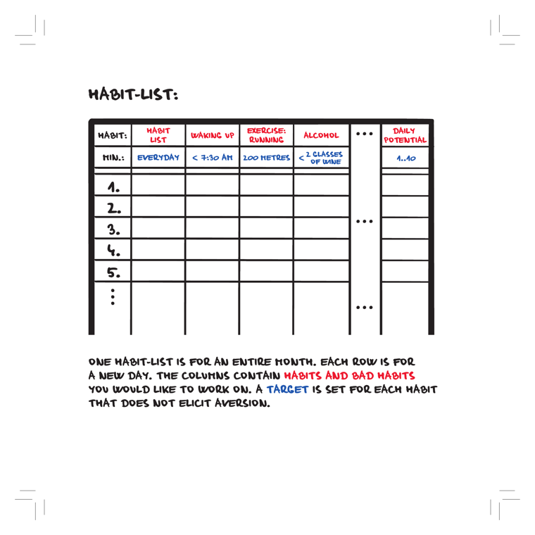
DEPICTS
A hand-drawn blank worksheet titled "HABIT-LIST:" — a grid table for tracking habits over one month. The top-left cell reads "HABIT:" then "MIN.:" (minimum target). Column headers list example habits with their daily targets: Waking Up (< 7:30 AM), Exercise: Running (100 metres), Alcohol (< 2 classes of wine), then "..." for more columns, ending in a "Daily Potential" column (1..10). Rows are numbered 1, 2, 3, 4, 5... — each row = a new day. Caption: one habit-list covers an entire month, columns mix good habits and bad habits, and each habit gets a non-aversive target.
EXPLAIN AS
Full-cover explainer when introducing the Habit-list tool — animate the blank grid then populate it row-by-row (days) to show how a month of habits is tracked and scored. Reusable as a recurring b-roll motif since the book itself repeats it on pages 118/120/122.
ANIMATION
Start with the empty grid drawing itself line-by-line, then fill column headers (habits + targets) sliding in, then days 1-5 stamp in top-to-bottom with checkmarks/values appearing and the Daily Potential score ticking up per row.
CRITICAL ANGLE
The template is a sound habit-tracking instrument, but the "Daily Potential 1..10" self-score column implies a tidy quantification of willpower/discipline that leans on the book's broader willpower-as-depletable-resource framing — contested post-2016 ego-depletion replication failures. Also worth noting the book reuses this same blank table 3x (pp.118/120/122), padding the page count rather than adding new information.
Idea: Habit-List Tracker Table  (book page 118, area: Discipline, tool: Habit-list)
What it shows: A hand-drawn blank worksheet titled "HABIT-LIST:" — a grid table for tracking habits over one month. The top-left cell reads "HABIT:" then "MIN.:" (minimum target). Column headers list example habits with their daily targets: Waking Up (< 7:30 AM), Exercise: Running (100 metres), Alcohol (< 2 classes of wine), then "..." for more columns, ending in a "Daily Potential" column (1..10). Rows are numbered 1, 2, 3, 4, 5... — each row = a new day. Caption: one habit-list covers an entire month, columns mix good habits and bad habits, and each habit gets a non-aversive target.
Explain as: Full-cover explainer when introducing the Habit-list tool — animate the blank grid then populate it row-by-row (days) to show how a month of habits is tracked and scored. Reusable as a recurring b-roll motif since the book itself repeats it on pages 118/120/122.
Animation/build: Start with the empty grid drawing itself line-by-line, then fill column headers (habits + targets) sliding in, then days 1-5 stamp in top-to-bottom with checkmarks/values appearing and the Daily Potential score ticking up per row.
CRITICAL (two-state myth→reality): The template is a sound habit-tracking instrument, but the "Daily Potential 1..10" self-score column implies a tidy quantification of willpower/discipline that leans on the book's broader willpower-as-depletable-resource framing — contested post-2016 ego-depletion replication failures. Also worth noting the book reuses this same blank table 3x (pp.118/120/122), padding the page count rather than adding new information.
Render 16:9, yt.rya.ae style (near-black, amber accent, Space Grotesk/Inter, clean vector).
27Decision Paralysis Fork (A ≠ B → Nothing / C)
must
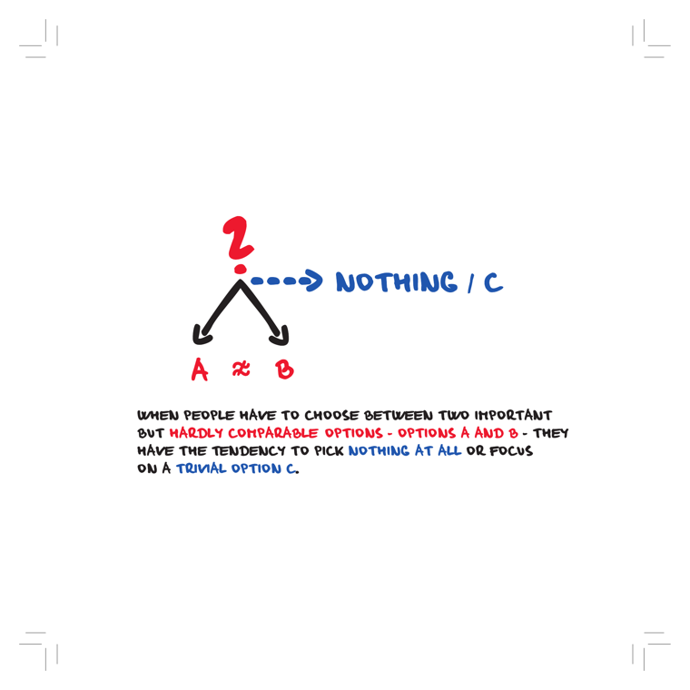
DEPICTS
A hand-drawn branching diagram: a red question mark sits at the top of a fork. Two solid black arrows split down-left and down-right to "A ≠ B" (red), meaning two important but hardly-comparable options. A blue dashed arrow shoots sideways to "NOTHING / C" (blue). Caption: when people must choose between two important but hardly comparable options A and B, they tend to pick nothing at all or focus on a trivial option C.
EXPLAIN AS
Full-cover explainer that animates the choice deadlock: A and B branches light up, the question mark pulses, then the dashed escape arrow slides out to "Nothing / C." Great cold-open metaphor for procrastination-as-avoidance and the paradox of choice; reusable as b-roll whenever Roman describes decision avoidance.
ANIMATION
Question mark wobbles between the A and B arrows (eyes darting), the two black arrows flicker as if undecided, then a blue dashed arrow zips out horizontally to "NOTHING / C" which lands with a relieved-but-hollow bounce.
CRITICAL ANGLE
The cartoon implies decision paralysis is a universal trap, but the real research is more bounded: Iyengar & Lepper's "paradox of choice" / jam study has largely failed to replicate (Scheibehenne 2010 meta-analysis found near-zero average choice-overload effect). Avoidance under hard tradeoffs is real but far more context-dependent than the clean fork suggests — Roman can flag that the diagram overgeneralizes a contested effect.
Idea: Decision Paralysis Fork (A ≠ B → Nothing / C)  (book page 129, area: Discipline, tool: —)
What it shows: A hand-drawn branching diagram: a red question mark sits at the top of a fork. Two solid black arrows split down-left and down-right to "A ≠ B" (red), meaning two important but hardly-comparable options. A blue dashed arrow shoots sideways to "NOTHING / C" (blue). Caption: when people must choose between two important but hardly comparable options A and B, they tend to pick nothing at all or focus on a trivial option C.
Explain as: Full-cover explainer that animates the choice deadlock: A and B branches light up, the question mark pulses, then the dashed escape arrow slides out to "Nothing / C." Great cold-open metaphor for procrastination-as-avoidance and the paradox of choice; reusable as b-roll whenever Roman describes decision avoidance.
Animation/build: Question mark wobbles between the A and B arrows (eyes darting), the two black arrows flicker as if undecided, then a blue dashed arrow zips out horizontally to "NOTHING / C" which lands with a relieved-but-hollow bounce.
CRITICAL (two-state myth→reality): The cartoon implies decision paralysis is a universal trap, but the real research is more bounded: Iyengar & Lepper's "paradox of choice" / jam study has largely failed to replicate (Scheibehenne 2010 meta-analysis found near-zero average choice-overload effect). Avoidance under hard tradeoffs is real but far more context-dependent than the clean fork suggests — Roman can flag that the diagram overgeneralizes a contested effect.
Render 16:9, yt.rya.ae style (near-black, amber accent, Space Grotesk/Inter, clean vector).
30Long To-Do List Breeds Aversion & Decision Paralysis
must
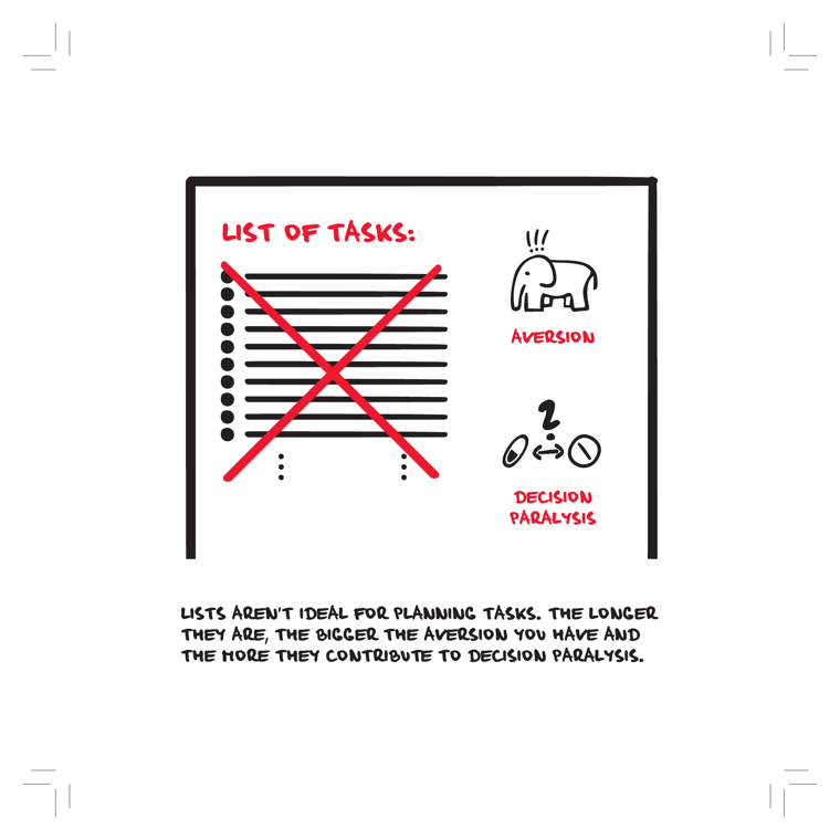
DEPICTS
A hand-drawn frame titled "LIST OF TASKS:" containing a long bulleted list whose every line is struck out by a large red X, trailing into dots (implying it goes on endlessly). To the right, two captioned icons: an annoyed elephant with stress marks labeled "AVERSION", and below it two opposed choices (a checkmark-pill vs. a no-symbol) with a "?" and double-headed arrow between them labeled "DECISION PARALYSIS". Caption: lists aren't ideal for planning — the longer they are, the bigger the aversion and the more decision paralysis.
EXPLAIN AS
Full-cover explainer: animate the red X slashing across an ever-growing list to dramatize why long to-do lists fail, then introduce the book's "To-Do Today" tool as the fix (short, fixed, today-only). Good as a problem-statement card before revealing the solution.
ANIMATION
List lines type in one by one and keep growing; as they pile up, the elephant's stress marks pop and the red X sweeps across the whole stack, then the "?" decision-paralysis icon wobbles between the two opposed buttons — beat ends by collapsing the long list into a tidy 3-item "To-Do Today" card.
CRITICAL ANGLE
The "elephant" (Haidt's emotional system) framing of task-aversion is a useful metaphor, not a mechanism; the stronger, testable claim — that longer lists monotonically raise aversion and cause choice overload / decision paralysis — leans on choice-overload research (Iyengar & Lepper's jam study) that has largely failed to replicate in meta-analysis (Scheibehenne 2010). So "longer list = more paralysis" is plausible folk wisdom but not robustly evidenced; effect depends heavily on context.
Idea: Long To-Do List Breeds Aversion & Decision Paralysis  (book page 138, area: Discipline, tool: To-Do Today)
What it shows: A hand-drawn frame titled "LIST OF TASKS:" containing a long bulleted list whose every line is struck out by a large red X, trailing into dots (implying it goes on endlessly). To the right, two captioned icons: an annoyed elephant with stress marks labeled "AVERSION", and below it two opposed choices (a checkmark-pill vs. a no-symbol) with a "?" and double-headed arrow between them labeled "DECISION PARALYSIS". Caption: lists aren't ideal for planning — the longer they are, the bigger the aversion and the more decision paralysis.
Explain as: Full-cover explainer: animate the red X slashing across an ever-growing list to dramatize why long to-do lists fail, then introduce the book's "To-Do Today" tool as the fix (short, fixed, today-only). Good as a problem-statement card before revealing the solution.
Animation/build: List lines type in one by one and keep growing; as they pile up, the elephant's stress marks pop and the red X sweeps across the whole stack, then the "?" decision-paralysis icon wobbles between the two opposed buttons — beat ends by collapsing the long list into a tidy 3-item "To-Do Today" card.
CRITICAL (two-state myth→reality): The "elephant" (Haidt's emotional system) framing of task-aversion is a useful metaphor, not a mechanism; the stronger, testable claim — that longer lists monotonically raise aversion and cause choice overload / decision paralysis — leans on choice-overload research (Iyengar & Lepper's jam study) that has largely failed to replicate in meta-analysis (Scheibehenne 2010). So "longer list = more paralysis" is plausible folk wisdom but not robustly evidenced; effect depends heavily on context.
Render 16:9, yt.rya.ae style (near-black, amber accent, Space Grotesk/Inter, clean vector).
31One Large Task vs. Three Small Tasks (Elephant Split)
must
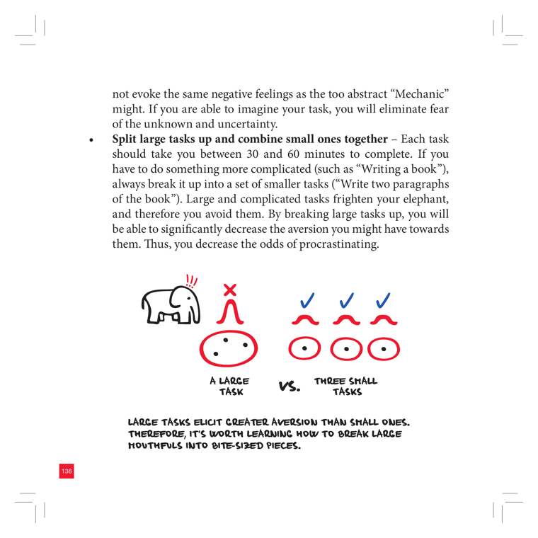
DEPICTS
A hand-drawn comparison. On the left: a small elephant icon beside a single big worried/frowning face marked with a red X and a red exclamation "!!" above — labeled "A LARGE TASK." On the right: three small smiling faces, each topped with a blue check mark — labeled "THREE SMALL TASKS." A "vs." sits between them. Caption below: "Large tasks elicit greater aversion than small ones. Therefore, it's worth learning how to break large mouthfuls into bite-sized pieces."
EXPLAIN AS
Full-cover explainer / side-by-side comparison: red-X frowning "big task" face morphs/splits into three green-check smiling small faces. Great as a visual punchline when Roman explains task-chunking, or as recurring b-roll whenever the "elephant" (emotional brain) appears.
ANIMATION
Single big frowning face with red X and "!!" shakes nervously, then a scissors/dashed-line wipe splits it into three small faces that pop in one-by-one, each stamping a blue check with a satisfying tick — frown flips to smile on each.
CRITICAL ANGLE
The chunking advice itself is solid and survives a science-check (it maps onto goal-gradient and reducing task aversion / implementation-intentions research). The contestable part is the surrounding "elephant" framing — the book leans on the Haidt elephant-and-rider metaphor and on motivation/willpower models that are softer than presented; the claim "large tasks frighten your elephant" is a vivid story, not a measured mechanism. Roman can endorse the practical tip while flagging that the emotional-brain causality is metaphor, not evidence.
Idea: One Large Task vs. Three Small Tasks (Elephant Split)  (book page 139, area: Discipline, tool: To-Do Today)
What it shows: A hand-drawn comparison. On the left: a small elephant icon beside a single big worried/frowning face marked with a red X and a red exclamation "!!" above — labeled "A LARGE TASK." On the right: three small smiling faces, each topped with a blue check mark — labeled "THREE SMALL TASKS." A "vs." sits between them. Caption below: "Large tasks elicit greater aversion than small ones. Therefore, it's worth learning how to break large mouthfuls into bite-sized pieces."
Explain as: Full-cover explainer / side-by-side comparison: red-X frowning "big task" face morphs/splits into three green-check smiling small faces. Great as a visual punchline when Roman explains task-chunking, or as recurring b-roll whenever the "elephant" (emotional brain) appears.
Animation/build: Single big frowning face with red X and "!!" shakes nervously, then a scissors/dashed-line wipe splits it into three small faces that pop in one-by-one, each stamping a blue check with a satisfying tick — frown flips to smile on each.
CRITICAL (two-state myth→reality): The chunking advice itself is solid and survives a science-check (it maps onto goal-gradient and reducing task aversion / implementation-intentions research). The contestable part is the surrounding "elephant" framing — the book leans on the Haidt elephant-and-rider metaphor and on motivation/willpower models that are softer than presented; the claim "large tasks frighten your elephant" is a vivid story, not a measured mechanism. Roman can endorse the practical tip while flagging that the emotional-brain causality is metaphor, not evidence.
Render 16:9, yt.rya.ae style (near-black, amber accent, Space Grotesk/Inter, clean vector).
32To-Do Today Board (Scattered Tasks)
must
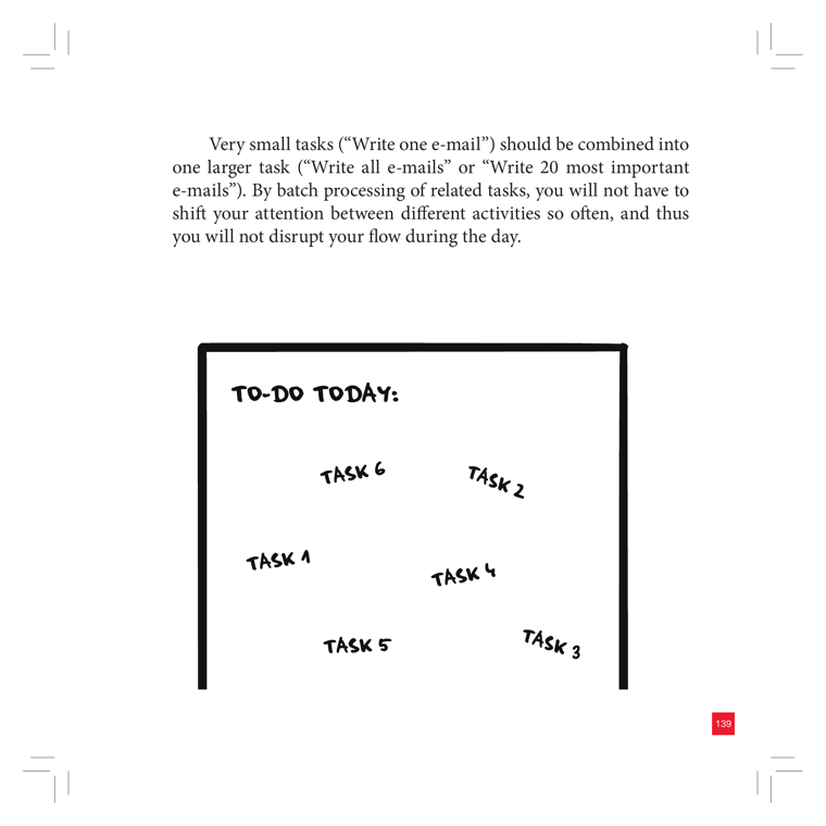
DEPICTS
A hand-drawn whiteboard/sheet with a bold black border and the handwritten heading "TO-DO TODAY:". Inside, six items labeled TASK 1 through TASK 6 are scattered randomly across the board at varying positions and slight rotations, with no list order, columns, or priority structure. The placement is deliberately chaotic rather than a neat top-to-bottom list. Page number 139 in the red corner tab.
EXPLAIN AS
Full-cover explainer of the "To-Do Today" tool: start with the scattered tasks (the messy default), then animate them snapping into a clean prioritized single-day list to show the method's value. Good recurring b-roll since the book reuses it across pages 140-143,169.
ANIMATION
Tasks 1-6 start scattered and jittering at random angles, then on a snap they fly into a tidy vertical numbered list (1 at top) inside the same board, each gaining a checkbox — visualizing "chaos to a single focused day-list."
CRITICAL ANGLE
The image is a neutral worksheet metaphor, so no contested neuroscience claim to debunk; the critical angle is method-level — a flat 6-task daily list ignores prioritization weight (it's not Eisenhower/MITs) and the book repeating the same blank board across 5 pages pads the page count rather than adding new evidence. Roman can flag the "scatter then list" as cosmetic vs. genuine prioritization research.
Idea: To-Do Today Board (Scattered Tasks)  (book page 140, area: Discipline, tool: To-Do Today)
What it shows: A hand-drawn whiteboard/sheet with a bold black border and the handwritten heading "TO-DO TODAY:". Inside, six items labeled TASK 1 through TASK 6 are scattered randomly across the board at varying positions and slight rotations, with no list order, columns, or priority structure. The placement is deliberately chaotic rather than a neat top-to-bottom list. Page number 139 in the red corner tab.
Explain as: Full-cover explainer of the "To-Do Today" tool: start with the scattered tasks (the messy default), then animate them snapping into a clean prioritized single-day list to show the method's value. Good recurring b-roll since the book reuses it across pages 140-143,169.
Animation/build: Tasks 1-6 start scattered and jittering at random angles, then on a snap they fly into a tidy vertical numbered list (1 at top) inside the same board, each gaining a checkbox — visualizing "chaos to a single focused day-list."
CRITICAL (two-state myth→reality): The image is a neutral worksheet metaphor, so no contested neuroscience claim to debunk; the critical angle is method-level — a flat 6-task daily list ignores prioritization weight (it's not Eisenhower/MITs) and the book repeating the same blank board across 5 pages pads the page count rather than adding new evidence. Roman can flag the "scatter then list" as cosmetic vs. genuine prioritization research.
Render 16:9, yt.rya.ae style (near-black, amber accent, Space Grotesk/Inter, clean vector).
37Hamster Analysis Worksheet
must
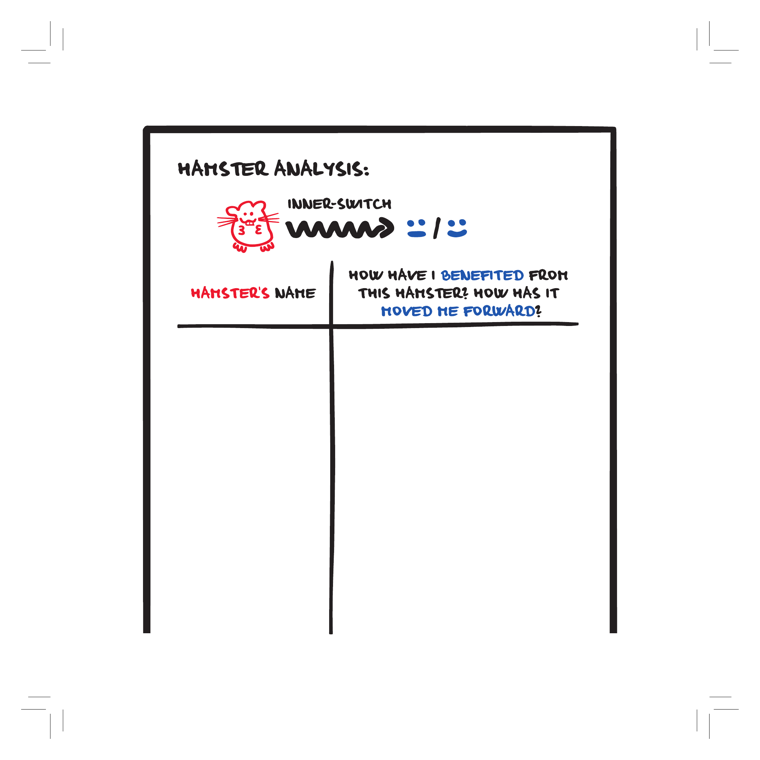
DEPICTS
A hand-drawn worksheet titled "HAMSTER ANALYSIS:" with the Inner-switch icon (a red hamster, a black squiggle-arrow, and a frown/smile face pair). Below is a two-column table: left column header "HAMSTER'S NAME" (red), right column header "How have I BENEFITED from this hamster? How has it MOVED ME FORWARD?" Both columns are blank, ready to be filled in by the reader.
EXPLAIN AS
Full-cover explainer: show the blank two-column worksheet, then fill rows live on screen (e.g. "The Comparison Hamster" / "It pushed me to raise my standards") to demonstrate the reframing exercise — turning a self-sabotaging inner voice into something that moved you forward.
ANIMATION
Hamster icon spins on its wheel (the squiggle), then the frown flips to a smile; the two empty columns slide in, and handwritten example rows type themselves into "name" / "how it helped" cells.
CRITICAL ANGLE
The "hamster" is the book's metaphor for an automatic negative thought-loop; reframing it as beneficial is essentially classic CBT cognitive reappraisal — solid and evidence-based. But the worksheet's premise that every self-critical inner voice has genuinely "moved you forward" risks toxic-positivity bias: forcing a silver lining onto rumination or anxiety can invalidate when those loops are simply harmful and need stopping, not reframing.
Idea: Hamster Analysis Worksheet  (book page 199, area: Discipline, tool: Hamster-restart)
What it shows: A hand-drawn worksheet titled "HAMSTER ANALYSIS:" with the Inner-switch icon (a red hamster, a black squiggle-arrow, and a frown/smile face pair). Below is a two-column table: left column header "HAMSTER'S NAME" (red), right column header "How have I BENEFITED from this hamster? How has it MOVED ME FORWARD?" Both columns are blank, ready to be filled in by the reader.
Explain as: Full-cover explainer: show the blank two-column worksheet, then fill rows live on screen (e.g. "The Comparison Hamster" / "It pushed me to raise my standards") to demonstrate the reframing exercise — turning a self-sabotaging inner voice into something that moved you forward.
Animation/build: Hamster icon spins on its wheel (the squiggle), then the frown flips to a smile; the two empty columns slide in, and handwritten example rows type themselves into "name" / "how it helped" cells.
CRITICAL (two-state myth→reality): The "hamster" is the book's metaphor for an automatic negative thought-loop; reframing it as beneficial is essentially classic CBT cognitive reappraisal — solid and evidence-based. But the worksheet's premise that every self-critical inner voice has genuinely "moved you forward" risks toxic-positivity bias: forcing a silver lining onto rumination or anxiety can invalidate when those loops are simply harmful and need stopping, not reframing.
Render 16:9, yt.rya.ae style (near-black, amber accent, Space Grotesk/Inter, clean vector).
38Flow-List Worksheet
must
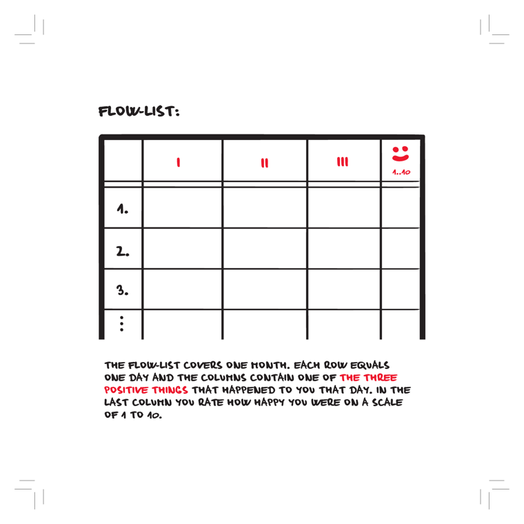
DEPICTS
A hand-drawn blank worksheet table titled "Flow-list:". Rows are numbered 1, 2, 3... (each row = one day of a month). Three columns headed with red tally marks I, II, III hold the three positive things that happened that day; a fourth column headed with a red smiley and "1..10" rates daily happiness. Caption explains it covers one month, one row per day, three positives plus a 1-10 happiness rating.
EXPLAIN AS
Full-cover explainer: animate the blank grid filling in three positives + happiness scores across days, illustrating the gratitude-journaling tool. Good as the canonical reference when Roman demos how to actually keep a Flow-list.
ANIMATION
Start with the empty grid, then row by row let handwritten positives drop into columns I/II/III while the smiley column ticks up a rising 1-10 score and a small mood line-graph grows alongside, showing a month of accumulating positivity.
CRITICAL ANGLE
It's a "three good things" gratitude journal rebranded as a Flow-list. The core gratitude-journaling effect is one of positive psychology's better-replicated interventions, but effect sizes are modest and shrink in higher-quality trials; "flow" (Csikszentmihalyi) is a separate construct and logging three positives doesn't actually train flow, so the naming oversells the mechanism.
Idea: Flow-List Worksheet  (book page 202, area: Discipline, tool: Flow-list)
What it shows: A hand-drawn blank worksheet table titled "Flow-list:". Rows are numbered 1, 2, 3... (each row = one day of a month). Three columns headed with red tally marks I, II, III hold the three positive things that happened that day; a fourth column headed with a red smiley and "1..10" rates daily happiness. Caption explains it covers one month, one row per day, three positives plus a 1-10 happiness rating.
Explain as: Full-cover explainer: animate the blank grid filling in three positives + happiness scores across days, illustrating the gratitude-journaling tool. Good as the canonical reference when Roman demos how to actually keep a Flow-list.
Animation/build: Start with the empty grid, then row by row let handwritten positives drop into columns I/II/III while the smiley column ticks up a rising 1-10 score and a small mood line-graph grows alongside, showing a month of accumulating positivity.
CRITICAL (two-state myth→reality): It's a "three good things" gratitude journal rebranded as a Flow-list. The core gratitude-journaling effect is one of positive psychology's better-replicated interventions, but effect sizes are modest and shrink in higher-quality trials; "flow" (Csikszentmihalyi) is a separate construct and logging three positives doesn't actually train flow, so the naming oversells the mechanism.
Render 16:9, yt.rya.ae style (near-black, amber accent, Space Grotesk/Inter, clean vector).
39Flow vs Hamster Spirals (Tipping Point)
must
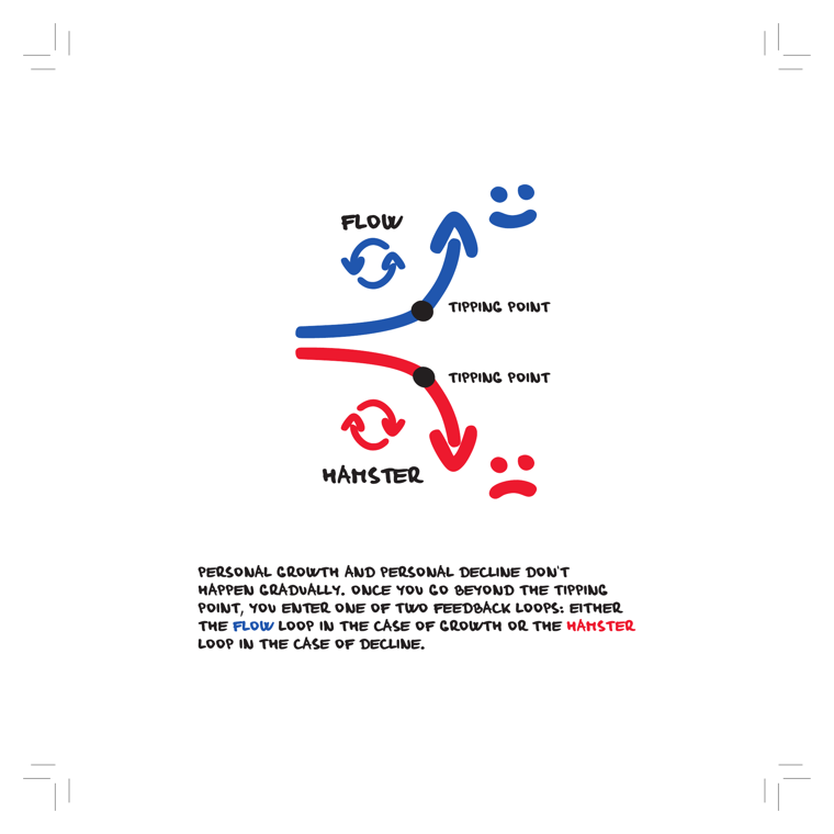
DEPICTS
Two hand-drawn curved paths diverge from a horizontal baseline. The upper blue path rises after a black dot labeled "TIPPING POINT," arcing into an upward arrow toward a smiley face, with a circular two-arrow loop icon labeled "FLOW." The lower red path drops after its own black dot labeled "TIPPING POINT," curving into a downward arrow toward a frowning face, with a circular loop icon labeled "HAMSTER." Caption: growth and decline are non-gradual; past the tipping point you enter either the FLOW (growth) or HAMSTER (decline) feedback loop.
EXPLAIN AS
Full-cover explainer and recurring motif: this is the book's central thesis diagram (repeated on 8 pages), so use it as an animated anchor that returns each time Roman transitions between the growth-loop and decline-loop halves of the review. Good as a chaptering device.
ANIMATION
Start with both faint paths at the baseline; on a beat, light the blue path climbing through its tipping-point dot into the smiley while the FLOW loop arrows spin clockwise — then mirror it, dropping the red path through its tipping point into the frown with the HAMSTER loop spinning, ending on the fork to let Roman pause on "which loop are you in?"
CRITICAL ANGLE
The "tipping point + self-reinforcing feedback loop" framing dramatizes behavior change as a binary, near-irreversible bifurcation. In reality habit/behavior change is more continuous and reversible; lapses don't lock you into a downward spiral. The two-attractor model is a motivational metaphor, not an established dynamical-systems finding for personal productivity — worth flagging as rhetorically tidy but empirically loose. Since the book reprints it 8 times, note the repetition as persuasion-by-repetition rather than added evidence.
Idea: Flow vs Hamster Spirals (Tipping Point)  (book page 208, area: Meta/System, tool: —)
What it shows: Two hand-drawn curved paths diverge from a horizontal baseline. The upper blue path rises after a black dot labeled "TIPPING POINT," arcing into an upward arrow toward a smiley face, with a circular two-arrow loop icon labeled "FLOW." The lower red path drops after its own black dot labeled "TIPPING POINT," curving into a downward arrow toward a frowning face, with a circular loop icon labeled "HAMSTER." Caption: growth and decline are non-gradual; past the tipping point you enter either the FLOW (growth) or HAMSTER (decline) feedback loop.
Explain as: Full-cover explainer and recurring motif: this is the book's central thesis diagram (repeated on 8 pages), so use it as an animated anchor that returns each time Roman transitions between the growth-loop and decline-loop halves of the review. Good as a chaptering device.
Animation/build: Start with both faint paths at the baseline; on a beat, light the blue path climbing through its tipping-point dot into the smiley while the FLOW loop arrows spin clockwise — then mirror it, dropping the red path through its tipping point into the frown with the HAMSTER loop spinning, ending on the fork to let Roman pause on "which loop are you in?"
CRITICAL (two-state myth→reality): The "tipping point + self-reinforcing feedback loop" framing dramatizes behavior change as a binary, near-irreversible bifurcation. In reality habit/behavior change is more continuous and reversible; lapses don't lock you into a downward spiral. The two-attractor model is a motivational metaphor, not an established dynamical-systems finding for personal productivity — worth flagging as rhetorically tidy but empirically loose. Since the book reprints it 8 times, note the repetition as persuasion-by-repetition rather than added evidence.
Render 16:9, yt.rya.ae style (near-black, amber accent, Space Grotesk/Inter, clean vector).
48A Meeting With Yourself (Worksheet)
must
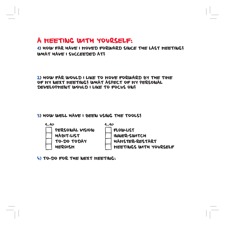
DEPICTS
A blank "A Meeting With Yourself" worksheet with a red hand-drawn header. Four numbered prompts: (1) How far have I moved forward since the last meeting? What have I succeeded at? (2) How far would I like to move forward by the time of my next meeting? What aspect of personal development to focus on? (3) How well have I been using the tools? — followed by a 1..10 self-rating column listing all eight tools (Personal Vision, Habit-list, To-Do Today, Heroism, Flow-list, Inner-switch, Hamster-restart, Meetings With Yourself) each with a small empty score box. (4) To-do for the next meeting. Mostly white space left for handwritten answers.
EXPLAIN AS
Full-cover explainer to close the video: present it as the book's "control panel" — a recurring retrospective where you review progress and self-score every other tool 1..10. Animate the eight tool names dropping into the rating column to visually tie the whole 8-tool system together. Works as a downloadable lead-magnet / call-to-action template.
ANIMATION
Eight tool labels fly in one by one and snap into the "1..10" rating column, each empty box filling with a handwritten score, then the four question prompts fade up in sequence like an agenda being checked off.
CRITICAL ANGLE
Self-report 1..10 ratings on your own discipline are exactly where bias lives — people overestimate adherence, and the lowest performers self-score highest (Dunning-Kruger territory), so the worksheet's feedback loop can quietly reinforce delusion rather than correct it. There's also no evidence a periodic self-meeting beats simpler external accountability; it risks becoming productivity theatre. The honest framing: useful as a structured reflection ritual, not a validated measurement instrument.
Idea: A Meeting With Yourself (Worksheet)  (book page 236, area: Meta/System, tool: Meeting With Myself)
What it shows: A blank "A Meeting With Yourself" worksheet with a red hand-drawn header. Four numbered prompts: (1) How far have I moved forward since the last meeting? What have I succeeded at? (2) How far would I like to move forward by the time of my next meeting? What aspect of personal development to focus on? (3) How well have I been using the tools? — followed by a 1..10 self-rating column listing all eight tools (Personal Vision, Habit-list, To-Do Today, Heroism, Flow-list, Inner-switch, Hamster-restart, Meetings With Yourself) each with a small empty score box. (4) To-do for the next meeting. Mostly white space left for handwritten answers.
Explain as: Full-cover explainer to close the video: present it as the book's "control panel" — a recurring retrospective where you review progress and self-score every other tool 1..10. Animate the eight tool names dropping into the rating column to visually tie the whole 8-tool system together. Works as a downloadable lead-magnet / call-to-action template.
Animation/build: Eight tool labels fly in one by one and snap into the "1..10" rating column, each empty box filling with a handwritten score, then the four question prompts fade up in sequence like an agenda being checked off.
CRITICAL (two-state myth→reality): Self-report 1..10 ratings on your own discipline are exactly where bias lives — people overestimate adherence, and the lowest performers self-score highest (Dunning-Kruger territory), so the worksheet's feedback loop can quietly reinforce delusion rather than correct it. There's also no evidence a periodic self-meeting beats simpler external accountability; it risks becoming productivity theatre. The honest framing: useful as a structured reflection ritual, not a validated measurement instrument.
Render 16:9, yt.rya.ae style (near-black, amber accent, Space Grotesk/Inter, clean vector).
50Theory Recap: Future Magnet & Present Self
must
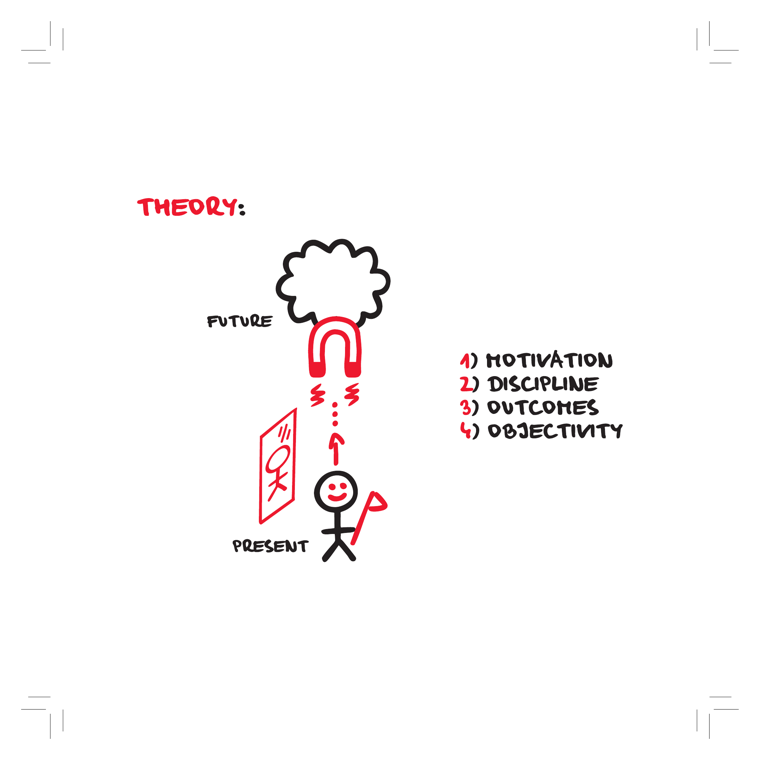
DEPICTS
A hand-drawn recap titled "THEORY:". At top, a thought-cloud labeled "FUTURE" with a red horseshoe magnet hanging below it, emitting red spark/wave symbols and a dotted line with an upward arrow. At bottom, a smiling stick figure labeled "PRESENT" holds a flag, standing beside a red-framed mirror/poster showing a small figure. To the right is a numbered red/black list of the four areas: 1) Motivation, 2) Discipline, 3) Outcomes, 4) Objectivity.
EXPLAIN AS
Full-cover recap explainer / chapter summary slide: use as the "here's the whole system in one picture" beat, animating the four-area list in while the present-self is magnetically pulled toward the future vision. Good transition card between the book's parts.
ANIMATION
Magnet pulses red, the dotted line draws upward and the present stick-figure is tugged toward the FUTURE cloud; the four numbered areas (Motivation→Discipline→Outcomes→Objectivity) snap in one by one in sync with each pull.
CRITICAL ANGLE
The metaphor frames a vivid future vision as a literal "magnet" that pulls behavior — but future-self pull is a motivational aid, not a mechanism; intention-behavior gap research shows vision alone rarely closes the gap without implementation intentions/environment design. The tidy 4-area sequence also implies a clean causal pipeline that the underlying willpower/ego-depletion claims (contested post-2016 replication failures) don't fully support.
Idea: Theory Recap: Future Magnet & Present Self  (book page 239, area: Meta/System, tool: —)
What it shows: A hand-drawn recap titled "THEORY:". At top, a thought-cloud labeled "FUTURE" with a red horseshoe magnet hanging below it, emitting red spark/wave symbols and a dotted line with an upward arrow. At bottom, a smiling stick figure labeled "PRESENT" holds a flag, standing beside a red-framed mirror/poster showing a small figure. To the right is a numbered red/black list of the four areas: 1) Motivation, 2) Discipline, 3) Outcomes, 4) Objectivity.
Explain as: Full-cover recap explainer / chapter summary slide: use as the "here's the whole system in one picture" beat, animating the four-area list in while the present-self is magnetically pulled toward the future vision. Good transition card between the book's parts.
Animation/build: Magnet pulses red, the dotted line draws upward and the present stick-figure is tugged toward the FUTURE cloud; the four numbered areas (Motivation→Discipline→Outcomes→Objectivity) snap in one by one in sync with each pull.
CRITICAL (two-state myth→reality): The metaphor frames a vivid future vision as a literal "magnet" that pulls behavior — but future-self pull is a motivational aid, not a mechanism; intention-behavior gap research shows vision alone rarely closes the gap without implementation intentions/environment design. The tidy 4-area sequence also implies a clean causal pipeline that the underlying willpower/ego-depletion claims (contested post-2016 replication failures) don't fully support.
Render 16:9, yt.rya.ae style (near-black, amber accent, Space Grotesk/Inter, clean vector).
53Objectivity–Good–Heroism Triangle
must
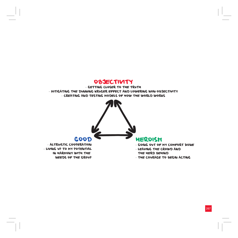
DEPICTS
A hand-drawn triangle with double-headed arrows along each edge connecting three labeled vertices. Top (red) = OBJECTIVITY: getting closer to the truth, mitigating the Dunning-Kruger effect and lowering non-objectivity, creating and testing models of how the world works. Bottom-left (blue) = GOOD: altruistic cooperation, living up to my potential in harmony with the needs of the group. Bottom-right (green) = HEROISM: going out of my comfort zone, leaving the crowd and the herd behind, the courage to begin acting. The bidirectional arrows imply the three reinforce each other.
EXPLAIN AS
Full-cover explainer: animate the triangle as the book's "meaningful life" north-star model, then drill into the Objectivity vertex (it's the cap of the whole system). Good as a recurring framing graphic to tie the three pillars together before contrasting them with the practical tools.
ANIMATION
Draw the three vertices one at a time, then ping each bidirectional arrow back and forth to show mutual reinforcement; finally zoom into Objectivity and overlay a flickering/glitching Dunning-Kruger curve that gets a red "contested" stamp for Roman's critical beat.
CRITICAL ANGLE
The Objectivity vertex explicitly invokes the Dunning-Kruger effect as a real thing to "mitigate" — but the canonical DK curve is heavily contested (much of the original effect is reproducible by regression-to-the-mean and noise; the dramatic "peak of Mount Stupid" graphic is a popularization, not the data). The book treats DK as settled fact. Also, the triangle presents Objectivity/Good/Heroism as a clean, mutually-reinforcing system, which is more an aspirational value-diagram than an empirical claim.
Idea: Objectivity–Good–Heroism Triangle  (book page 268, area: Objectivity, tool: —)
What it shows: A hand-drawn triangle with double-headed arrows along each edge connecting three labeled vertices. Top (red) = OBJECTIVITY: getting closer to the truth, mitigating the Dunning-Kruger effect and lowering non-objectivity, creating and testing models of how the world works. Bottom-left (blue) = GOOD: altruistic cooperation, living up to my potential in harmony with the needs of the group. Bottom-right (green) = HEROISM: going out of my comfort zone, leaving the crowd and the herd behind, the courage to begin acting. The bidirectional arrows imply the three reinforce each other.
Explain as: Full-cover explainer: animate the triangle as the book's "meaningful life" north-star model, then drill into the Objectivity vertex (it's the cap of the whole system). Good as a recurring framing graphic to tie the three pillars together before contrasting them with the practical tools.
Animation/build: Draw the three vertices one at a time, then ping each bidirectional arrow back and forth to show mutual reinforcement; finally zoom into Objectivity and overlay a flickering/glitching Dunning-Kruger curve that gets a red "contested" stamp for Roman's critical beat.
CRITICAL (two-state myth→reality): The Objectivity vertex explicitly invokes the Dunning-Kruger effect as a real thing to "mitigate" — but the canonical DK curve is heavily contested (much of the original effect is reproducible by regression-to-the-mean and noise; the dramatic "peak of Mount Stupid" graphic is a popularization, not the data). The book treats DK as settled fact. Also, the triangle presents Objectivity/Good/Heroism as a clean, mutually-reinforcing system, which is more an aspirational value-diagram than an empirical claim.
Render 16:9, yt.rya.ae style (near-black, amber accent, Space Grotesk/Inter, clean vector).
05Crossing the Procrastination Chasm to a Fulfilled Life
nice
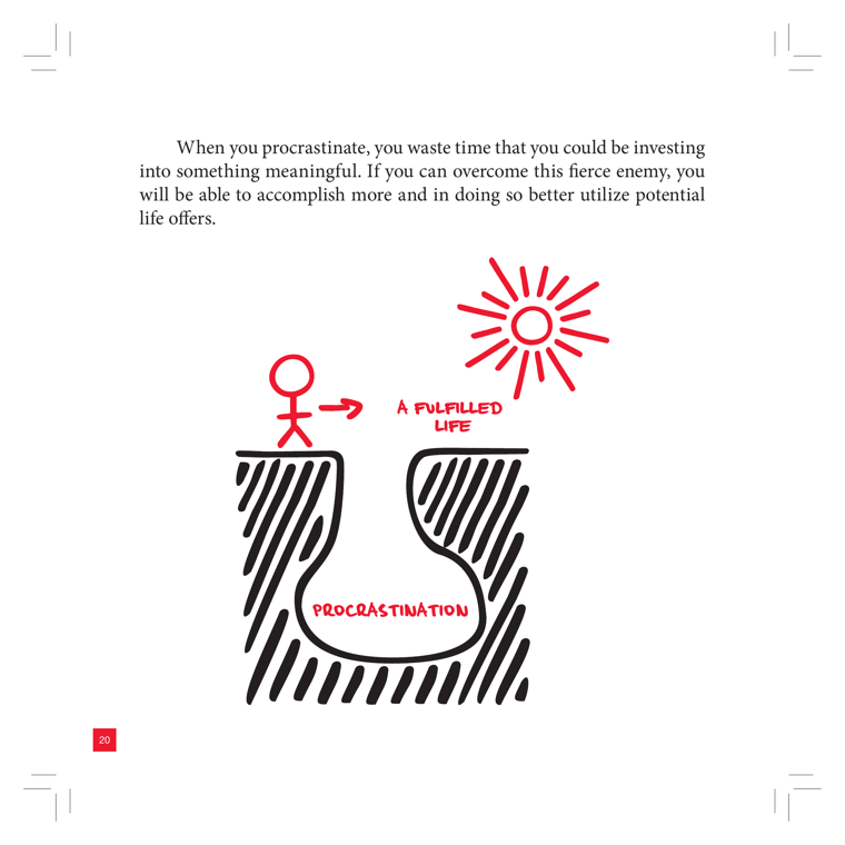
DEPICTS
A red stick figure stands on the left edge of a deep, hatched chasm labeled "PROCRASTINATION" at its bottom, pointing with an arrow across the gap toward a hand-drawn red radiating sun labeled "A FULFILLED LIFE" on the far right. The body text above frames procrastination as a "fierce enemy" you must overcome to invest time in something meaningful. It is a single dominant metaphor illustration spanning the lower two-thirds of the page (despite the filename's "fire-and-rubbish-bin" hint, the art is a figure-at-a-chasm reaching toward a sun).
EXPLAIN AS
Full-cover opening explainer / chapter intro b-roll: animate the figure deciding whether to cross the gap, with the sun as the payoff. Good emotional cold-open establishing the stakes of the whole book before introducing the 4-area system.
ANIMATION
Stick figure crouches, the red arrow extends into a leap arc, and as it lands the procrastination chasm darkens/fills while the sun's rays draw outward one by one and brighten to full bloom.
CRITICAL ANGLE
The visual frames procrastination as a single external "fierce enemy" you defeat in one heroic leap toward a sunny payoff. 2026 behavioral science treats procrastination less as an enemy to conquer and more as emotion-regulation / mood-repair (Sirois & Pychyl) — a recurring management problem, not a one-time chasm-crossing. The single-jump-to-bliss framing oversells a binary win.
Idea: Crossing the Procrastination Chasm to a Fulfilled Life  (book page 21, area: Motivation, tool: —)
What it shows: A red stick figure stands on the left edge of a deep, hatched chasm labeled "PROCRASTINATION" at its bottom, pointing with an arrow across the gap toward a hand-drawn red radiating sun labeled "A FULFILLED LIFE" on the far right. The body text above frames procrastination as a "fierce enemy" you must overcome to invest time in something meaningful. It is a single dominant metaphor illustration spanning the lower two-thirds of the page (despite the filename's "fire-and-rubbish-bin" hint, the art is a figure-at-a-chasm reaching toward a sun).
Explain as: Full-cover opening explainer / chapter intro b-roll: animate the figure deciding whether to cross the gap, with the sun as the payoff. Good emotional cold-open establishing the stakes of the whole book before introducing the 4-area system.
Animation/build: Stick figure crouches, the red arrow extends into a leap arc, and as it lands the procrastination chasm darkens/fills while the sun's rays draw outward one by one and brighten to full bloom.
CRITICAL (two-state myth→reality): The visual frames procrastination as a single external "fierce enemy" you defeat in one heroic leap toward a sunny payoff. 2026 behavioral science treats procrastination less as an enemy to conquer and more as emotion-regulation / mood-repair (Sirois & Pychyl) — a recurring management problem, not a one-time chasm-crossing. The single-jump-to-bliss framing oversells a binary win.
Render 16:9, yt.rya.ae style (near-black, amber accent, Space Grotesk/Inter, clean vector).
08Life: A Limited Amount of Time
nice
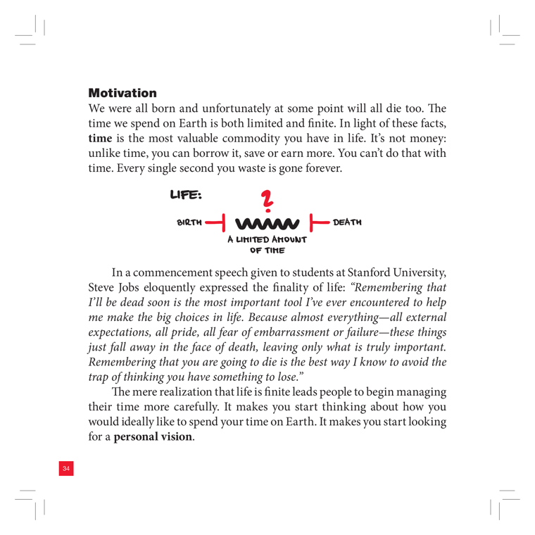
DEPICTS
A hand-drawn doodle captioned "LIFE:" with a horizontal timeline running between two bracket end-caps labeled "BIRTH" (left) and "DEATH" (right). Between them is a jagged zig-zag line representing the lived span, with a red question mark hovering above its midpoint. Beneath, the caption reads "A LIMITED AMOUNT OF TIME." It illustrates the Motivation chapter's opening argument that time is finite and is the most valuable, non-renewable commodity.
EXPLAIN AS
Full-cover explainer or b-roll under the cold-open about mortality/finite time; the red "?" can punch in as the unknown length of one's lifeline. Pairs naturally with the Steve Jobs Stanford "remember you'll die" quote on the same spread, and as a lead-in to the Personal Vision tool.
ANIMATION
Draw-on the timeline left-to-right from BIRTH, the zig-zag scribbling itself in like a heartbeat/EKG, then the red "?" pops and pulses above the midpoint as the DEATH cap snaps in — implying you don't know where on the line you are.
CRITICAL ANGLE
The visual claim (life is finite, so time is your scarcest asset) survives a science-check fine — it's a values/motivational framing, not an empirical model. Roman's critical angle is rhetorical, not factual: this is classic memento-mori / mortality-salience persuasion (à la Jobs' speech), which research shows can spur either constructive planning OR avoidance and anxiety; the book sells only the productive half. The "?" implying you should optimize every second can also tip into the hustle-culture / time-guilt the book elsewhere claims to cure.
Idea: Life: A Limited Amount of Time  (book page 35, area: Motivation, tool: Personal Vision)
What it shows: A hand-drawn doodle captioned "LIFE:" with a horizontal timeline running between two bracket end-caps labeled "BIRTH" (left) and "DEATH" (right). Between them is a jagged zig-zag line representing the lived span, with a red question mark hovering above its midpoint. Beneath, the caption reads "A LIMITED AMOUNT OF TIME." It illustrates the Motivation chapter's opening argument that time is finite and is the most valuable, non-renewable commodity.
Explain as: Full-cover explainer or b-roll under the cold-open about mortality/finite time; the red "?" can punch in as the unknown length of one's lifeline. Pairs naturally with the Steve Jobs Stanford "remember you'll die" quote on the same spread, and as a lead-in to the Personal Vision tool.
Animation/build: Draw-on the timeline left-to-right from BIRTH, the zig-zag scribbling itself in like a heartbeat/EKG, then the red "?" pops and pulses above the midpoint as the DEATH cap snaps in — implying you don't know where on the line you are.
CRITICAL (two-state myth→reality): The visual claim (life is finite, so time is your scarcest asset) survives a science-check fine — it's a values/motivational framing, not an empirical model. Roman's critical angle is rhetorical, not factual: this is classic memento-mori / mortality-salience persuasion (à la Jobs' speech), which research shows can spur either constructive planning OR avoidance and anxiety; the book sells only the productive half. The "?" implying you should optimize every second can also tip into the hustle-culture / time-guilt the book elsewhere claims to cure.
Render 16:9, yt.rya.ae style (near-black, amber accent, Space Grotesk/Inter, clean vector).
09Discipline: The Present → The Future
nice
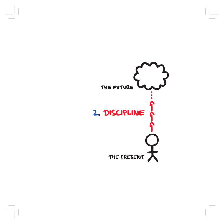
DEPICTS
A stick figure labeled "THE PRESENT" stands at the bottom. Above it floats a thought bubble labeled "THE FUTURE." A vertical chain of red dashed/solid arrows points upward from the person toward the future bubble, labeled "2. DISCIPLINE" (the "2." in blue, "DISCIPLINE" in red). The arrows visualize discipline as the upward force that carries a person from their present self toward their imagined future.
EXPLAIN AS
Full-cover explainer / chapter-opener animation establishing the second pillar of the system. Use as a clean transitional title card when Roman moves from Motivation into Discipline — the upward arrows are an obvious build/motion cue.
ANIMATION
The three red arrows light up and travel upward in sequence (present → future), each pulse nudging the stick figure slightly up while the future thought-bubble brightens and fills in on arrival.
CRITICAL ANGLE
The metaphor frames discipline as a simple upward force bridging "present self" and "future self" — neat but it sidesteps the contested science the book leans on elsewhere (willpower-as-depletable-muscle / ego depletion, now widely failed to replicate). The visual implies discipline is a single effortful push rather than environment design, habits, and identity — a 2026 behavior-science view would push back on the "just strain upward" framing.
Idea: Discipline: The Present → The Future  (book page 38, area: Discipline, tool: —)
What it shows: A stick figure labeled "THE PRESENT" stands at the bottom. Above it floats a thought bubble labeled "THE FUTURE." A vertical chain of red dashed/solid arrows points upward from the person toward the future bubble, labeled "2. DISCIPLINE" (the "2." in blue, "DISCIPLINE" in red). The arrows visualize discipline as the upward force that carries a person from their present self toward their imagined future.
Explain as: Full-cover explainer / chapter-opener animation establishing the second pillar of the system. Use as a clean transitional title card when Roman moves from Motivation into Discipline — the upward arrows are an obvious build/motion cue.
Animation/build: The three red arrows light up and travel upward in sequence (present → future), each pulse nudging the stick figure slightly up while the future thought-bubble brightens and fills in on arrival.
CRITICAL (two-state myth→reality): The metaphor frames discipline as a simple upward force bridging "present self" and "future self" — neat but it sidesteps the contested science the book leans on elsewhere (willpower-as-depletable-muscle / ego depletion, now widely failed to replicate). The visual implies discipline is a single effortful push rather than environment design, habits, and identity — a 2026 behavior-science view would push back on the "just strain upward" framing.
Render 16:9, yt.rya.ae style (near-black, amber accent, Space Grotesk/Inter, clean vector).
10Outcomes: From Present to Future
nice
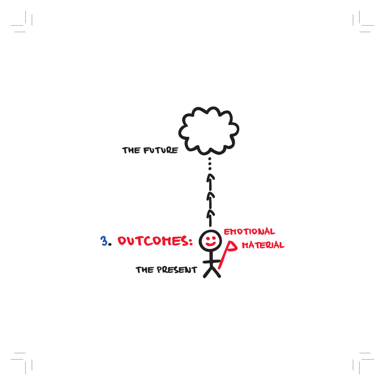
DEPICTS
A smiling stick figure stands on the ground labeled "THE PRESENT," planting a red flag labeled "EMOTIONAL MATERIAL." A dotted line with three upward chevron arrows rises from the figure to a thought cloud at top labeled "THE FUTURE." The header reads "3. OUTCOMES:" (3 in blue, OUTCOMES in red). It frames Outcomes as the bridge that turns present action into a desired future.
EXPLAIN AS
Full-cover explainer to open the third pillar (Outcomes); the rising arrows can animate present→future, and the "emotional material" flag can be a callout for why outcomes matter beyond logic.
ANIMATION
Build the stick figure first in "THE PRESENT," then have the three chevron arrows draw upward one-by-one along the dotted line, popping the "THE FUTURE" cloud into existence at the top, with the red flag planting last.
CRITICAL ANGLE
The figure literally is the "3. Outcomes" section opener, so it states the model rather than an empirical claim — low science-check risk. The contestable subtext is the implied promise that vividly imagining a desired future ("emotional material") reliably drives present action; positive future-fantasy / mental-contrasting research (Oettingen) actually shows pure positive visualization can sap motivation unless paired with obstacle planning.
Idea: Outcomes: From Present to Future  (book page 40, area: Outcomes, tool: —)
What it shows: A smiling stick figure stands on the ground labeled "THE PRESENT," planting a red flag labeled "EMOTIONAL MATERIAL." A dotted line with three upward chevron arrows rises from the figure to a thought cloud at top labeled "THE FUTURE." The header reads "3. OUTCOMES:" (3 in blue, OUTCOMES in red). It frames Outcomes as the bridge that turns present action into a desired future.
Explain as: Full-cover explainer to open the third pillar (Outcomes); the rising arrows can animate present→future, and the "emotional material" flag can be a callout for why outcomes matter beyond logic.
Animation/build: Build the stick figure first in "THE PRESENT," then have the three chevron arrows draw upward one-by-one along the dotted line, popping the "THE FUTURE" cloud into existence at the top, with the red flag planting last.
CRITICAL (two-state myth→reality): The figure literally is the "3. Outcomes" section opener, so it states the model rather than an empirical claim — low science-check risk. The contestable subtext is the implied promise that vividly imagining a desired future ("emotional material") reliably drives present action; positive future-fantasy / mental-contrasting research (Oettingen) actually shows pure positive visualization can sap motivation unless paired with obstacle planning.
Render 16:9, yt.rya.ae style (near-black, amber accent, Space Grotesk/Inter, clean vector).
13Money vs. Happiness Curve
nice
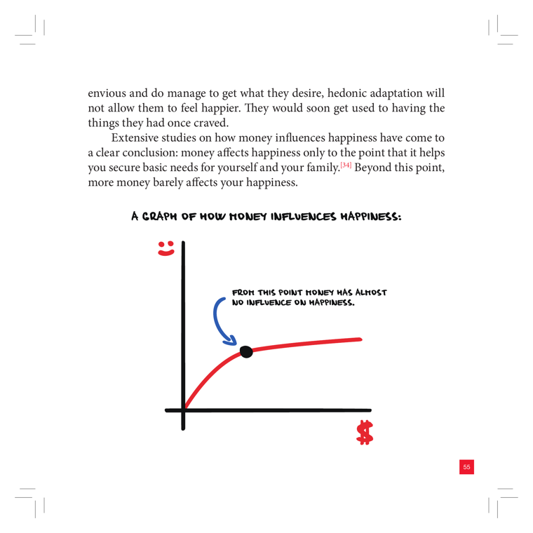
DEPICTS
A hand-drawn line graph titled "A graph of how money influences happiness." The Y-axis is marked by a red smiley face (happiness), the X-axis by a red dollar sign (money). A red curve rises steeply at first, then flattens into a near-horizontal plateau. A black dot sits at the inflection point where the curve bends, with a blue arrow and caption: "From this point money has almost no influence on happiness."
EXPLAIN AS
Full-cover explainer: animate the curve drawing in as Roman narrates the "money buys happiness only up to basic needs" claim, with the dot/threshold as the punchline. Reusable as b-roll for any segment on hedonic adaptation or diminishing returns.
ANIMATION
Draw the red curve left-to-right with a pen-stroke reveal; when it crosses the bend, pop in the black dot and have the blue arrow + caption swing in, then fade a ghosted "actual data" log-curve continuing to rise past the plateau to stage Roman's critique.
CRITICAL ANGLE
The book draws a hard plateau ("almost no influence beyond this point"), echoing the 2010 Kahneman-Deaton ~$75k satiation finding. But 2021 Killingsworth and the 2023 Killingsworth-Kahneman-Mellers adversarial collaboration showed experienced well-being keeps rising with log income for most people (with only a flattening for an unhappy minority) — so the strict flattening curve is contested. Honest redraw: log-shaped diminishing returns, not a true plateau.
Idea: Money vs. Happiness Curve  (book page 56, area: Outcomes, tool: —)
What it shows: A hand-drawn line graph titled "A graph of how money influences happiness." The Y-axis is marked by a red smiley face (happiness), the X-axis by a red dollar sign (money). A red curve rises steeply at first, then flattens into a near-horizontal plateau. A black dot sits at the inflection point where the curve bends, with a blue arrow and caption: "From this point money has almost no influence on happiness."
Explain as: Full-cover explainer: animate the curve drawing in as Roman narrates the "money buys happiness only up to basic needs" claim, with the dot/threshold as the punchline. Reusable as b-roll for any segment on hedonic adaptation or diminishing returns.
Animation/build: Draw the red curve left-to-right with a pen-stroke reveal; when it crosses the bend, pop in the black dot and have the blue arrow + caption swing in, then fade a ghosted "actual data" log-curve continuing to rise past the plateau to stage Roman's critique.
CRITICAL (two-state myth→reality): The book draws a hard plateau ("almost no influence beyond this point"), echoing the 2010 Kahneman-Deaton ~$75k satiation finding. But 2021 Killingsworth and the 2023 Killingsworth-Kahneman-Mellers adversarial collaboration showed experienced well-being keeps rising with log income for most people (with only a flattening for an unhappy minority) — so the strict flattening curve is contested. Honest redraw: log-shaped diminishing returns, not a true plateau.
Render 16:9, yt.rya.ae style (near-black, amber accent, Space Grotesk/Inter, clean vector).
18Group Selection: Cooperators vs. Loners
nice
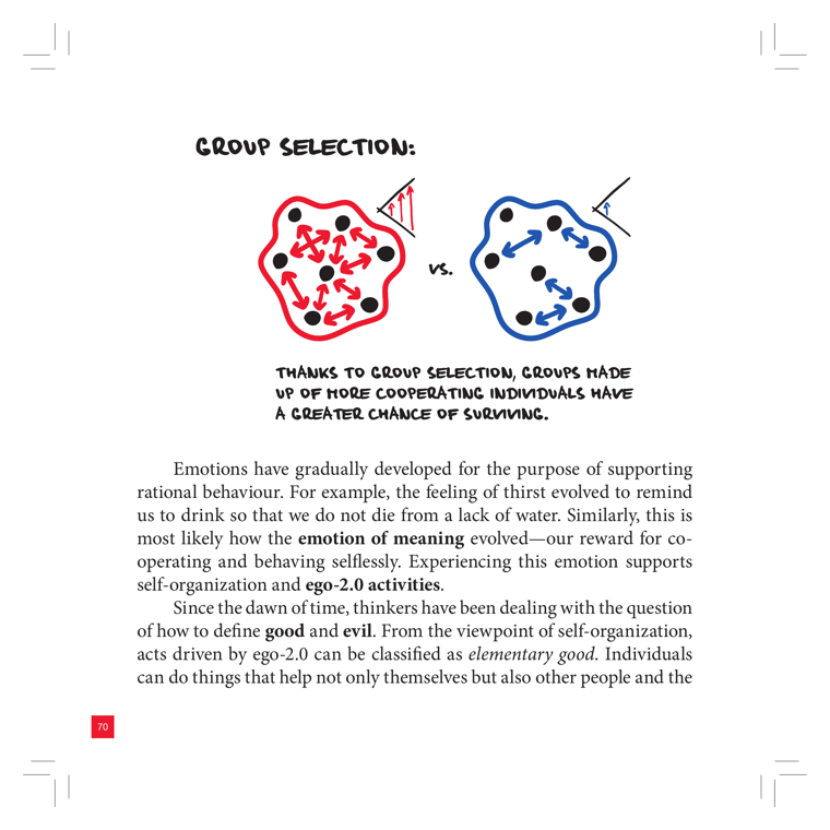
DEPICTS
Two hand-drawn cell-like blobs side by side labeled "GROUP SELECTION:". The left blob is outlined in red, filled with black dots (individuals) connected by many red arrows pointing inward toward each other (cooperation), with a small flag/banner icon at its edge. The right blob is outlined in blue with scattered black dots and blue arrows pointing outward/apart (non-cooperation), also with a flag icon. A "vs." sits between them. Caption: "Thanks to group selection, groups made up of more cooperating individuals have a greater chance of surviving."
EXPLAIN AS
Full-cover comparison explainer when Roman narrates the evolutionary-biology backstory for the "emotion of meaning" and ego-2.0 / cooperation argument: animate the red cooperative group thriving vs. the blue fragmented group; good A/B b-roll for the selfishness-vs-altruism beat.
ANIMATION
Reveal both blobs empty, then drop in the dots; red arrows snap inward and the red group pulses/grows (survives) while blue arrows fling the dots outward and the blue group fades/scatters, driving home "cooperators win."
CRITICAL ANGLE
Group selection is scientifically contested — most evolutionary biologists favor inclusive fitness / kin & multilevel selection over naive "groups of cooperators survive" group selection (the Wilson–Dawkins debate). The book leans on it as settled fact to justify an innate "emotion of meaning," which overstates the consensus.
Idea: Group Selection: Cooperators vs. Loners  (book page 71, area: Motivation, tool: —)
What it shows: Two hand-drawn cell-like blobs side by side labeled "GROUP SELECTION:". The left blob is outlined in red, filled with black dots (individuals) connected by many red arrows pointing inward toward each other (cooperation), with a small flag/banner icon at its edge. The right blob is outlined in blue with scattered black dots and blue arrows pointing outward/apart (non-cooperation), also with a flag icon. A "vs." sits between them. Caption: "Thanks to group selection, groups made up of more cooperating individuals have a greater chance of surviving."
Explain as: Full-cover comparison explainer when Roman narrates the evolutionary-biology backstory for the "emotion of meaning" and ego-2.0 / cooperation argument: animate the red cooperative group thriving vs. the blue fragmented group; good A/B b-roll for the selfishness-vs-altruism beat.
Animation/build: Reveal both blobs empty, then drop in the dots; red arrows snap inward and the red group pulses/grows (survives) while blue arrows fling the dots outward and the blue group fades/scatters, driving home "cooperators win."
CRITICAL (two-state myth→reality): Group selection is scientifically contested — most evolutionary biologists favor inclusive fitness / kin & multilevel selection over naive "groups of cooperators survive" group selection (the Wilson–Dawkins debate). The book leans on it as settled fact to justify an innate "emotion of meaning," which overstates the consensus.
Render 16:9, yt.rya.ae style (near-black, amber accent, Space Grotesk/Inter, clean vector).
28Decision Paralysis — The Research
nice
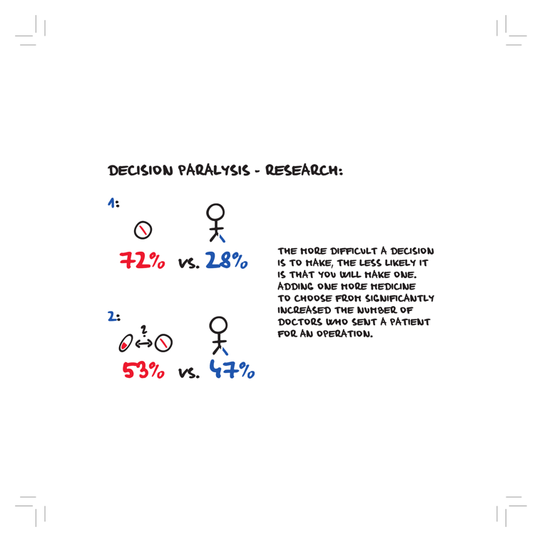
DEPICTS
Two stacked hand-drawn stat panels under the title "Decision Paralysis - Research:". Panel 1: a single crossed-out pill (a "no" circle) beside a confident stick figure, with "72% vs. 28%" (72% in red, 28% in blue) — the easy single-option case. Panel 2: two pills connected by a double-headed arrow with a question mark above (a comparison/dilemma) beside a stick figure, with "53% vs. 47%" (53% red, 47% blue) — the harder two-option case. A side text block explains: the more difficult a decision is to make, the less likely you are to make one; adding one more medicine to choose from significantly increased the number of doctors who sent a patient for an operation instead.
EXPLAIN AS
Full-cover explainer: animate the two panels as a before/after comparison to show how adding a second option flips doctor behavior. Works as a clean two-stat reveal (72/28 then 53/47) while Roman narrates the decision-paralysis study, or as b-roll cutaway when discussing choice overload.
ANIMATION
Panel 1 shows one pill and the stick figure decisively acts (72% bar fills red); then a second pill slides in with a "?" arrow between them, the figure hesitates, and the bars rebalance to 53/47 — the red "act" share visibly shrinking to dramatize paralysis.
CRITICAL ANGLE
This is the Redelmeier & Shafir (1995) hip-replacement/ibuprofen vignette study. The book presents it as a hard percentage fact, but it was a hypothetical-scenario survey of physicians, not real referral data, and the broader "choice overload" / jam-study literature failed to replicate robustly (Scheibehenne et al. 2010 meta-analysis found near-zero average effect). So the crisp 72/28 vs 53/47 numbers oversell a contested, context-dependent effect.
Idea: Decision Paralysis — The Research  (book page 131, area: Discipline, tool: —)
What it shows: Two stacked hand-drawn stat panels under the title "Decision Paralysis - Research:". Panel 1: a single crossed-out pill (a "no" circle) beside a confident stick figure, with "72% vs. 28%" (72% in red, 28% in blue) — the easy single-option case. Panel 2: two pills connected by a double-headed arrow with a question mark above (a comparison/dilemma) beside a stick figure, with "53% vs. 47%" (53% red, 47% blue) — the harder two-option case. A side text block explains: the more difficult a decision is to make, the less likely you are to make one; adding one more medicine to choose from significantly increased the number of doctors who sent a patient for an operation instead.
Explain as: Full-cover explainer: animate the two panels as a before/after comparison to show how adding a second option flips doctor behavior. Works as a clean two-stat reveal (72/28 then 53/47) while Roman narrates the decision-paralysis study, or as b-roll cutaway when discussing choice overload.
Animation/build: Panel 1 shows one pill and the stick figure decisively acts (72% bar fills red); then a second pill slides in with a "?" arrow between them, the figure hesitates, and the bars rebalance to 53/47 — the red "act" share visibly shrinking to dramatize paralysis.
CRITICAL (two-state myth→reality): This is the Redelmeier & Shafir (1995) hip-replacement/ibuprofen vignette study. The book presents it as a hard percentage fact, but it was a hypothetical-scenario survey of physicians, not real referral data, and the broader "choice overload" / jam-study literature failed to replicate robustly (Scheibehenne et al. 2010 meta-analysis found near-zero average effect). So the crisp 72/28 vs 53/47 numbers oversell a contested, context-dependent effect.
Render 16:9, yt.rya.ae style (near-black, amber accent, Space Grotesk/Inter, clean vector).
29The Ball of Problems
nice
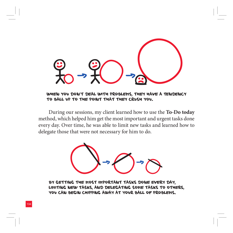
DEPICTS
Two stacked stick-figure strips. Top strip: a smiling stick figure, then the same figure pushing a small red circle, then pushing a much larger red ball while frowning — labeled "When you don't deal with problems, they have a tendency to ball up to the point that they crush you." Bottom strip: a large red circle with a diagonal line through it, then a smaller one, then a tiny one — labeled "By getting the most important tasks done every day, limiting new tasks, and delegating some tasks to others, you can begin chipping away at your ball of problems." Bright red circles, blue arrows, hand-drawn caps captions.
EXPLAIN AS
Full-cover explainer or b-roll for the To-Do Today section: animate the growing red ball crushing the figure (cost of procrastination), then the reverse shrink-down to show the method chipping problems away. A clean before/after comparison of the two strips.
ANIMATION
Red ball inflates and visibly crushes/squashes the pushing figure as the caption types in; then on the method beat, the diagonal "slash" wipes across and the ball shrinks step-by-step from huge to tiny, the figure straightening up and smiling.
CRITICAL ANGLE
The "snowball of problems" is an intuitive motivational metaphor, not a research claim, so it survives a science-check. Roman could note it oversimplifies: not every deferred task compounds (some problems decay or self-resolve), and the tidy "do top tasks + delegate = ball shrinks" arc ignores that real overload often isn't a prioritization failure but structural over-commitment — chipping away assumes the inflow is controllable, which the snowball framing itself contradicts.
Idea: The Ball of Problems  (book page 135, area: Discipline, tool: To-Do Today)
What it shows: Two stacked stick-figure strips. Top strip: a smiling stick figure, then the same figure pushing a small red circle, then pushing a much larger red ball while frowning — labeled "When you don't deal with problems, they have a tendency to ball up to the point that they crush you." Bottom strip: a large red circle with a diagonal line through it, then a smaller one, then a tiny one — labeled "By getting the most important tasks done every day, limiting new tasks, and delegating some tasks to others, you can begin chipping away at your ball of problems." Bright red circles, blue arrows, hand-drawn caps captions.
Explain as: Full-cover explainer or b-roll for the To-Do Today section: animate the growing red ball crushing the figure (cost of procrastination), then the reverse shrink-down to show the method chipping problems away. A clean before/after comparison of the two strips.
Animation/build: Red ball inflates and visibly crushes/squashes the pushing figure as the caption types in; then on the method beat, the diagonal "slash" wipes across and the ball shrinks step-by-step from huge to tiny, the figure straightening up and smiling.
CRITICAL (two-state myth→reality): The "snowball of problems" is an intuitive motivational metaphor, not a research claim, so it survives a science-check. Roman could note it oversimplifies: not every deferred task compounds (some problems decay or self-resolve), and the tidy "do top tasks + delegate = ball shrinks" arc ignores that real overload often isn't a prioritization failure but structural over-commitment — chipping away assumes the inflow is controllable, which the snowball framing itself contradicts.
Render 16:9, yt.rya.ae style (near-black, amber accent, Space Grotesk/Inter, clean vector).
36Brick of Fate & the Inner-Switch Reset
nice
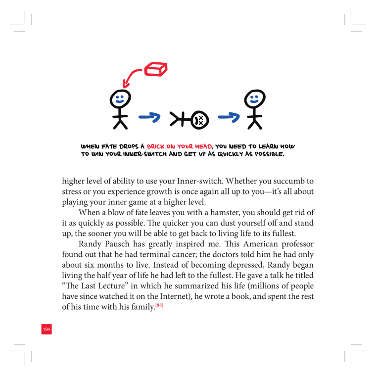
DEPICTS
A smiling stick figure on the left gets a red brick ("brick of fate") dropping onto its head via a curved arrow. A blue arrow leads to a small target/switch icon labeled with a flipped state, then another blue arrow leads to a recovered smiling stick figure on the right. Hand-lettered caption: "When fate drops a brick on your head, you need to learn how to turn your Inner-switch and get up as quickly as possible." Page number 194.
EXPLAIN AS
Full-cover explainer / b-roll metaphor: animate the brick falling, the figure flipping its inner-switch, and bouncing back to smiling — illustrates resilience / cognitive reappraisal after a setback. Pairs with the Randy Pausch "Last Lecture" anecdote on the same page.
ANIMATION
Brick drops on the smiling figure (it briefly frowns/wobbles), a glowing toggle-switch in its chest flips from OFF to ON with a click, and the figure straightens up and re-smiles as it strides forward.
CRITICAL ANGLE
The "Inner-switch" frames recovery from adversity as a simple toggle you flip by choice — close to cognitive reappraisal, which has real support, but the book overstates it as instant and willpower-driven ("it's all up to you"). 2026 science on stress, trauma and post-traumatic growth shows recovery is uneven, not a binary switch, and "growth vs. succumb is entirely your choice" risks victim-blaming people facing severe loss. Optimistic but oversimplified.
Idea: Brick of Fate & the Inner-Switch Reset  (book page 195, area: Discipline, tool: Inner-switch)
What it shows: A smiling stick figure on the left gets a red brick ("brick of fate") dropping onto its head via a curved arrow. A blue arrow leads to a small target/switch icon labeled with a flipped state, then another blue arrow leads to a recovered smiling stick figure on the right. Hand-lettered caption: "When fate drops a brick on your head, you need to learn how to turn your Inner-switch and get up as quickly as possible." Page number 194.
Explain as: Full-cover explainer / b-roll metaphor: animate the brick falling, the figure flipping its inner-switch, and bouncing back to smiling — illustrates resilience / cognitive reappraisal after a setback. Pairs with the Randy Pausch "Last Lecture" anecdote on the same page.
Animation/build: Brick drops on the smiling figure (it briefly frowns/wobbles), a glowing toggle-switch in its chest flips from OFF to ON with a click, and the figure straightens up and re-smiles as it strides forward.
CRITICAL (two-state myth→reality): The "Inner-switch" frames recovery from adversity as a simple toggle you flip by choice — close to cognitive reappraisal, which has real support, but the book overstates it as instant and willpower-driven ("it's all up to you"). 2026 science on stress, trauma and post-traumatic growth shows recovery is uneven, not a binary switch, and "growth vs. succumb is entirely your choice" risks victim-blaming people facing severe loss. Optimistic but oversimplified.
Render 16:9, yt.rya.ae style (near-black, amber accent, Space Grotesk/Inter, clean vector).
42The World, the Senses & Mental Models
nice
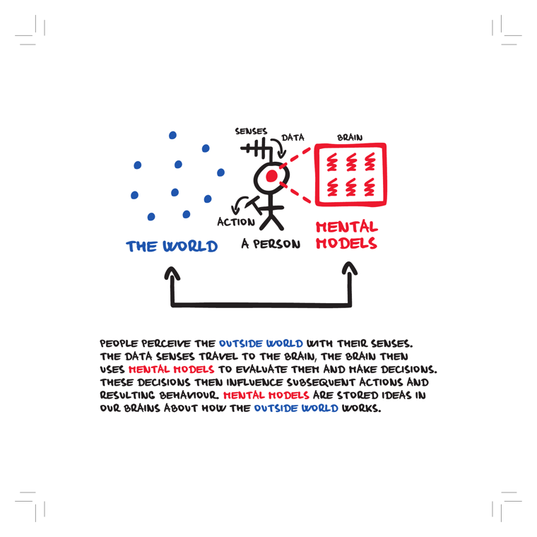
DEPICTS
A stick figure (the red dot on the forehead marks the "person/brain") stands between two domains. On the left, scattered blue dots labeled "THE WORLD" feed into the figure via "SENSES" → "DATA". Inside/beside the head a red gridded box of squiggles is labeled "BRAIN" / "MENTAL MODELS". An "ACTION" arrow loops back out from the figure toward the world, and a big bracket-arrow underneath ties world and mental models together. Caption: senses carry data to the brain, the brain uses mental models to evaluate and decide, decisions drive actions, and mental models are stored ideas about how the outside world works.
EXPLAIN AS
Full-cover explainer: animate the perception loop (World → Senses → Data → Brain/Mental Models → Action → World) to set up why our internal map can be wrong before the Objectivity tools section. Good recurring b-roll motif for any "we don't see reality directly" point.
ANIMATION
Draw the blue world-dots, then fire a single dot along the "SENSES/DATA" line into the head; the red mental-models grid lights up square-by-square, then an "ACTION" arrow shoots back out and nudges the world dots — closing the loop on repeat to show the perception cycle.
CRITICAL ANGLE
The "mental models" / perception-as-construction framing is broadly defensible (predictive processing, schema theory), so it survives a science-check better than the book's contested icons (willpower-muscle, ego-depletion glass, Dunning-Kruger curve). Roman's divergence: the diagram is a tidy linear pipeline (data in → model → action out), whereas modern cognitive science is more loop/prediction-driven — the brain isn't a passive receiver but actively predicts and filters input. Also worth flagging that "mental models" here is a loose self-help label, not a precise mechanism.
Idea: The World, the Senses & Mental Models  (book page 214, area: Objectivity, tool: —)
What it shows: A stick figure (the red dot on the forehead marks the "person/brain") stands between two domains. On the left, scattered blue dots labeled "THE WORLD" feed into the figure via "SENSES" → "DATA". Inside/beside the head a red gridded box of squiggles is labeled "BRAIN" / "MENTAL MODELS". An "ACTION" arrow loops back out from the figure toward the world, and a big bracket-arrow underneath ties world and mental models together. Caption: senses carry data to the brain, the brain uses mental models to evaluate and decide, decisions drive actions, and mental models are stored ideas about how the outside world works.
Explain as: Full-cover explainer: animate the perception loop (World → Senses → Data → Brain/Mental Models → Action → World) to set up why our internal map can be wrong before the Objectivity tools section. Good recurring b-roll motif for any "we don't see reality directly" point.
Animation/build: Draw the blue world-dots, then fire a single dot along the "SENSES/DATA" line into the head; the red mental-models grid lights up square-by-square, then an "ACTION" arrow shoots back out and nudges the world dots — closing the loop on repeat to show the perception cycle.
CRITICAL (two-state myth→reality): The "mental models" / perception-as-construction framing is broadly defensible (predictive processing, schema theory), so it survives a science-check better than the book's contested icons (willpower-muscle, ego-depletion glass, Dunning-Kruger curve). Roman's divergence: the diagram is a tidy linear pipeline (data in → model → action out), whereas modern cognitive science is more loop/prediction-driven — the brain isn't a passive receiver but actively predicts and filters input. Also worth flagging that "mental models" here is a loose self-help label, not a precise mechanism.
Render 16:9, yt.rya.ae style (near-black, amber accent, Space Grotesk/Inter, clean vector).
43Level of Objectivity Scale
nice
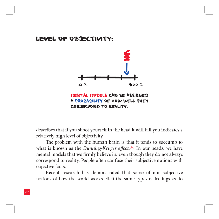
DEPICTS
A hand-drawn horizontal scale/gauge with five tick marks, labeled "0 %" on the left and "100 %" on the right. A red squiggly marker with a blue arrow points down onto the high end near 100%. A handwritten caption below reads "MENTAL MODELS can be assigned a PROBABILITY of how well they correspond to reality," with "MENTAL MODELS" in red and "PROBABILITY" in blue.
EXPLAIN AS
Full-cover explainer: animate the arrow sliding along a 0–100% objectivity gauge to show how a belief ("a bullet to the head is lethal") sits near 100% while subjective mental models sit lower. Good for narrating the probability-of-correctness concept.
ANIMATION
Arrow marker glides left-to-right along the scale; as it nears 100% the tick segment fills green, and floating belief-labels snap to different positions to show their assigned probability.
CRITICAL ANGLE
The book frames objectivity as a single 0–100% probability you can assign to any belief, and the surrounding text invokes the Dunning-Kruger effect — which is heavily contested in 2026 (much of the classic curve is a statistical artifact of autocorrelation/regression to the mean). Roman can note that "rate your belief on an objectivity scale" sounds rigorous but is itself a subjective self-estimate, the very bias it claims to fix.
Idea: Level of Objectivity Scale  (book page 215, area: Objectivity, tool: —)
What it shows: A hand-drawn horizontal scale/gauge with five tick marks, labeled "0 %" on the left and "100 %" on the right. A red squiggly marker with a blue arrow points down onto the high end near 100%. A handwritten caption below reads "MENTAL MODELS can be assigned a PROBABILITY of how well they correspond to reality," with "MENTAL MODELS" in red and "PROBABILITY" in blue.
Explain as: Full-cover explainer: animate the arrow sliding along a 0–100% objectivity gauge to show how a belief ("a bullet to the head is lethal") sits near 100% while subjective mental models sit lower. Good for narrating the probability-of-correctness concept.
Animation/build: Arrow marker glides left-to-right along the scale; as it nears 100% the tick segment fills green, and floating belief-labels snap to different positions to show their assigned probability.
CRITICAL (two-state myth→reality): The book frames objectivity as a single 0–100% probability you can assign to any belief, and the surrounding text invokes the Dunning-Kruger effect — which is heavily contested in 2026 (much of the classic curve is a statistical artifact of autocorrelation/regression to the mean). Roman can note that "rate your belief on an objectivity scale" sounds rigorous but is itself a subjective self-estimate, the very bias it claims to fix.
Render 16:9, yt.rya.ae style (near-black, amber accent, Space Grotesk/Inter, clean vector).
44Non-Objectivity: Subjective vs Objective Probability Scale
nice
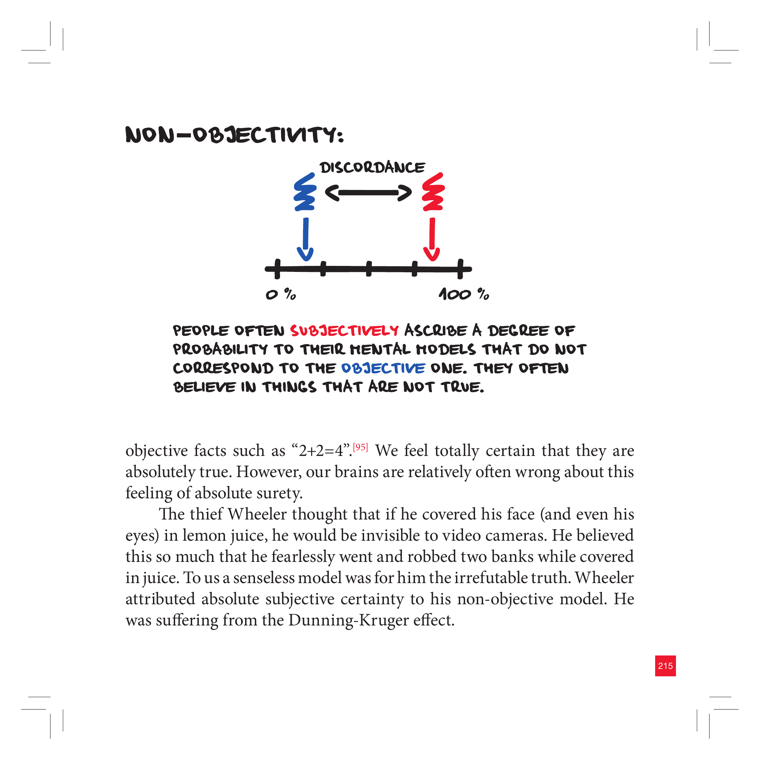
DEPICTS
A 0%–100% horizontal probability scale (number line) with two zig-zag spring/lightning-bolt markers above it: a blue one on the left and a red one on the right, joined by a double-headed arrow labeled "DISCORDANCE". Each marker drops a colored arrow down to a point on the scale, showing a gap between where someone subjectively places their certainty (red, near 100%) and where the objective probability actually sits (blue, lower). Caption below: "People often SUBJECTIVELY ascribe a degree of probability to their mental models that do not correspond to the OBJECTIVE one. They often believe in things that are not true." The page text ties it to the thief Wheeler (lemon-juice invisibility) and the Dunning-Kruger effect.
EXPLAIN AS
Full-cover explainer: animate the two markers on a 0–100% confidence scale and grow the "discordance" gap between felt certainty and real probability — a clean visual for the calibration / overconfidence point before Roman pivots to the Dunning-Kruger critique.
ANIMATION
Two pins drop onto a 0–100% bar — blue "objective" lands mid-scale, red "subjective" snaps to ~95% — then a glowing double arrow stretches between them and pulses the word DISCORDANCE as the gap widens.
CRITICAL ANGLE
The diagram itself (subjective confidence can diverge from objective probability = miscalibration/overconfidence) is well-supported. But the page anchors it to the Dunning-Kruger effect, which is heavily contested in 2026: much of the classic DK "curve" is reproduced by regression to the mean and the better-than-average artifact (Nuhfer, Gignac & Zajenkowski), so Roman should keep the calibration point but flag the DK framing as the weak link.
Idea: Non-Objectivity: Subjective vs Objective Probability Scale  (book page 216, area: Objectivity, tool: —)
What it shows: A 0%–100% horizontal probability scale (number line) with two zig-zag spring/lightning-bolt markers above it: a blue one on the left and a red one on the right, joined by a double-headed arrow labeled "DISCORDANCE". Each marker drops a colored arrow down to a point on the scale, showing a gap between where someone subjectively places their certainty (red, near 100%) and where the objective probability actually sits (blue, lower). Caption below: "People often SUBJECTIVELY ascribe a degree of probability to their mental models that do not correspond to the OBJECTIVE one. They often believe in things that are not true." The page text ties it to the thief Wheeler (lemon-juice invisibility) and the Dunning-Kruger effect.
Explain as: Full-cover explainer: animate the two markers on a 0–100% confidence scale and grow the "discordance" gap between felt certainty and real probability — a clean visual for the calibration / overconfidence point before Roman pivots to the Dunning-Kruger critique.
Animation/build: Two pins drop onto a 0–100% bar — blue "objective" lands mid-scale, red "subjective" snaps to ~95% — then a glowing double arrow stretches between them and pulses the word DISCORDANCE as the gap widens.
CRITICAL (two-state myth→reality): The diagram itself (subjective confidence can diverge from objective probability = miscalibration/overconfidence) is well-supported. But the page anchors it to the Dunning-Kruger effect, which is heavily contested in 2026: much of the classic DK "curve" is reproduced by regression to the mean and the better-than-average artifact (Nuhfer, Gignac & Zajenkowski), so Roman should keep the calibration point but flag the DK framing as the weak link.
Render 16:9, yt.rya.ae style (near-black, amber accent, Space Grotesk/Inter, clean vector).
46The Dunning-Kruger Effect
nice
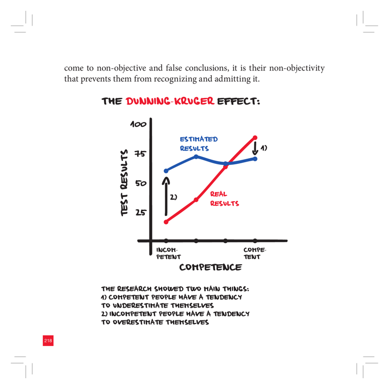
DEPICTS
A hand-drawn line chart titled "THE DUNNING-KRUGER EFFECT". Y-axis = "TEST RESULTS" (25, 50, 75, 100); X-axis = "COMPETENCE" running from "INCOMPETENT" to "COMPETENT". A blue line labeled "ESTIMATED RESULTS" stays high and roughly flat across the range; a red line labeled "REAL RESULTS" rises steeply from low to high. Arrow 2) points up at the gap where incompetent people overestimate; arrow 4) points down where competent people underestimate. Caption: competent people tend to underestimate themselves, incompetent people tend to overestimate themselves.
EXPLAIN AS
Full-cover explainer: animate the blue "estimated" vs red "real" lines diverging, then highlight the two gaps (over- and under-estimation). Strong b-roll for the segment on objectivity / why people can't see their own non-objectivity.
ANIMATION
Draw the red "real results" line rising left-to-right, then snap in the flat blue "estimated" line; pulse the two divergence arrows (overestimate at the left, underestimate at the right) with their captions, then overlay a "contested?" stamp for Roman's critique beat.
CRITICAL ANGLE
The classic "confidence-high-at-the-incompetent-end" curve is heavily contested. Critics (Nuhfer 2016/2017, Gignac & Zajenkowski 2020) argue the Dunning-Kruger pattern is largely a statistical artifact — regression to the mean plus the better-than-average effect — and that random/noise data reproduce the same shape. The book presents it as a settled, clean behavioral law, which a 2026 science-check does not support.
Idea: The Dunning-Kruger Effect  (book page 219, area: Objectivity, tool: —)
What it shows: A hand-drawn line chart titled "THE DUNNING-KRUGER EFFECT". Y-axis = "TEST RESULTS" (25, 50, 75, 100); X-axis = "COMPETENCE" running from "INCOMPETENT" to "COMPETENT". A blue line labeled "ESTIMATED RESULTS" stays high and roughly flat across the range; a red line labeled "REAL RESULTS" rises steeply from low to high. Arrow 2) points up at the gap where incompetent people overestimate; arrow 4) points down where competent people underestimate. Caption: competent people tend to underestimate themselves, incompetent people tend to overestimate themselves.
Explain as: Full-cover explainer: animate the blue "estimated" vs red "real" lines diverging, then highlight the two gaps (over- and under-estimation). Strong b-roll for the segment on objectivity / why people can't see their own non-objectivity.
Animation/build: Draw the red "real results" line rising left-to-right, then snap in the flat blue "estimated" line; pulse the two divergence arrows (overestimate at the left, underestimate at the right) with their captions, then overlay a "contested?" stamp for Roman's critique beat.
CRITICAL (two-state myth→reality): The classic "confidence-high-at-the-incompetent-end" curve is heavily contested. Critics (Nuhfer 2016/2017, Gignac & Zajenkowski 2020) argue the Dunning-Kruger pattern is largely a statistical artifact — regression to the mean plus the better-than-average effect — and that random/noise data reproduce the same shape. The book presents it as a settled, clean behavioral law, which a 2026 science-check does not support.
Render 16:9, yt.rya.ae style (near-black, amber accent, Space Grotesk/Inter, clean vector).
52Action Plan: The Exact Steps I Will Take
nice
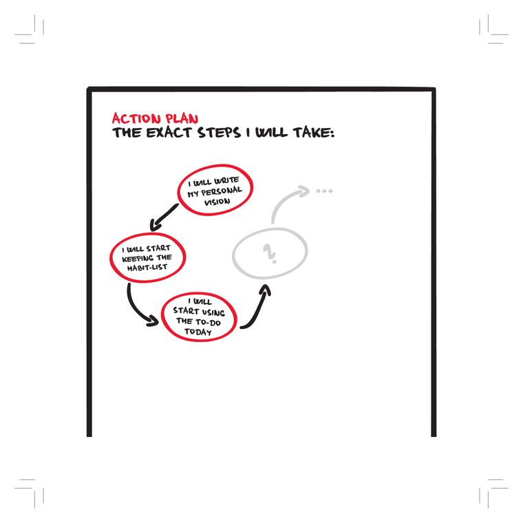
DEPICTS
A bordered worksheet titled "ACTION PLAN — The exact steps I will take:". Three red hand-drawn ellipses are arranged in a clockwise loop, connected by black arrows: "I will write my personal vision" → "I will start keeping the habit-list" → "I will start using the To-Do Today". A fourth node in the cycle is left as a faint grey ellipse with a question mark, and a grey dashed arrow trails off into "…", signalling the reader fills in their own next step. It is a commitment/worksheet diagram, not a chart.
EXPLAIN AS
Full-cover explainer to close the video: an animated "your turn" cycle that recaps the first three tools (Personal Vision → Habit-list → To-Do Today) as concrete first actions, with the empty grey node inviting the viewer to commit their own next step — a natural call-to-action / outro beat.
ANIMATION
Reveal each red node in sequence with its arrow drawing on, then have the faint grey "?" node and trailing "…" dashed arrow pulse, prompting "what's your step?" before it resolves to the viewer's own text.
CRITICAL ANGLE
Implies that simply writing a vision and starting two paper tools reliably triggers a self-sustaining action loop. Intention-behavior-gap research shows written intentions alone produce only modest follow-through; the empty fourth node also quietly admits the system has no defined endpoint — momentum is asserted, not evidenced.
Idea: Action Plan: The Exact Steps I Will Take  (book page 241, area: Meta/System, tool: Personal Vision)
What it shows: A bordered worksheet titled "ACTION PLAN — The exact steps I will take:". Three red hand-drawn ellipses are arranged in a clockwise loop, connected by black arrows: "I will write my personal vision" → "I will start keeping the habit-list" → "I will start using the To-Do Today". A fourth node in the cycle is left as a faint grey ellipse with a question mark, and a grey dashed arrow trails off into "…", signalling the reader fills in their own next step. It is a commitment/worksheet diagram, not a chart.
Explain as: Full-cover explainer to close the video: an animated "your turn" cycle that recaps the first three tools (Personal Vision → Habit-list → To-Do Today) as concrete first actions, with the empty grey node inviting the viewer to commit their own next step — a natural call-to-action / outro beat.
Animation/build: Reveal each red node in sequence with its arrow drawing on, then have the faint grey "?" node and trailing "…" dashed arrow pulse, prompting "what's your step?" before it resolves to the viewer's own text.
CRITICAL (two-state myth→reality): Implies that simply writing a vision and starting two paper tools reliably triggers a self-sustaining action loop. Intention-behavior-gap research shows written intentions alone produce only modest follow-through; the empty fourth node also quietly admits the system has no defined endpoint — momentum is asserted, not evidenced.
Render 16:9, yt.rya.ae style (near-black, amber accent, Space Grotesk/Inter, clean vector).
YTRSCEN · RomanSergeevCom [En] · Claude Design hand-off · powered by RYA.AE